The network for creativity
Join 1.25M professional creatives like you
Connect with clients, get discovered, and run your business 100% commission-free
Creatives on Contra have earned over $150M and we are just getting started
Back to feedPost
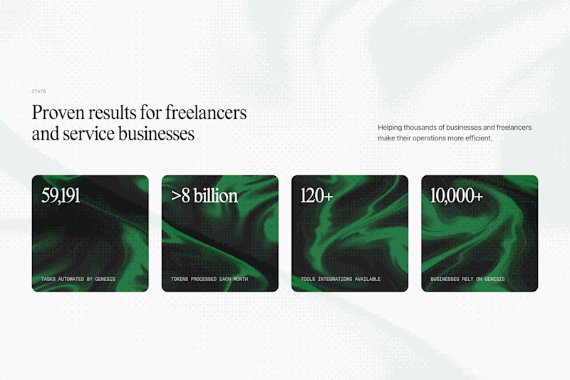
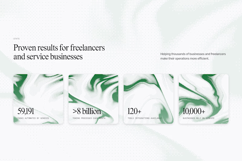
Taste Test
Experimenting with textured backgrounds for this stats section
Which one do you prefer?
53 voted
72%
21 voted
28%
74 votes
Closed
A
I like A more as well
Both
Love it 😂
Both are good, I will go with option B
Good choice!
A seems good to me
A is my preference as well
I love A
Thank you!
Overall look is better and data is more prominent in A 👍
I agree! The contrast feels bette to me
I love the layout in B but A is easier to read!
True! The contrast in A makes me like it more
I like A the most too!
Thanks a million! truly appreciate it!
No problem!
Thank you!
The darker is more bold for me!
I agree! It captures more attention for sure
I think the text at the bottom of the cards is easier to read in Option A. Great work!
Yeah that draws me to Option A as well. Thanks Evan!
go for A!
Thanks Sufyan!
I prefer A, so much cleaner like that
I agree Natália, I prefer that one as well!
The boldness in A! 🔥
Thanks Eduardo!
I like A the most too 🤝
B
The network for creativity
Join 1.25M professional creatives like you
Connect with clients, get discovered, and run your business 100% commission-free
Creatives on Contra have earned over $150M and we are just getting started
Trending
Claude
Claude has entered the design space. How are you using Claude Design?
Contra University
Learn from expert creatives how to earn more using next-gen AI tools.
creativeaiflow
Creative AI workflows are evolving. What tools do you use, and what are their strengths and weaknesses?
freelancerlife
Freelancer life is wins, pivots, and everything in between. What’s yours right now?