The network for creativity
Join 1.25M professional creatives like you
Connect with clients, get discovered, and run your business 100% commission-free
Creatives on Contra have earned over $150M and we are just getting started
Back to feedPost
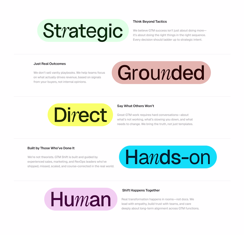
Taste Test


I like both of them, but this section will decide the overall theme of the landing page!! So only one I can choose 🤔
12 voted
38%
20 voted
62%
32 votes
Closed

The black is more clearer, considering the multiple use of colors.

Yes, its even standing out in here..

the black glow always 😍
Yes.. 🙌

I love the usual white. Sometimes, simplicity is everything.
Awesome designs mate!
Okay, I like the way your seeing things.
But don't you think its standing out? (Black) eye catchy?
Exactly my point. Most people are used to dark mode designs, seeing something done with white gives a breath of fresh air.
Thats Great insight!! Thanks

Amazing
Thank You!!

I wish I could vote for the two haha. It’s kind of tough for me to pick but I ended up voting for dark version because it catches my eye more
Really, I also like both.. Thanks for the honesty..
You’re welcome!

Thanks @Alvin A , Considering that ✨

the black one is more better looking
Considering that… Thank You..😇

Great work!
The network for creativity
Join 1.25M professional creatives like you
Connect with clients, get discovered, and run your business 100% commission-free
Creatives on Contra have earned over $150M and we are just getting started
Trending
maxearnings
The next frontier of payments is live on Contra. How are you maximizing revenue?
freelancerlife
Freelancer life is wins, pivots, and everything in between. What’s yours right now?
aidesignflow
AI tools are redefining how designer work. What does your workflow look like?
micrographics
Micrographics started as utility - barcodes, packaging, instruction labels. How would you use them?
aivideo
AI video tools are moving at warp speed. What tools are you using?