The network for creativity
Join 1.25M professional creatives like you
Connect with clients, get discovered, and run your business 100% commission-free
Creatives on Contra have earned over $150M and we are just getting started
Back to feedPost
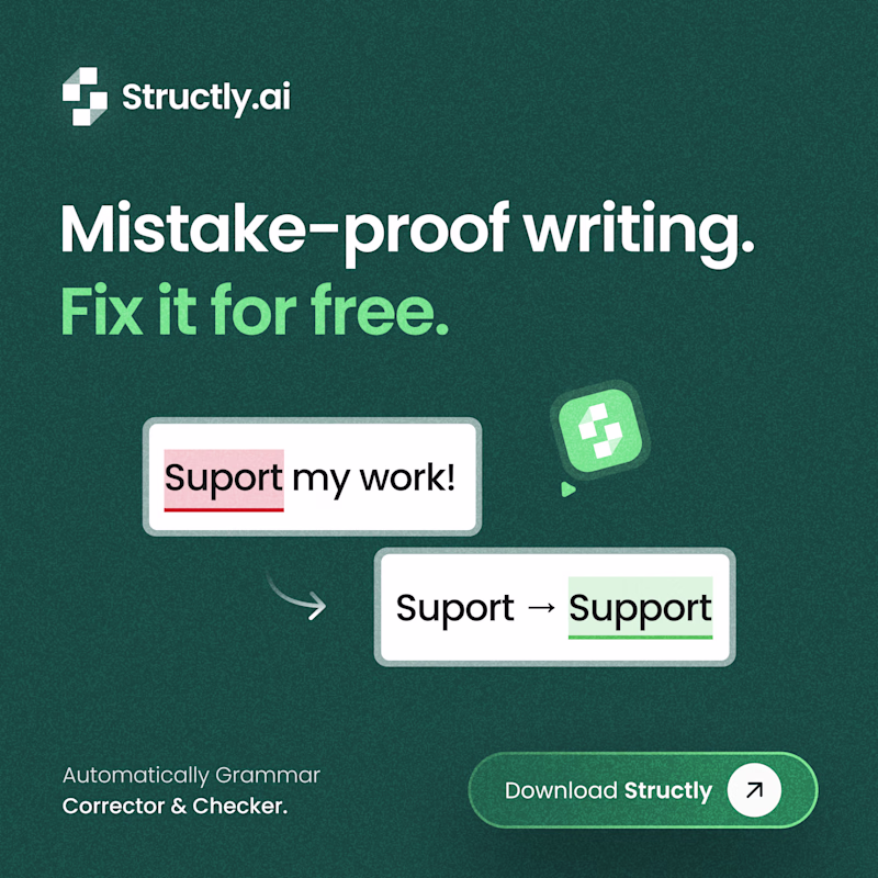
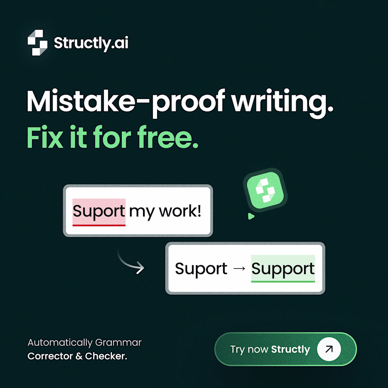
Taste Test
Which concept is your favorite? 👀
left ↔️ right
93 voted
47%
104 voted
53%
197 votes
Closed
+++
Appreciate it, Andi! 🙏
Should contrast always look "subtle" ?
I will go for the one at the right
Left one look clear.
"No rebuttal if you go subtle." - old(er) designer
Also, as a user ... the CTA "download" vs. "try now" ... I prefer to know exactly what i am required to do.
+2 for the left
Love the left
Not sure, the black one overall looks great but then those borders go well with green background.
I like the contrast of the right side! Feels super clean and all the elements stand out more.
Thanks, Julia! 🙌
im going for right. because it's feel seroius about the content and easy to readable beacuse of the solid dark background color.
cool work
Definitely going with the first one. It feels more relaxing
the contrast in the background in the first frame matches the text
the left side, because it looks like more consistent with the brand colours 🔥
but the right side provides better contrast
perhaps to improve contrast, could the CTA be made a dark colour, like the background on the right side?
I like the all green! Feels super cohesive
Thank you, Keara! 😍
I prefer the second card, the darker background gives it more depth and makes the design feel nicer overall
I feel the second is more attractive and well positioned 👍
The left option works better for me! The contrast is more subtle and the interface feels cleaner. Both concepts are solid though - nice work on the UX!
The network for creativity
Join 1.25M professional creatives like you
Connect with clients, get discovered, and run your business 100% commission-free
Creatives on Contra have earned over $150M and we are just getting started
Trending
Claude
Claude has entered the design space. How are you using Claude Design?
Contra University
Learn from expert creatives how to earn more using next-gen AI tools.
creativeaiflow
Creative AI workflows are evolving. What tools do you use, and what are their strengths and weaknesses?
portfolioreview
The best portfolios tell a story, not just show a grid. Share yours for feedback.
freelancerlife
Freelancer life is wins, pivots, and everything in between. What’s yours right now?