The network for creativity
Join 1.25M professional creatives like you
Connect with clients, get discovered, and run your business 100% commission-free
Creatives on Contra have earned over $150M and we are just getting started
Back to feedPost
Taste Test

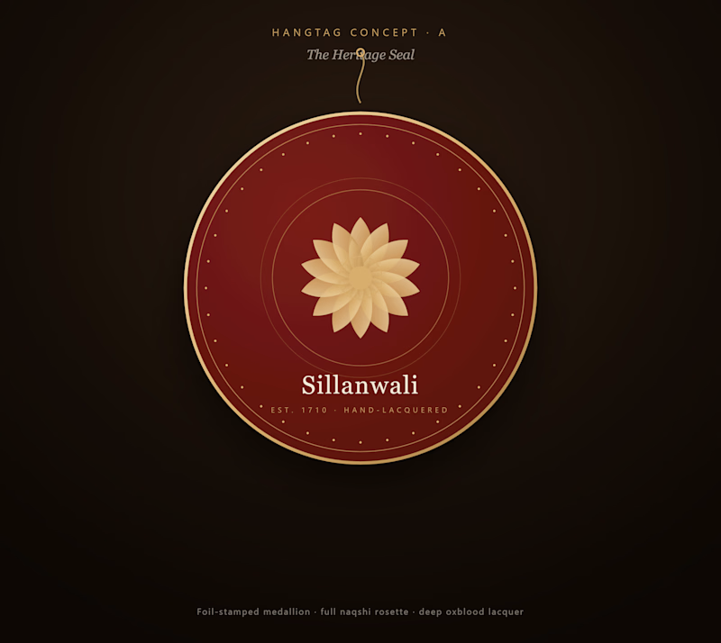
Designing the physical hangtag for Sillanwali — a 300-year-old naqshi lacquer woodcraft brand from Punjab. Two directions, same hand-vectored rosette motif, opposite instincts. Which one would make you flip the tag over to read the story?
1 voted
100%
0 voted
0%
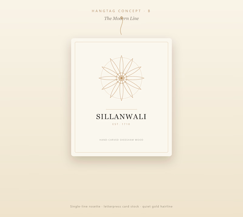
1 vote
Closed
The network for creativity
Join 1.25M professional creatives like you
Connect with clients, get discovered, and run your business 100% commission-free
Creatives on Contra have earned over $150M and we are just getting started








Related posts

WIP - Brand Identity
Which one?
9 voted
47%
10 voted
53%
19 votes
Closed

B is more suitable for these textures ❤️❤️
Great job Gaber🎉🎉🔥🔥


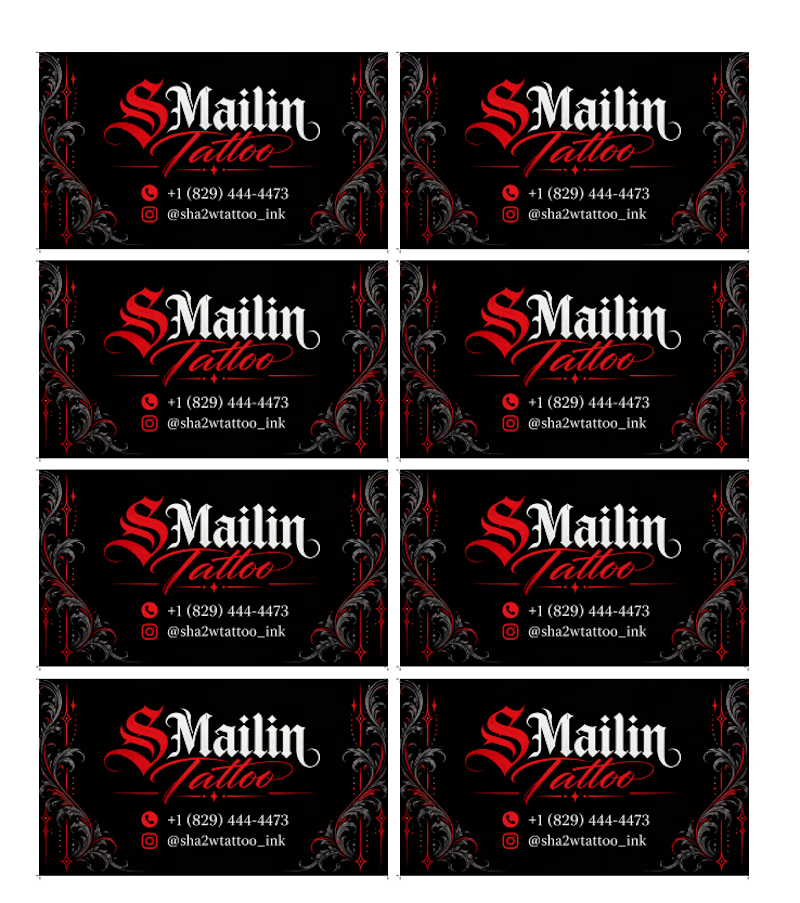
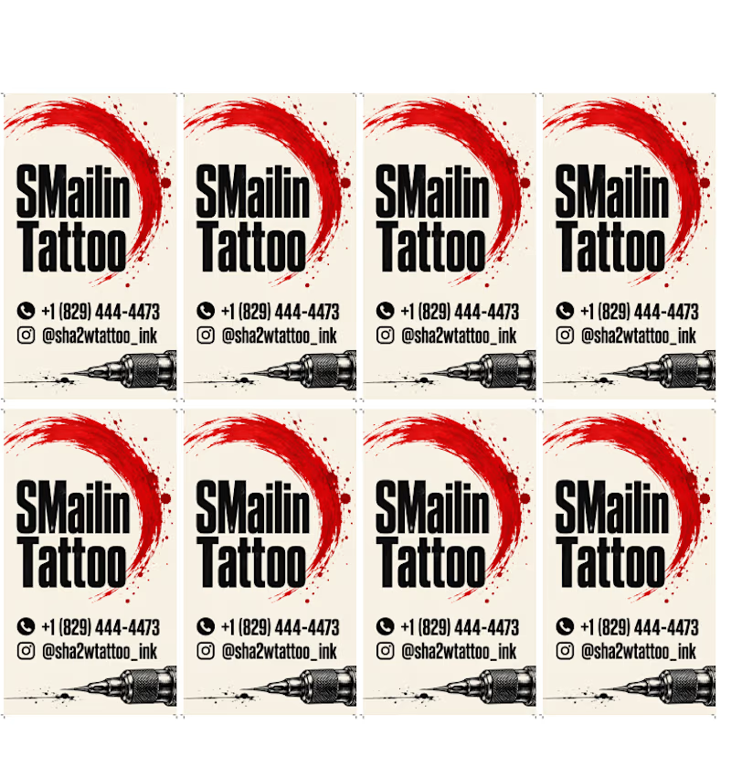
Two directions, one identity. 🖤❤️
Horizontal and vertical business card concepts for SMailin Tattoo, exploring bold contrast and clean layouts.
Which one would you choose?
🅰️ Horizontal
🅱️ Vertical
Vote A or B in the comments! What would you improve? 👇
#GraphicDesign #BusinessCardDesign #BrandIdentity #TattooStudio #DesignFeedback
1 voted
25%
3 voted
75%
4 votes
Closed

Same Design.com promo, two crops. Square keeps the desk tight, wide gives the room its light. 1 or 2.
11 voted
73%
4 voted
27%
15 votes
Closed