The network for creativity
Join 1.25M professional creatives like you
Connect with clients, get discovered, and run your business 100% commission-free
Creatives on Contra have earned over $150M and we are just getting started
Back to feedPost

Community Engagement Mini App for a Blockchain Company

The network for creativity
Join 1.25M professional creatives like you
Connect with clients, get discovered, and run your business 100% commission-free
Creatives on Contra have earned over $150M and we are just getting started

Challenges
View all


Related posts

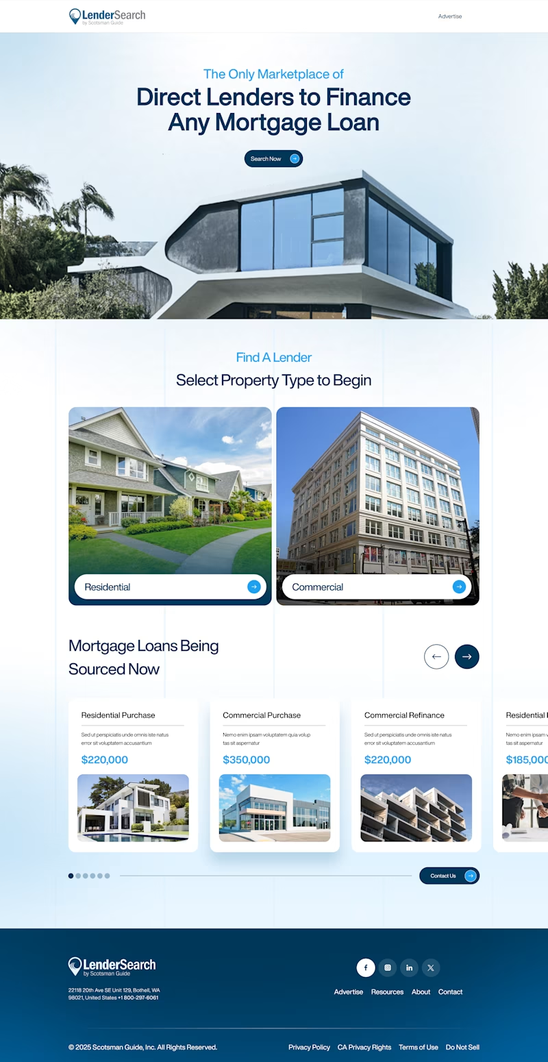
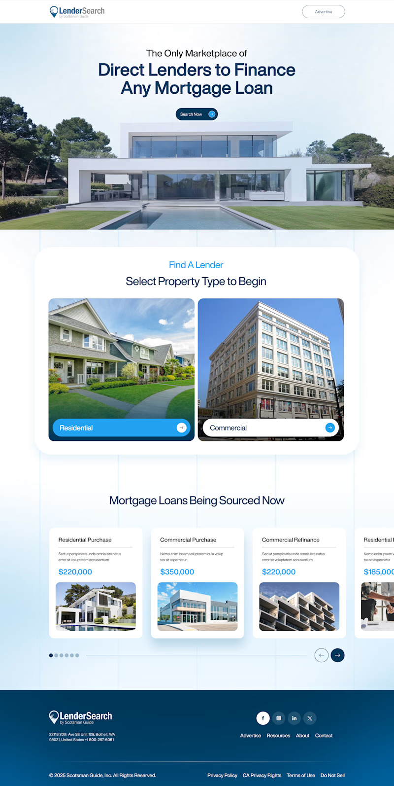
Two layout directions for LenderSearch, a mortgage marketplace by Scotsman Guide.
A: centered hero text, full-width property image, content sits in a lifted white card
B: hero image bleeds into the content section, layout feels more connected and continuous
Same product, different flow. Which one feels easier to trust with a mortgage decision? 👇
7 voted
47%
8 voted
53%
15 votes
Closed
Designed two versions of the Dermoscan website. Same product, two languages, same layout adapted for each market.
A — English version, clean and clinical
B — French version, same structure localized for a European audience
Curious from a design perspective: does anything feel off between the two, or does the layout hold up across both? 👇
4 voted
67%

2 voted
33%

6 votes
Closed

Ceya Website Design & Development, 2025.
Ceya’s identity getting featured here, the website is now live in my portfolio too. 🟢 Same brand, next chapter: eight IT services in one clear structure, with green saved only for action.
Full case study 👉 https://serkanhursgunel.com


Stellar work!