The network for creativity
Join 1.25M professional creatives like you
Connect with clients, get discovered, and run your business 100% commission-free
Creatives on Contra have earned over $150M and we are just getting started
Back to feedPost

The Discipline System | eBook & Digital Product Cover Design
eBook Cover Design • Digital Product Design • Editorial Graphic Design
Project Overview
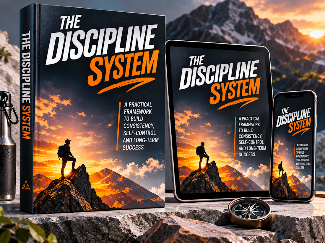
The Discipline System is a self-initiated eBook and digital product cover design concept created to explore how typography, visual storytelling, and cinematic art direction can communicate the themes of consistency, self-control, and personal development.
The fictional publication is positioned as a practical guide to building discipline and developing sustainable habits for long-term success.
The creative objective was to establish a strong, recognizable cover identity that feels motivational and sophisticated without relying on conventional self-help imagery or overly complicated visual elements.
The completed design is presented across a physical book mockup, tablet, and smartphone to demonstrate how the cover translates across different formats and viewing environments.
Creative Concept & Visual Storytelling
The central visual concept is built around the relationship between personal ambition and the journey required to achieve meaningful progress.
A solitary climber stands on a rugged mountain peak, overlooking a dramatic landscape illuminated by the setting sun.
Rather than depicting success as an effortless destination, the image suggests persistence, preparation, resilience, and the gradual process of reaching difficult goals.
The climber is deliberately small within the landscape, emphasizing the scale of the challenge while allowing the environment to communicate determination and possibility.
This restrained visual storytelling gives the artwork emotional depth without competing with the main title.
Typography & Visual Hierarchy
Typography serves as the dominant design element.
The title, THE DISCIPLINE SYSTEM, uses oversized condensed sans-serif lettering with a strong forward-leaning structure.
The word DISCIPLINE appears in bright white, establishing immediate readability, while SYSTEM introduces a vivid orange contrast that reinforces energy and determination.
A dynamic orange underline creates a sense of movement and visually connects the title with the mountain imagery beneath it.
The subtitle, A Practical Framework to Build Consistency, Self-Control and Long-Term Success, is positioned in a compact vertical arrangement to maintain balance and support the overall hierarchy.
The typographic approach is designed to remain recognizable at smaller digital thumbnail sizes while preserving its impact on a full-size book cover.
Color Palette & Art Direction
The design uses a focused palette of deep charcoal, midnight blue, crisp white, and intense sunset orange.
Dark tones establish a serious, disciplined atmosphere, while the orange highlights introduce energy, optimism, and a sense of forward momentum.
The landscape transitions from shadowed mountain textures to a glowing horizon, creating depth and cinematic contrast.
Subtle surface textures reinforce the rugged visual identity, while the overall composition remains clean enough to let the typography and landscape carry the message.
Cover Composition
The cover is organized into three primary visual layers:
1. The Typographic Statement
A dominant title occupies the upper section, creating immediate recognition and establishing the publication's identity.
2. The Supporting Message
A concise subtitle explains the subject matter and provides context without overwhelming the composition.
3. The Visual Narrative
The mountain landscape and solitary climber communicate perseverance, ambition, and the gradual pursuit of meaningful goals.
These elements work together to create a clear visual hierarchy that is consistent across the book, tablet, and smartphone presentations.
Product Mockup Presentation
The final presentation was developed to demonstrate the versatility of the cover across physical and digital formats.
The upright book mockup establishes the artwork as a premium publication, with coordinated spine typography and a consistent visual identity.
The tablet and smartphone reproduce the cover at different scales, highlighting its adaptability for digital reading platforms, online storefronts, and promotional content.
The surrounding environment incorporates rugged stone surfaces, mountain scenery, a compass, and outdoor equipment to extend the visual story beyond the cover itself.
These supporting elements reinforce the central concept while maintaining the book design as the primary focal point.
Design Outcome
The completed project demonstrates an approach to eBook and digital product cover design that combines strong typographic hierarchy, cinematic storytelling, cohesive art direction, and realistic product presentation.
It highlights the ability to develop a distinctive visual identity for a publication while considering how that identity performs across multiple formats.
Created as a portfolio concept, the project illustrates how a simple, carefully directed composition can communicate a compelling message without unnecessary visual complexity.
The creative goal was to make discipline feel powerful, purposeful, and visually unforgettable.


The network for creativity
Join 1.25M professional creatives like you
Connect with clients, get discovered, and run your business 100% commission-free
Creatives on Contra have earned over $150M and we are just getting started



Related posts

AI Advertising Video for BetGenuine
How do you capture the attention of football fans and communicate a brand's value through video?
Created an AI-generated promotional video for BetGenuine, a football prediction platform offering match predictions, football statistics and betting insights.
The project focused on creating engaging advertising content that introduces the brand, communicates its offering and captures the attention of its target audience.
Services:
AI Video Creation
Commercial Ad Production
Creative Direction
Video Editing
Project: Promotional Advertising Video
Brand: BetGenuine


Nice


awesome work

Created a premium advertising banner concept for Remento, a service that transforms family memories and recorded stories into beautiful books.
The design focuses on emotional storytelling, premium product presentation, and clear visual hierarchy.
Design highlights:
AI-assisted visual creation
E-commerce advertising concept
Product-focused composition
Professional typography
Marketing-oriented call-to-action
Warm, premium visual style
Tools: AI Design Tools, Photoshop
Project type: Concept Design / Portfolio Project