The network for creativity
Join 1.25M professional creatives like you
Connect with clients, get discovered, and run your business 100% commission-free
Creatives on Contra have earned over $150M and we are just getting started
Back to feedPost

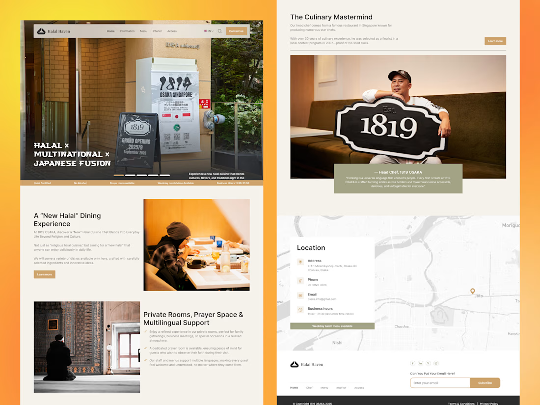
Japanese Fusion Restaurant Website, UI/UX Design (Figma)
Sharing a website UI/UX concept focused on creating a welcoming, modern dining experience. The goal was to clearly communicate the restaurant’s identity while making key information, concept, location, and services, easy to access.
Designed with attention to visual hierarchy, typography, and layout clarity.
Feedback is welcome! 🙌
#UIUXDesign #WebDesign #Figma #LandingPage #RestaurantWebsite



nice landing page...
The network for creativity
Join 1.25M professional creatives like you
Connect with clients, get discovered, and run your business 100% commission-free
Creatives on Contra have earned over $150M and we are just getting started








Related posts

NURV® now has a home on the web 🟠
Same cream canvas, same dot-matrix numerals, same single orange. Scroll it and nine dots in the margin fill up one by one.
Pool to plate to pill, nine scenes, one system.

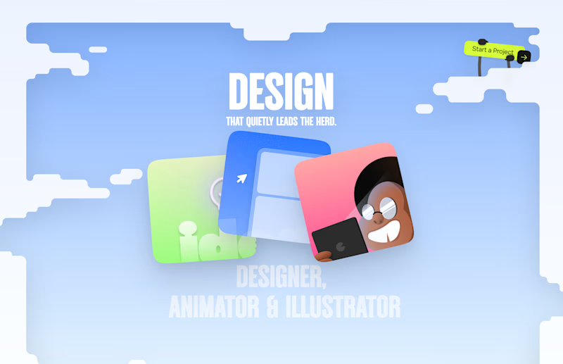
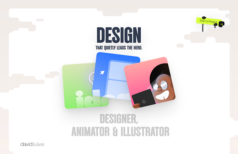
Should I go for left or right? Focusing on updating and finishing up my portfolio... and then I came across this crossroads. Another alternative is to make them switchable themes through a toggle, but I still need to decide which should be the default.
27 voted
75%
9 voted
25%
36 votes
Closed

Left is better because the text is readable, the overall blue background is not flashing to the eyes as compared to the right one.
For the top right button " Start a project ", you can add some animation so that it stands out and encourage users to click on it.

A recent SaaS website design project Done...


Excellent project, really nice