The network for creativity
Join 1.25M professional creatives like you
Connect with clients, get discovered, and run your business 100% commission-free
Creatives on Contra have earned over $150M and we are just getting started
Back to feedPost
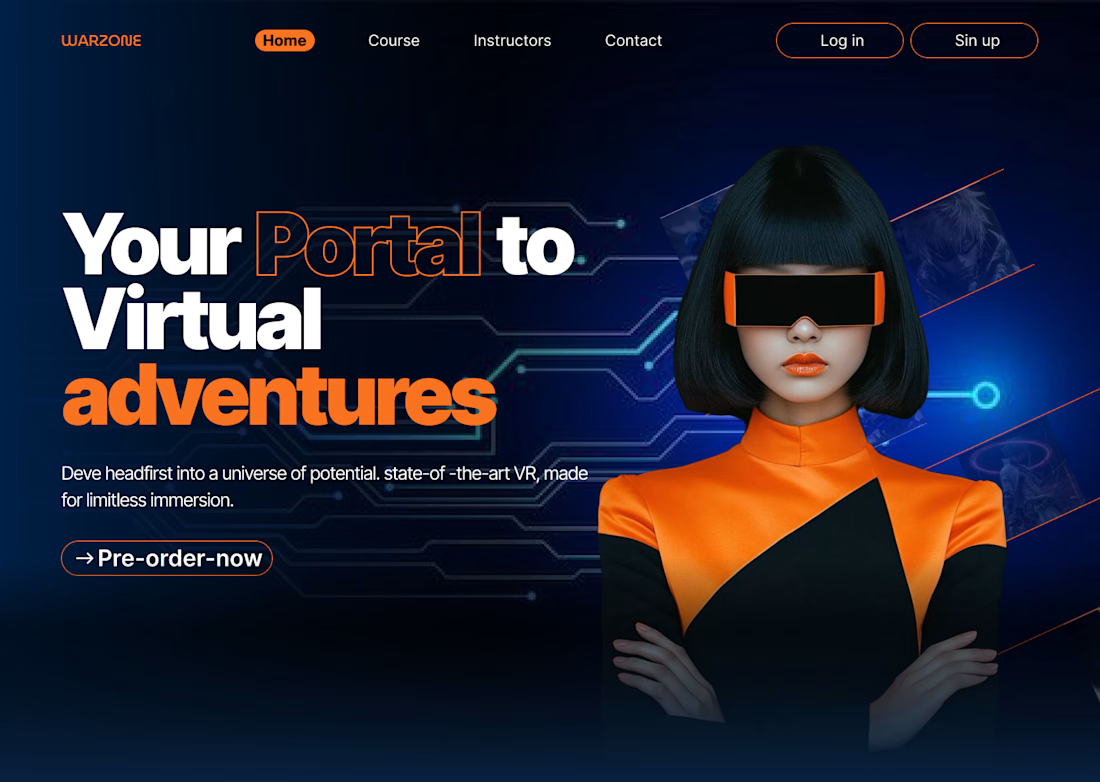
Title: Portal VR — Motion-First Hero Section That Sells in 3 Seconds
Description: Most landing pages explain the product. This one sells it before the visitor even finishes reading.
A fully animated hero section for a VR product launch — designed on one rule: if it doesn't grab attention in the first 3 seconds, it's dead on arrival.
Why it works:
Motion instead of a static image — the eye has no choice but to follow it
Cyberpunk visual identity — bold orange/blue contrast that feels premium, not generic
Copy that hits in 5 words or less — no fluff, no over-explaining
One CTA. Zero distractions. Zero decision fatigue for the visitor. This is what a hero section should do: stop the scroll, sell the vision, and get the click — all before the fold.
Tools: Figma → Motion Design
I build landing experiences that don't just look good — they move people to act. Currently taking on select VR, gaming, and futuristic product brands.
Tags:
Motion Design, Hero Section, Landing Page Design, UI/UX Design, Cyberpunk Design, VR Design, Web Design, Animation, Product Design, Framer Development




Love the bold use of cyberpunk colors! How do you decide on the perfect motion elements to capture attention so quickly?

Thank you! I actually made this in Canva using just one motion effect. I kept it simple and focused on making the movement complement the visual rather than adding too many animations.

The high-contrast cyberpunk palette instantly sets the VR vibe. Did you prototype the motion interactions directly in Figma or build them out in Framer?
Thank you so much! I’m really glad you liked the cyberpunk/VR direction!
I actually created this concept in Canva, but I can also take the same visual direction much further with interactive motion. I can build the prototype animations directly in Figma, or create a fully...
The network for creativity
Join 1.25M professional creatives like you
Connect with clients, get discovered, and run your business 100% commission-free
Creatives on Contra have earned over $150M and we are just getting started






Related posts


new work is live. quite proud of this one!

I like this


Fresh case study 🚀🚀🚀
Brand identity for Peak, an all-in-one website builder for WordPress that I design and build. A four-letter mark, a warm paper-and-ember palette and one system that runs from the favicon to the packaging.

A four-letter mark that has to hold from favicon to packaging is a tough constraint. Did you draw one letterform first and build the other three from it, or design them together as a set from the start?


End of an era.
After 3 good years on Framer, we moved
@designme to our own stack.
Framer got us far, and I'd still recommend it for a lot of teams.
But the more we grew, the more we needed control: over the code, structure and speed of testing and shipping new things.
So, we rebuilt everything from scratch in Astro.
It's the same setup we now build for our clients (which is exactly why we had to run our own site on it first).
Really proud of the team and how fast we're moving now.
DesignMe 2.0 is live ↓


Big move! Framer is great for speed, but having full control over the stack opens up so many possibilities.


