The network for creativity
Join 1.25M professional creatives like you
Connect with clients, get discovered, and run your business 100% commission-free
Creatives on Contra have earned over $150M and we are just getting started
Back to feedPost

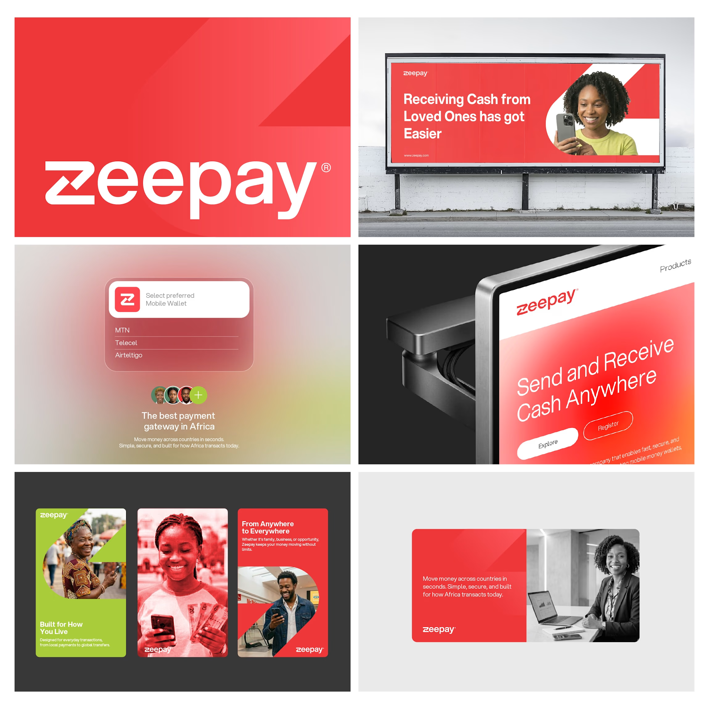
I reimagined Zeepay with a simpler, sharper identity.
I designed a clean wordmark and crafted the “Z” using up and down arrows to reflect sending and receiving money.
Built a flexible visual system around it using bold red and lime accents.
Clear. Fast. Functional.
Thoughts?

The Z built from arrows is such a smart concept, meaning baked right into the mark. And that red and lime combination is bold without feeling off. Clear, fast, functional is right 👌
The network for creativity
Join 1.25M professional creatives like you
Connect with clients, get discovered, and run your business 100% commission-free
Creatives on Contra have earned over $150M and we are just getting started
Related posts




Clean!
Without knowing what it's for, here's a very uniformed critique:
I really like how it looks as a whole, the lowercase vibe makes it feel modern and approachable, I'm assuming is for some sort of tech brand, like a digital app or something. Something feels off on the...

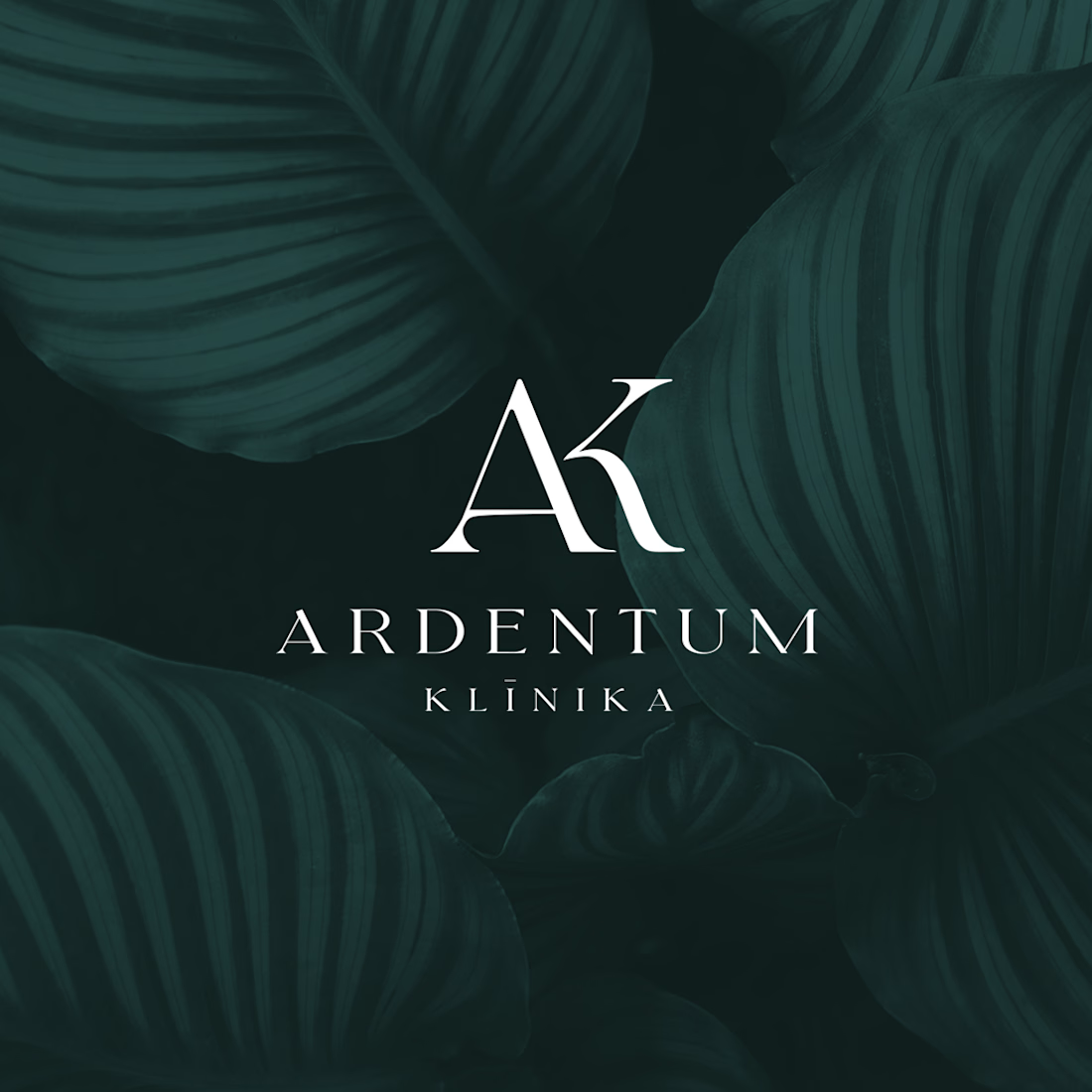
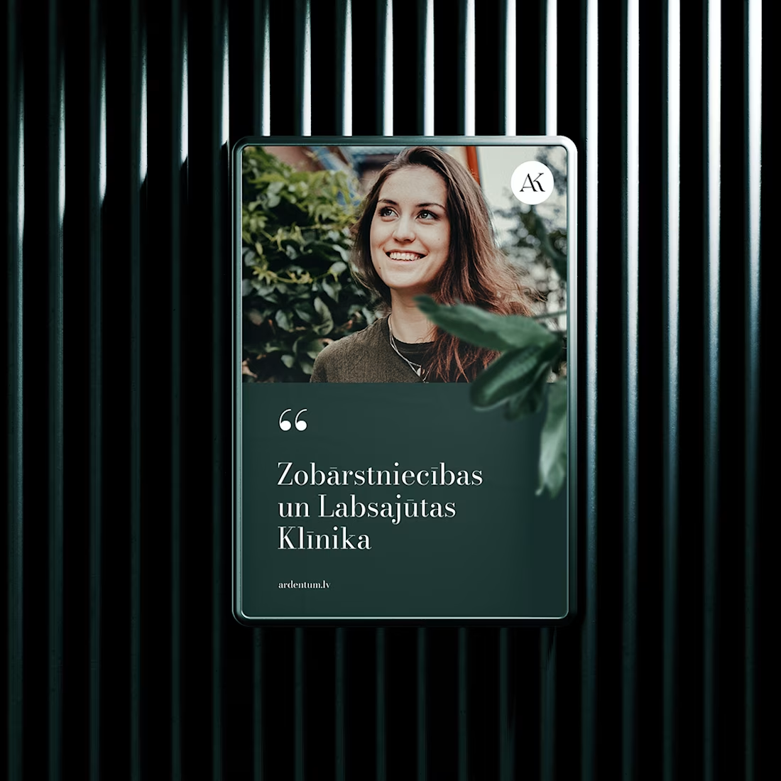
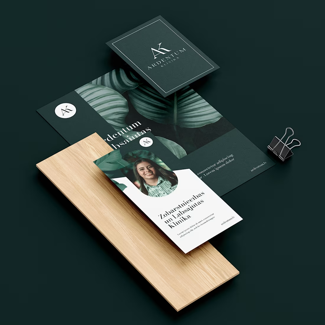
Brand identity created for a Riga based dental clinic. The goal was to develop a clean, contemporary visual identity that reflects professionalism, precision, and patient trust. The project included logo design, full brand system, and supporting visual assets, creating a distinctive identity with a consistent presence across both digital and print applications.


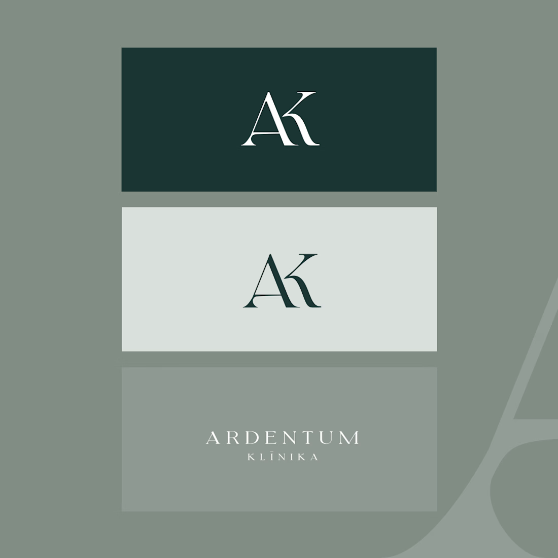

That deep green and the AK monogram feel premium without tipping into cold or clinical, hard balance to strike for healthcare branding. Did the clinic have existing brand equity you had to work around, or was this a clean slate?

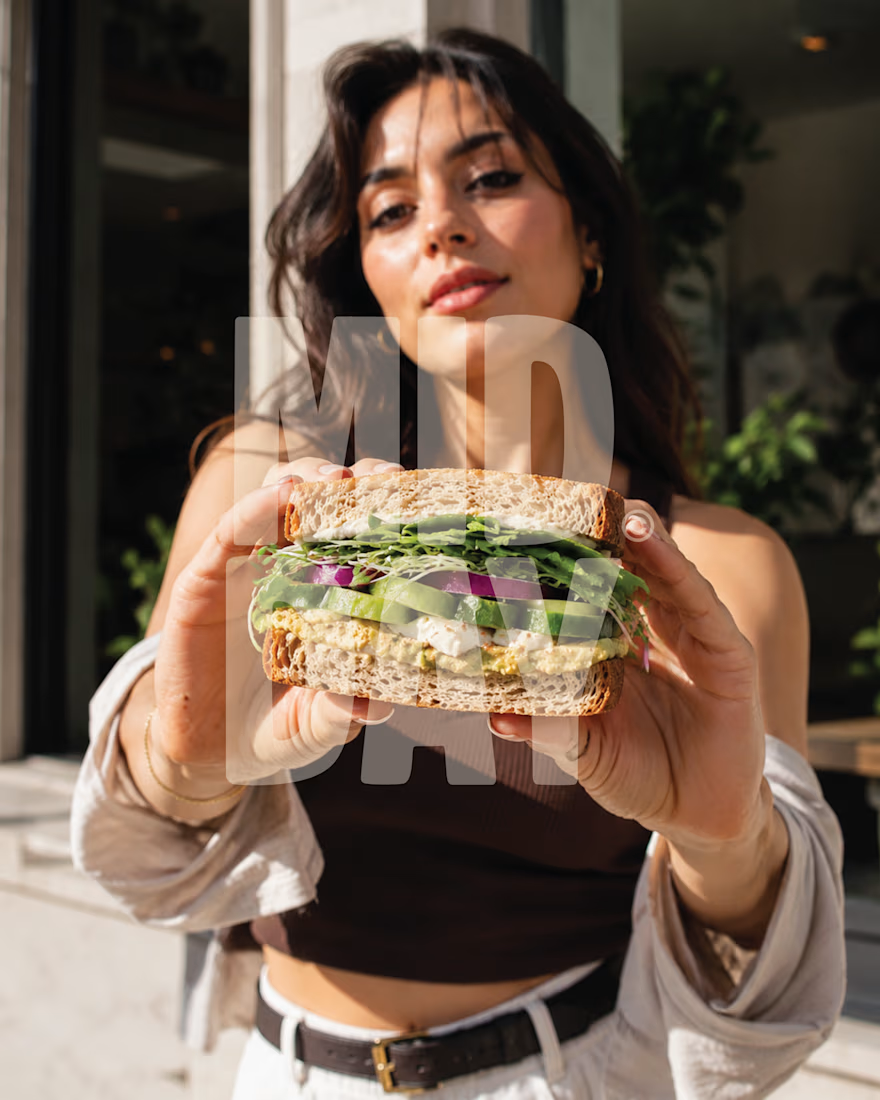
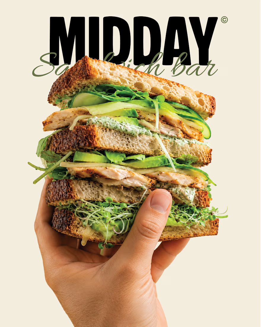
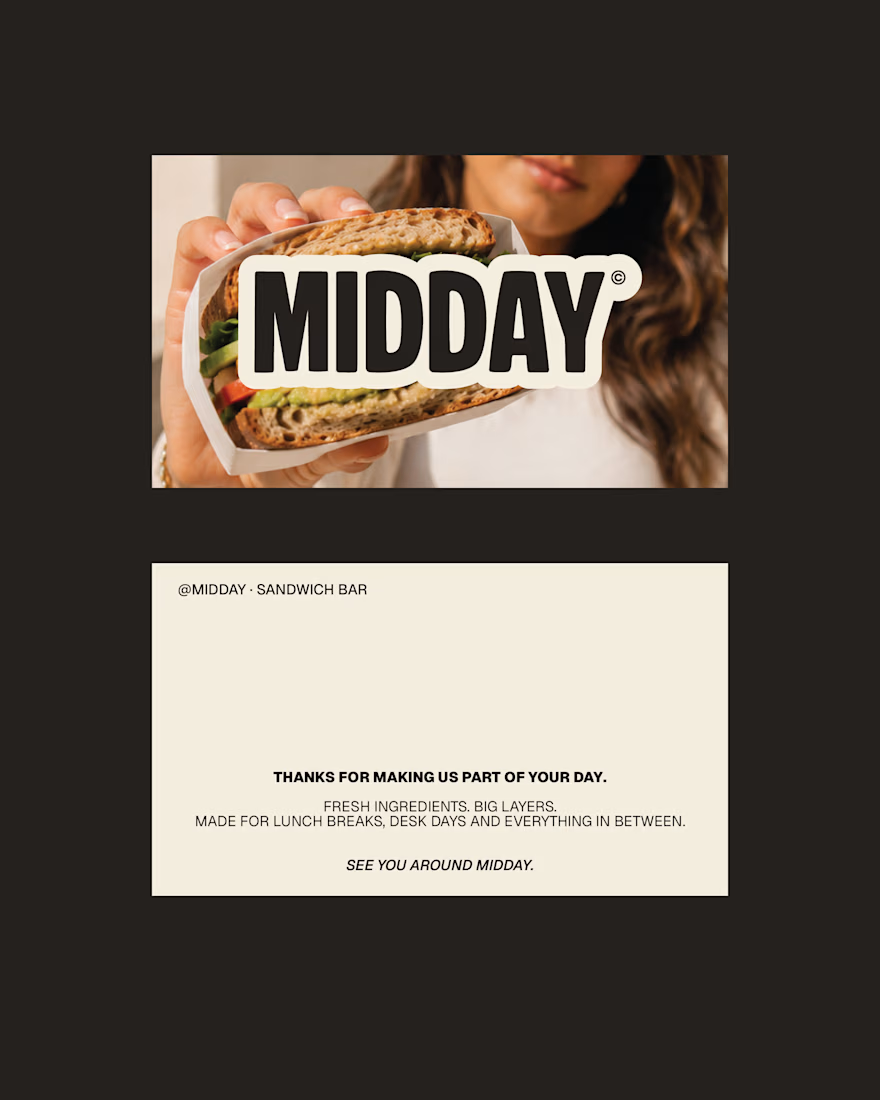
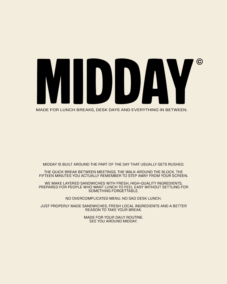
MIDDAY | Sandwich Bar Brand Identity
A self-initiated brand identity for MIDDAY, a contemporary sandwich bar built around one simple idea: everyday lunch should still feel worth looking forward to.
The identity combines bold editorial typography, warm lifestyle photography and familiar deli-inspired details to create something considered, approachable and easy to return to.
Your 12:30 deserves better.
more posts on this one in the upcoming days!

Amazing work!












Trending

Claude
Claude has entered the design space. How are you using Claude Design?

Contra University
Learn from expert creatives how to earn more using next-gen AI tools.
creativeaiflow
Creative AI workflows are evolving. What tools do you use, and what are their strengths and weaknesses?
freelancerlife
Freelancer life is wins, pivots, and everything in between. What’s yours right now?