The network for creativity
Join 1.25M professional creatives like you
Connect with clients, get discovered, and run your business 100% commission-free
Creatives on Contra have earned over $150M and we are just getting started
Back to feedPost

Your users can miss a lot in one screen — unless your notifications are designed to stop the scroll.
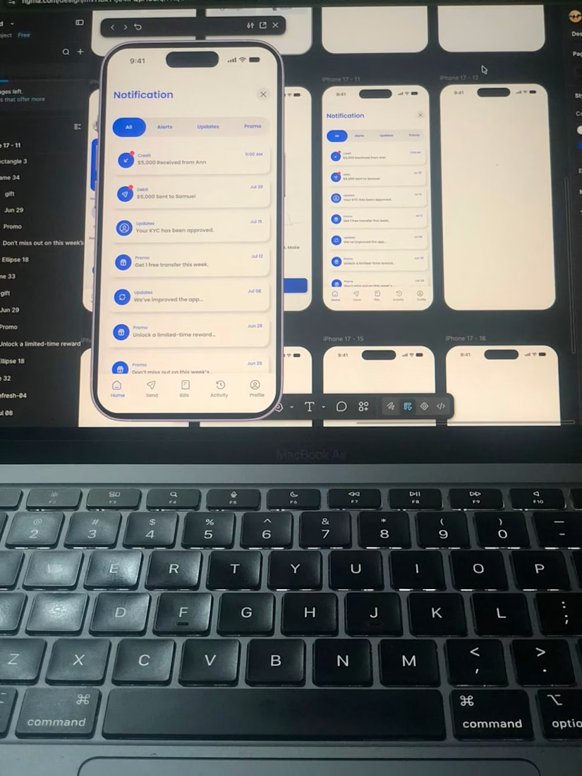
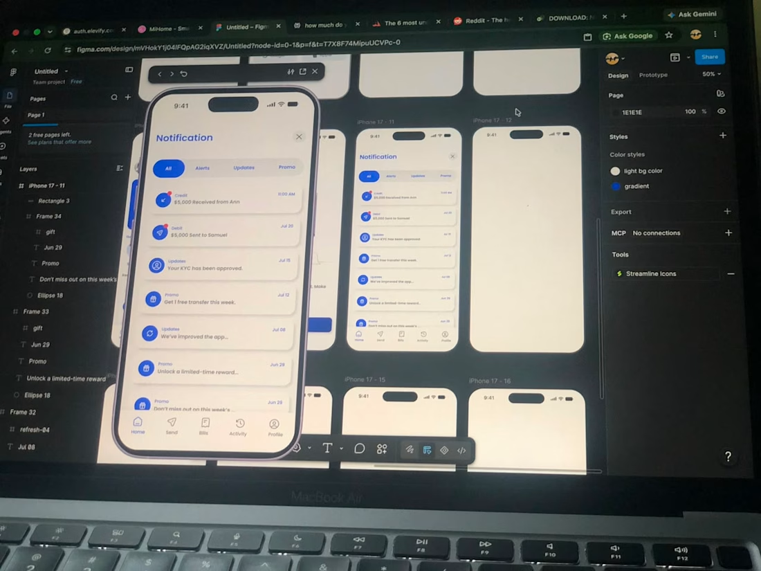
This is the notification screen I designed for Canpay, a fintech dashboard.
It’s not just a list of alerts. It’s a system that keeps users informed, organized, and in control.
What I focused on:
Grouping notifications by type: Transaction alerts, verification updates, promos
Clear visual hierarchy so the most important updates stand out
Icons and timestamps that make scanning effortless
Tap-to-action flows (e.g., alert → transaction details, verification → KYC status)
Why this matters:
A clean notification screen reduces anxiety, builds trust, and makes users more likely to stay engaged with the product. In fintech, clarity = confidence.
I’m sharing this as part of my ongoing work on the complete Canpay wallet/fintech app UI.
If you’re a recruiter or hiring manager, this is the kind of product thinking I bring to teams building financial products.
What’s the one thing you always check in a notifications screen?
What makes a notification UI feel “trustworthy” to you?
Drop your thoughts in the comments.
And if you want to see more screens from this project, follow along here.
#fintech #uxdesign #productdesign #uidesign #mobiledesign #appdesign #designportfolio #canpay


The network for creativity
Join 1.25M professional creatives like you
Connect with clients, get discovered, and run your business 100% commission-free
Creatives on Contra have earned over $150M and we are just getting started

Challenges
View all


Related posts

I am gathering cool references for my own work as a Motion Designer, and this one caught my eye this week.
Day 3 of 60-days-collecting-awesome-motion-design-references
I love the way this is designed, based on abstract shapes and concepts with a coding visual language that we are all already familiar with. This is a great reference in this modern era where we deal more and more with products and services that live on the internet, not on a physical product.
This animation was created by Odd Fellows in collaboration with Figma.


60 days of references is a serious commitment. Curious, are you mostly drawn to the same visual language each time, or does it shift a lot depending on the day?

Built this over a weekend as an experiment with AI-assisted design and development.
Duo Case is an absurd concept for turning two iPhones into a very unofficial foldable iPhone. The goal was to see how far AI could accelerate the process while keeping creative direction, design decisions and final execution in human hands.


A weekend build that looks this polished is wild. Where did AI actually save you the most time here, the concepting or the production grind?

Designed a clean, premium website concept for Arave — a modern digital watch brand. Focused on strong visuals, product storytelling, and a minimal, technical feel.
Would love to hear your thoughts — what do you think I could improve in this project?


"Built to be taken apart" reframes repairability as the premium feature, not a compromise - most watch sites hide the mechanism, this one leads with it.