The network for creativity
Join 1.25M professional creatives like you
Connect with clients, get discovered, and run your business 100% commission-free
Creatives on Contra have earned over $150M and we are just getting started
Back to feedPost

I tested two speeds for this button in Framer.
Which one feels better to you?
A (faster) or B (slower)?


I am going with A, the faster one. For a button micro-interaction, snappy feels more responsive and alive, while the slower version almost makes me wonder if it lagged. Did you try any easing tweaks on B to see if a different curve changes the feel?
I can't argue with you, Timothy. It's just taste, I would choose B!

Ye le Jani Rokas wali post ke liye:
Nice test Rokas! Between A and B, I'd lean towards A (faster) — feels more snappy and responsive in Framer, especially for a CTA button. The slower B has a smooth premium feel but faster usually converts better as it feels more instant. Great attention to micro-interaction detail!
Thank you for your opinion!
Most welcom rokas🔥
:Thanks for the love Anna! 🙏

B for me. The slower one feels more deliberate and premium.
Same for me, Rafee!

i love A! the quicker flash feels just a bit more lively.
Cool! Thanks for your opinion!
The network for creativity
Join 1.25M professional creatives like you
Connect with clients, get discovered, and run your business 100% commission-free
Creatives on Contra have earned over $150M and we are just getting started











Related posts
Absolute positioning can be really useful in Framer.
For example, when an element needs to overlap another element or sit on top of other stack. (1st clip)
It's also useful when an element needs to stay in a specific position instead of following the normal layout. (2nd clip)
These are just a few cases where absolute positioning makes sense.
Great breakdown! Absolute positioning is so underrated in Framer for those overlap cases. Love how you explained the 2 use-cases - stacking and fixed position vs normal flow. Super helpful tip!

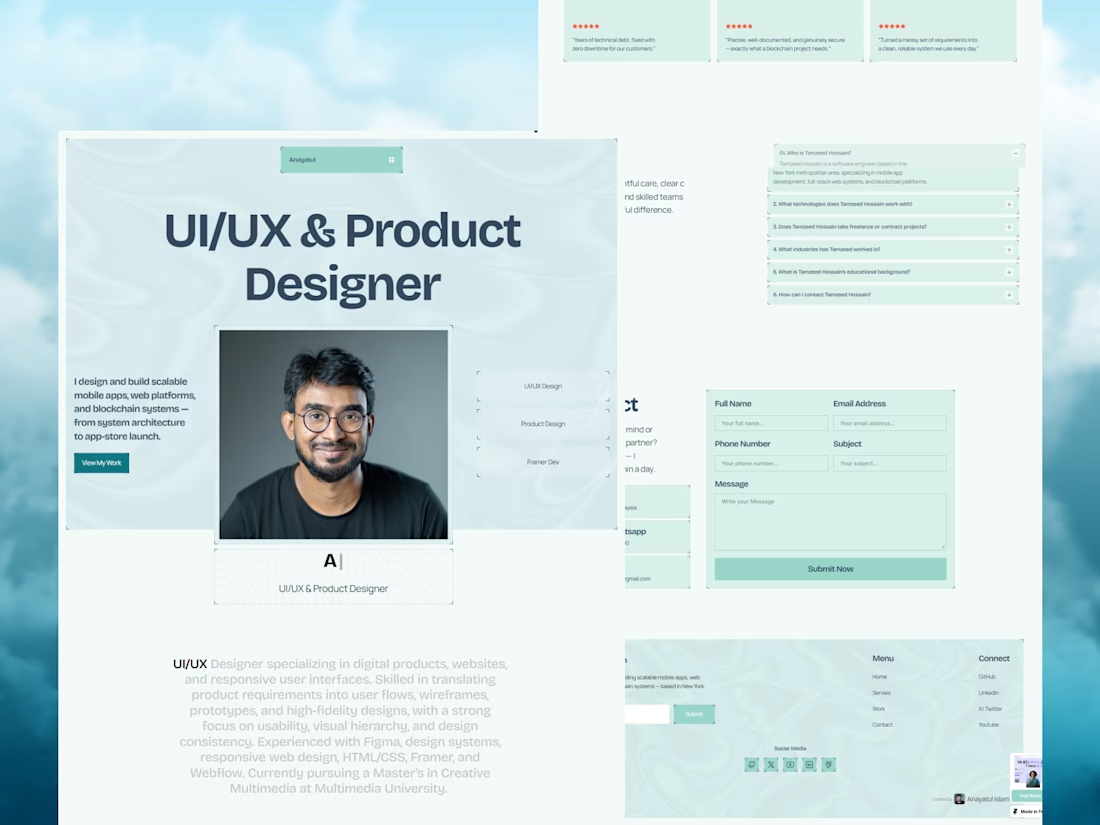
Your next client might be one portfolio away. ✨
MyFolio Pro — a premium Framer template for freelancers, UI/UX designers, and creative agencies.
Template link: https://framer.link/E9JSnLX



love this as well man


A Recent Framer-Based Brand Experience for a Real Estate Company


Super clean brand system! 🤌 Love the mint on dark contrast and how the mark works across touchpoints - that ID card mockup is chef's kiss. Great Framer execution for real estate!


