The network for creativity
Join 1.25M professional creatives like you
Connect with clients, get discovered, and run your business 100% commission-free
Creatives on Contra have earned over $150M and we are just getting started
Back to feedPost

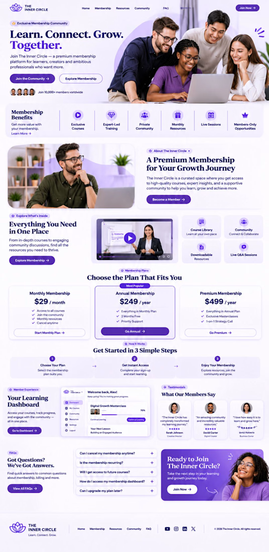
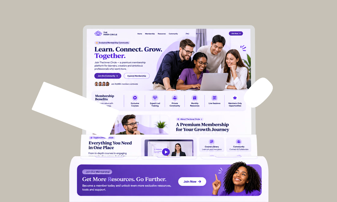
Another Kajabi build I am proud of.
The focus was to create a website that feels clean, professional, and easy to navigate while keeping the client’s brand at the center.
I worked on the page design, structure, user flow, and Kajabi setup to make the whole experience feel simple from start to finish.
No unnecessary sections.
No confusing navigation.
Just a clear experience built around the offer.
Got a Kajabi project you want to build? Let’s talk.

The network for creativity
Join 1.25M professional creatives like you
Connect with clients, get discovered, and run your business 100% commission-free
Creatives on Contra have earned over $150M and we are just getting started



Related posts


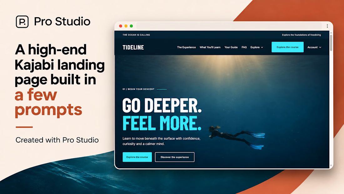
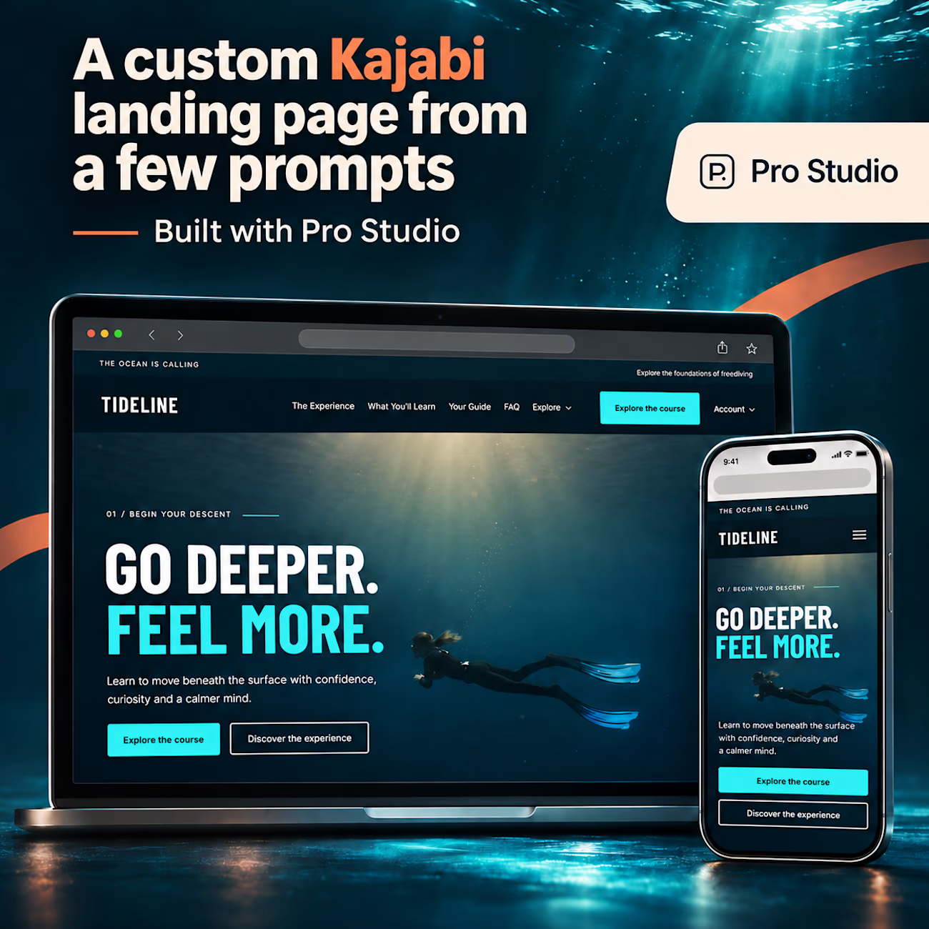
A high-end Kajabi landing page, built in just a few prompts with Pro Studio. 🌊
Meet TIDELINE: a fictional freediving school demo with immersive visuals, oversized typography, a custom header with dropdown navigation, and carefully crafted layouts. One page, with a whole lot of personality.
Explore the live page: https://mm-themes.mykajabi.com/tideline_2_
Built with https://tryprostudio.com
Graphics are AI promotional mockups.


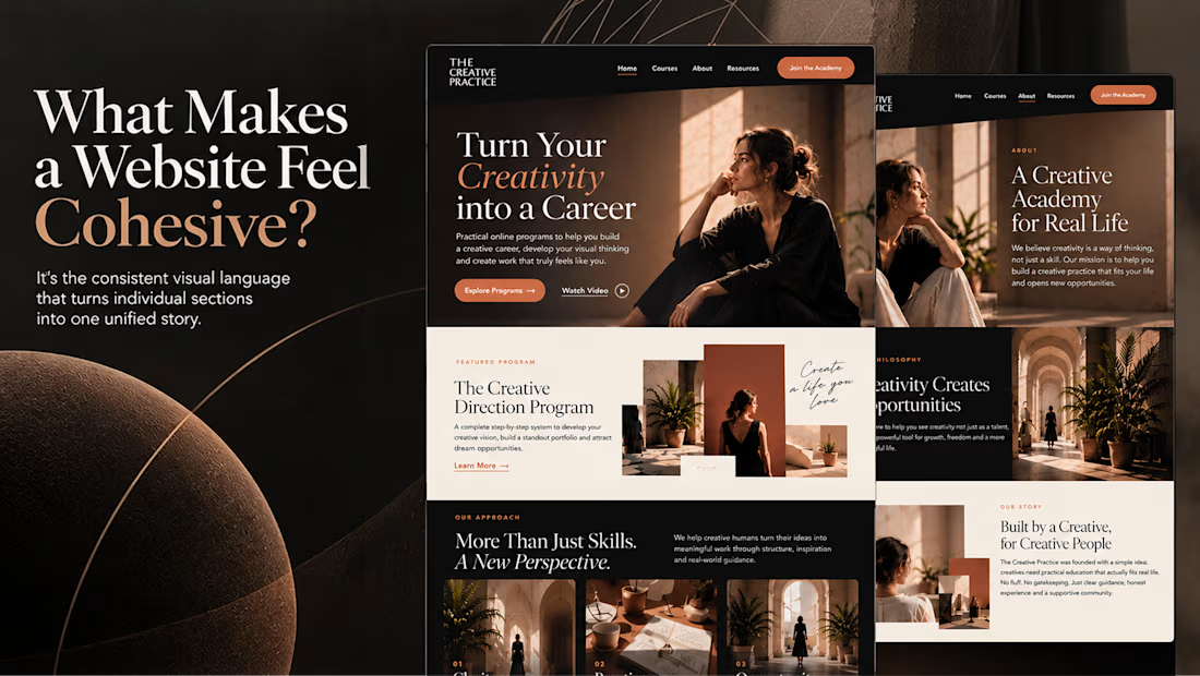
What makes a website feel cohesive?
It’s not just the colors.
It’s not just the typography.
And it’s definitely not about making every section look the same.
A cohesive website is built when every visual decision feels like part of the same story, from typography and imagery to spacing, buttons, cards, and even the smallest details.
The goal isn’t repetition.
It’s creating a visual language that people recognize and remember.
That’s when a website starts to feel like a brand, not just a collection of sections.

Kajabi Membership Site Setup & Subscription Management




This is looking so professional