The network for creativity
Join 1.25M professional creatives like you
Connect with clients, get discovered, and run your business 100% commission-free
Creatives on Contra have earned over $150M and we are just getting started
Back to feedPost

I didn't want to design another productivity hero.
You know the formula: calendar + laptop + clean gradient + "be more productive."
PRUMO needed something different.
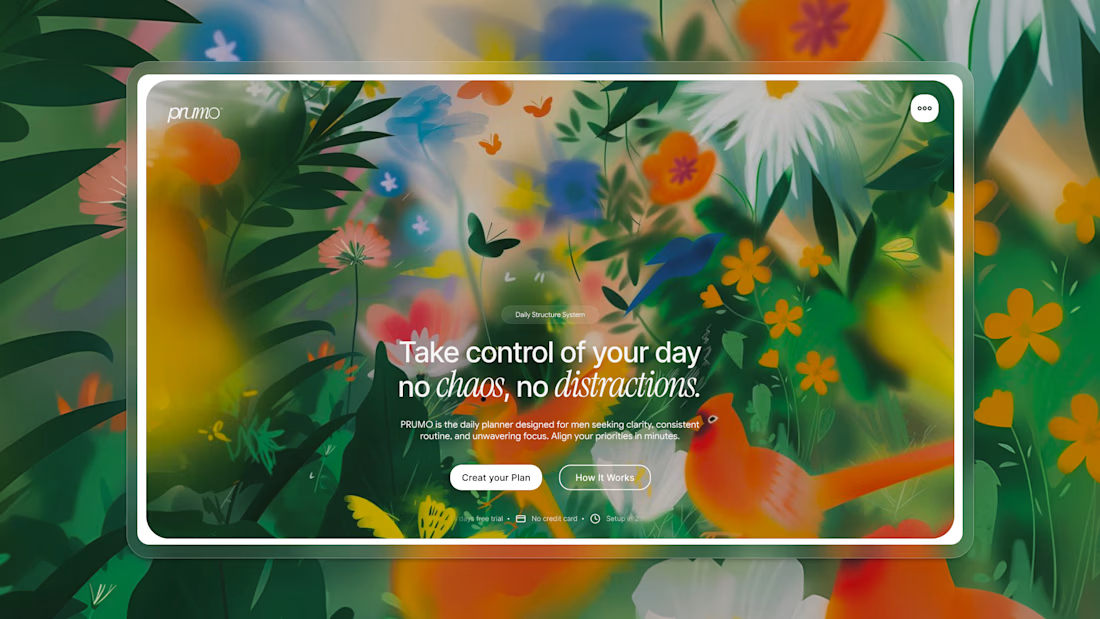
The product is about creating daily structure, so I decided to visualize the absence of structure instead. A garden became the metaphor.
Everything grows at once.
Everything demands attention.
Nothing follows a clear hierarchy.
Then I placed the product's message directly in the middle of it:
"Take control of your day."
The goal was to make the viewer experience the problem visually before reading the solution.
The interesting part was not creating the chaos. It was creating enough visual control inside the chaos so the hero still felt calm.
That contrast became the foundation of the entire direction.
Beautiful chaos outside. Clear intention inside. That is PRUMO.
The lesson: chaos isn't the enemy of clarity — it's the contrast that makes clarity visible.
Would you have pushed the metaphor further, or would you have reduced the visual noise?
#UXDesign #ProductDesign #WebDesign #SaaS #Illustration

The network for creativity
Join 1.25M professional creatives like you
Connect with clients, get discovered, and run your business 100% commission-free
Creatives on Contra have earned over $150M and we are just getting started
Trending
retrofuturism
Share your favorite designs from the past exploring the distant future. Or your own take on the aesthetic 🚀
halftone
Dots. Texture. Grain. Let's see your designs using the halftone technique.

Midjourney
Creatives are showing off what they're making with Midjourney.
colorgrade
Video editors sound off: How do you enhance the mood of your video in color grading?



Related posts

POV: you're a designer but all you like to do is create delicious textures for ambitious clients ready to take a risk.
In the tech world where we're governed by minimalistic and sharp design, a new era is coming. The era of bold, colorful and textured design, where tech becomes... appealing 🍭


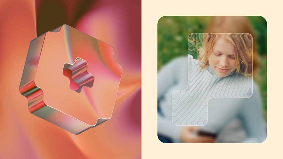

The real gatekeeper for textured brands is usually the product team, not the client — heavy texture tends to get traded away the moment someone raises load times or dark mode. The work that survives keeps the texture in marketing surfaces and lets the UI carry a quieter version....


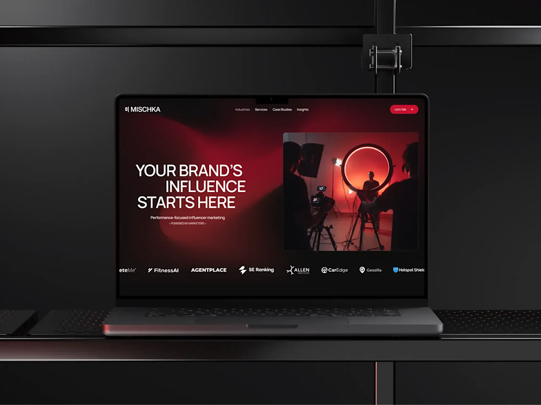
Mischka already had a bold identity. The website had to live up to it.
MISCHKA is an award-winning, performance-first influencer marketing agency working with cybersecurity and technology brands. The team came with a clear point of view, so this was never simply about giving them a more polished online presence.
It was about building a website that could carry the same confidence and energy as the agency itself. The project went far beyond technical implementation.
We spent a lot of time on the site structure and UX, as well as developing the visual language for the interface. The gradients, in particular, became one of the most recognizable parts of its digital identity. They aren’t just there for atmosphere - they connect sections, frame key content, and give the whole experience its rhythm.
Behind the visuals, we built a client-friendly CMS around the way the team publishes its work. MISCHKA can add and update case studies and insights without rebuilding pages or relying on a developer for every change.
My role covered Webflow development, responsive behavior, interactions, and CMS architecture. I was also directly involved in shaping the UX structure and wireframes, and created a number of visual elements used throughout the interface - including custom graphics, gradient treatments, and other identity-led details.
The result is a website that feels unmistakably MISCHKA on the surface while remaining practical and scalable behind it. It’s also one of those projects I still enjoy opening in a new tab, just to watch the whole experience move. A lot of care went into every part of it, and I think that comes through.
After launch, the team shared their experience in a verified Clutch review: “They really know Webflow inside out.”
A live result I’m proud of and a happy client at the end of it - that’s exactly how I want a project to close.
Thank you, Yuliya Gorenko, for your trust and for the opportunity to work on this project. I really enjoyed the collaboration and am proud of what we created together!
Explore the project:
Live website: https://www.mischka.agency/
Client review: https://clutch.co/go-to-review/82f12ed1-54c6-4072-ad3e-ca176f90de66/466955
If your company has a strong brand but its website still feels like the weaker version of it, send me the link. I’d love to hear what needs to change!



The visual identity and gradient framing look top notch! How long did the CMS architecture and UX wireframing phase take for this project?

Doing a bit of portfolio housekeeping this month, so a few older projects are going up.
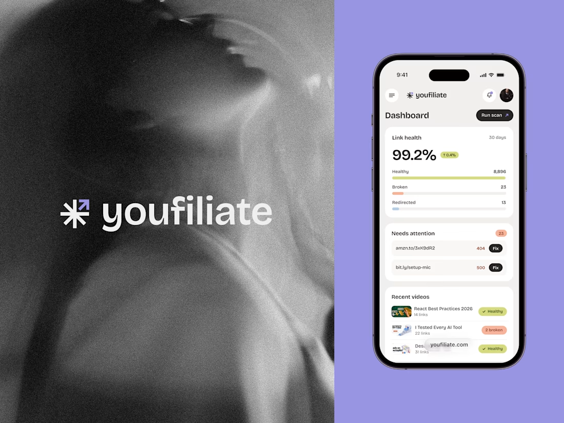
Youfiliate came to us with a name and PRD, and nothing else. No logo, no identity, no interface. Their product catches broken affiliate links before creators lose income from them. We did the branding and the whole product design.
It grew a lot since then, so we went back and brought the designs up to date. Smart links, analytics, dark mode, full mobile.
Another one built almost entirely through messages and Figma comments.
We did a second project with the same client too, already delivered, sharing that one soon.
Check it out 👇