The network for creativity
Join 1.25M professional creatives like you
Connect with clients, get discovered, and run your business 100% commission-free
Creatives on Contra have earned over $150M and we are just getting started
Back to feedPost

I enjoy creating clean print and editorial layouts that focus on readability, structure, and polished visual presentation.
A lot of my recent work has involved publication design, branded collateral, workbook layouts, and marketing materials designed to feel organized, consistent, and easy to engage with across both print and digital formats.
Currently sharing more work across:
• editorial & publication design
• branded marketing assets
• social media visuals
• email design
• landing pages
Open to new collaborations and ongoing design support.
The network for creativity
Join 1.25M professional creatives like you
Connect with clients, get discovered, and run your business 100% commission-free
Creatives on Contra have earned over $150M and we are just getting started





Related posts

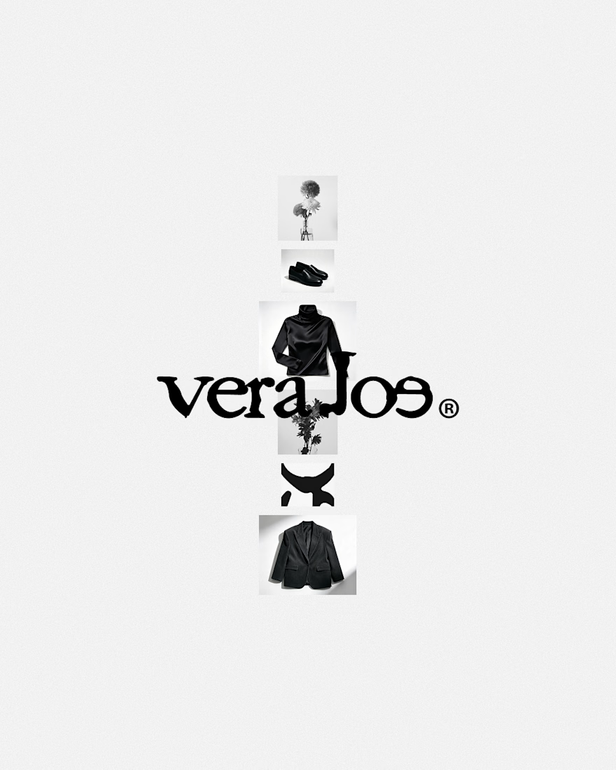
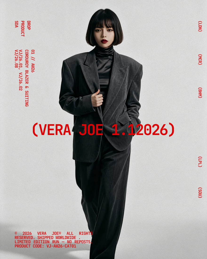
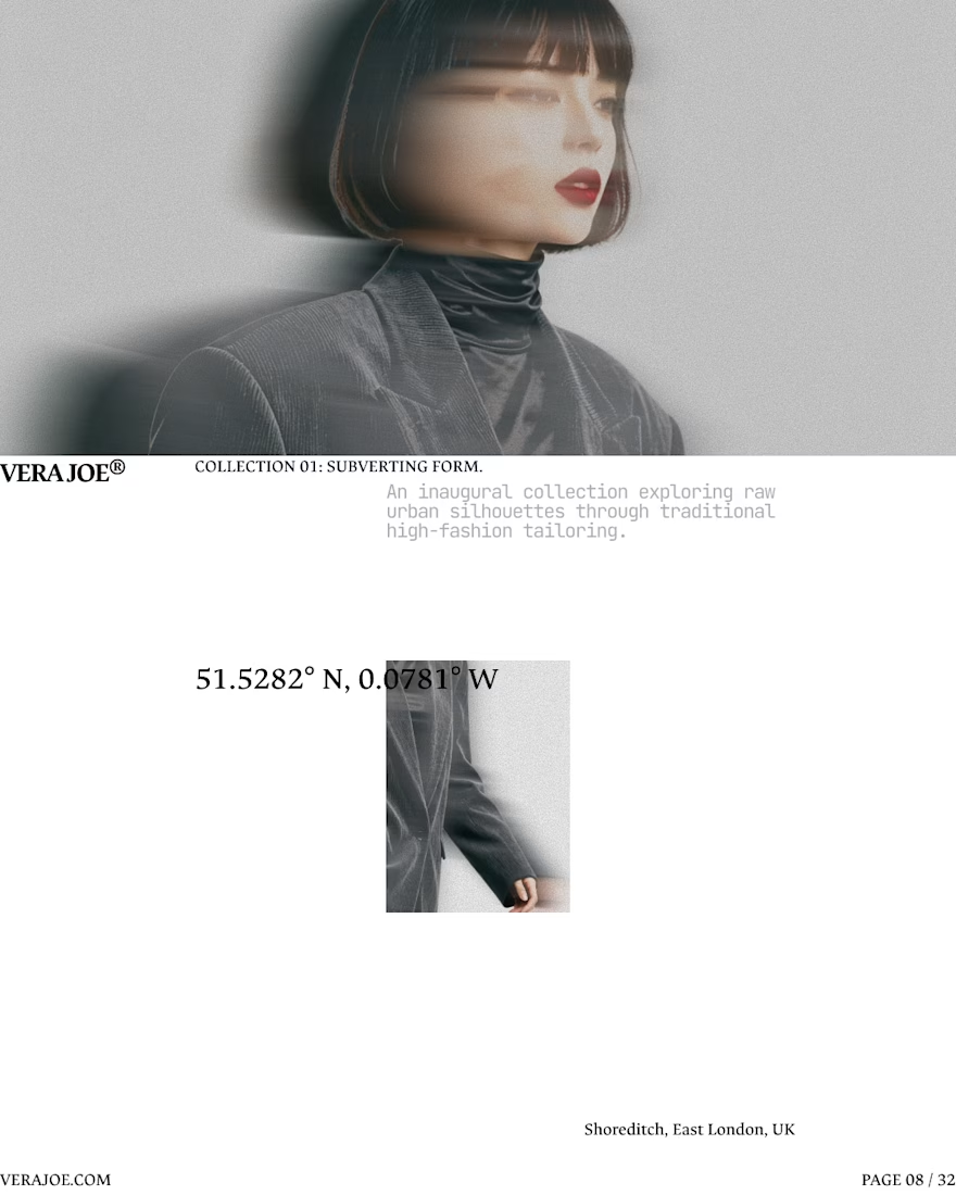
An editorial exploration for VERA JOE® Autumn/Winter 2026.
Exploratory Brand Identity & Visual Campaign.



Like the art direction

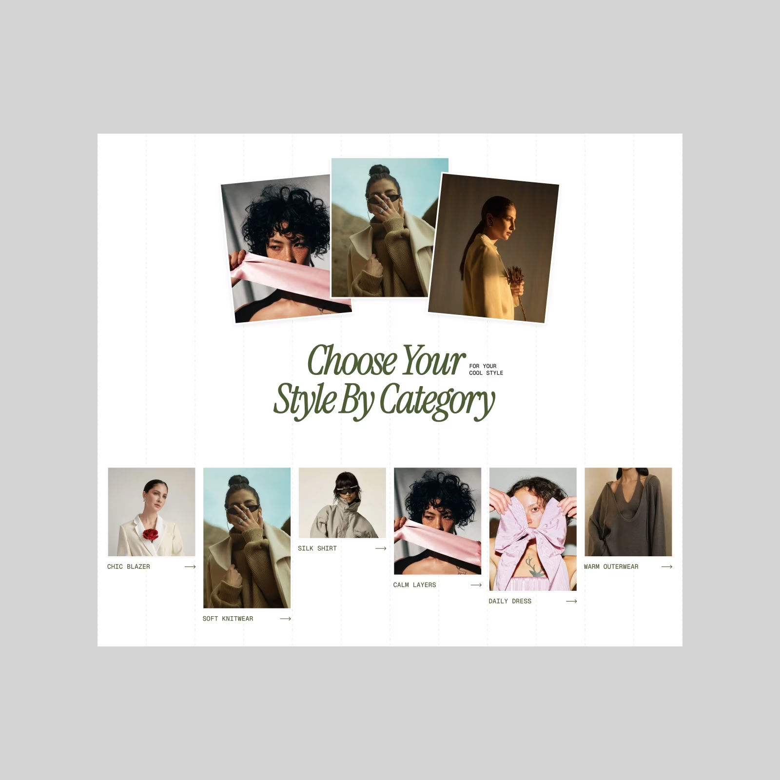
Saint Laurent — Fashion E-commerce Exploration. Starting with the category section.
Somewhere between a fashion editorial and an online store — expressive typography, photography, and plenty of breathing room. More coming next.


😍

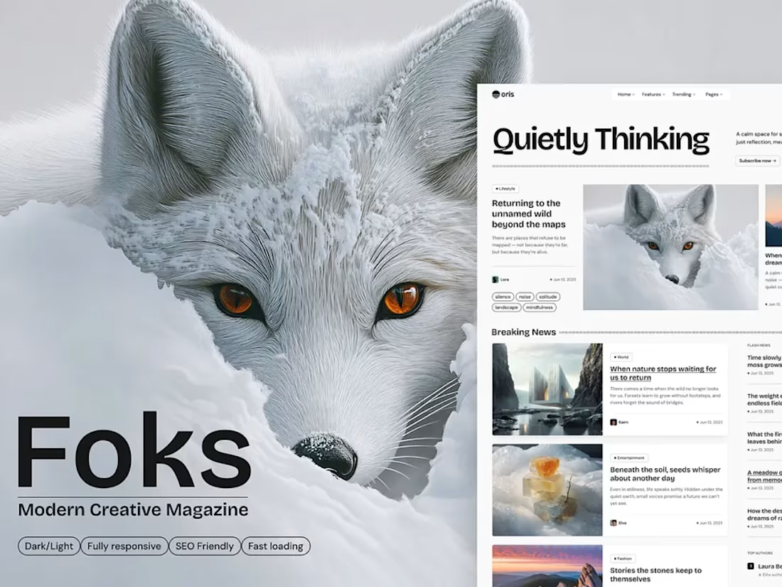
We created Foks to give stories a distinctive home online. The design combines bold typography, spacious editorial layouts, and expressive imagery to keep content at the center of the experience.
With responsive layouts, light and dark modes, and flexible blog, magazine, and portfolio pages, Foks helps writers, publishers, and creatives showcase their voice.
Available in WordPress, HTML, React, and Next.js, with editable Figma files included.



Clean, aesthetic, and super sleek layout! 🔥