The network for creativity
Join 1.25M professional creatives like you
Connect with clients, get discovered, and run your business 100% commission-free
Creatives on Contra have earned over $150M and we are just getting started
Back to feedPost
Taste Test

Which version feels cleaner and easier to scan?
2 voted
50%
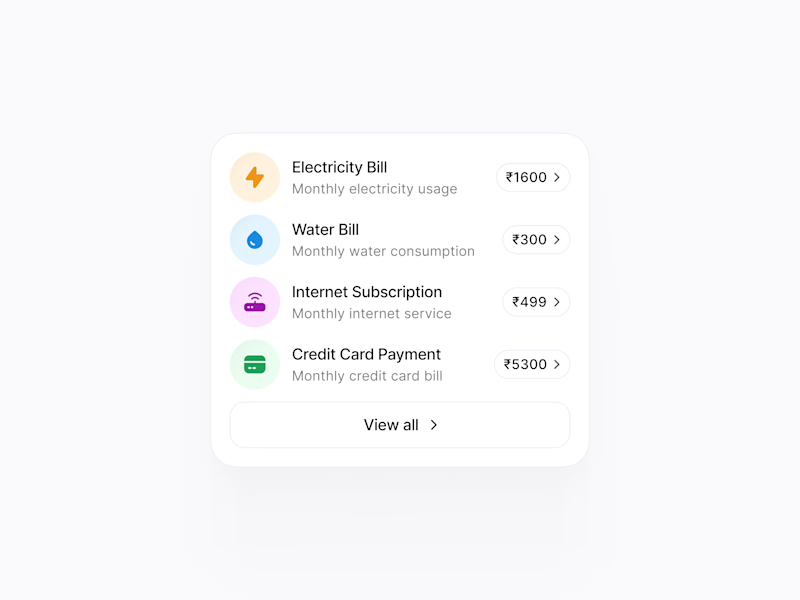
2 voted
50%
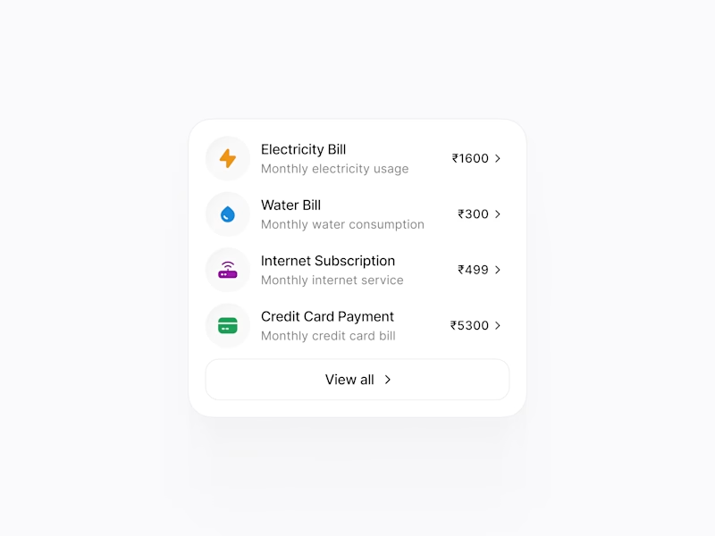
4 votes
Closed

Right, but I feel the colors are speaking to the users directly at a first glance. So I'd love to go with Option 1. But I do like the Option 2 as well.


I would like to go with option1

The design looks awesome. Great project!
The network for creativity
Join 1.25M professional creatives like you
Connect with clients, get discovered, and run your business 100% commission-free
Creatives on Contra have earned over $150M and we are just getting started





Related posts

An old client project: a full redesign of a crypto app.
Created the video with Opus 5.5

Top-notch design.

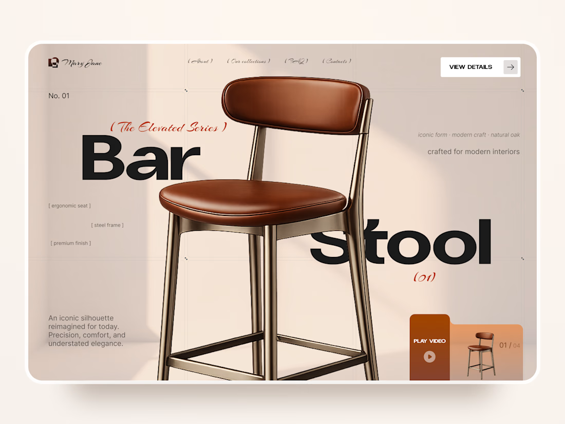
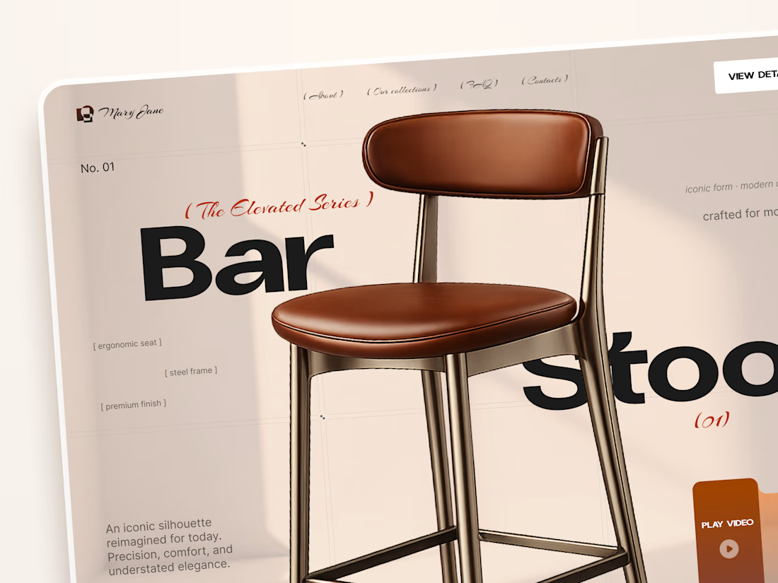
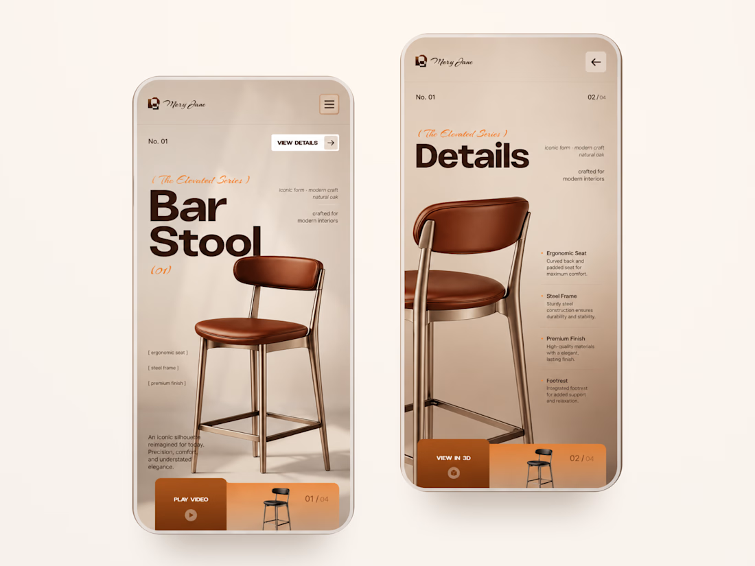
Mary Jane — Bar Stool Product Landing Page 🪑✨
A refined product landing page concept for a modern furniture brand, built around one statement piece
The design combines warm neutral tones, oversized typography, and editorial layouts to give the bar stool a premium, design-focused feel
Special attention was given to:
• Product-first composition
• Clean editorial typography
• Warm premium aesthetic
• Product details and features
• Video and 3D presentation
• Responsive mobile layout
The result is a simple, elegant experience that keeps the product at the center while giving the brand a distinctive visual character 🤎



Nice work

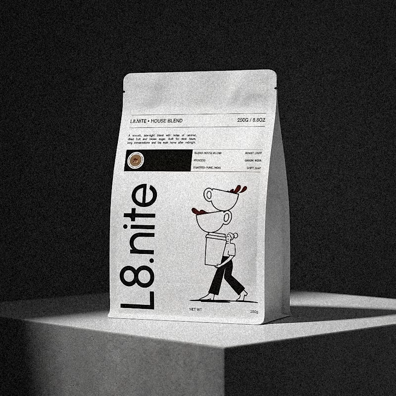
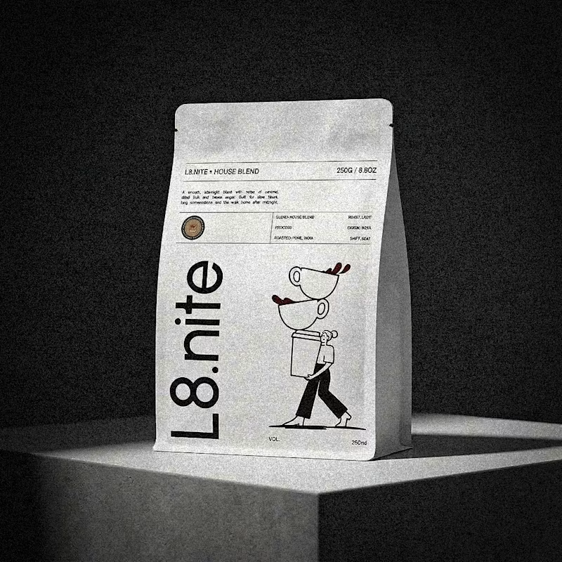
Nailing down the final grid for L8.nite coffee bags.
Left or Right?
Look closely at the central spacing and let me know which arrangement feels more balanced.
6 voted
33%
12 voted
67%
18 votes
Closed