The network for creativity
Join 1.25M professional creatives like you
Connect with clients, get discovered, and run your business 100% commission-free
Creatives on Contra have earned over $150M and we are just getting started
Back to feedPost

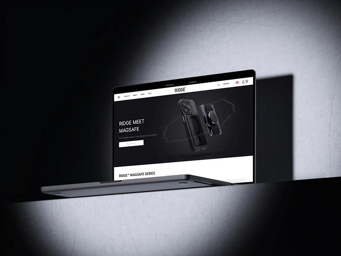
🚀 Ridge × MagSafe E-commerce Landing Page Concept is Live
I just finished this premium landing page concept for a MagSafe product, and I want to share why this design works 👇
✅ Key Features:
Minimal, dark-mode inspired UI for a premium feel
Strong product-focused hero section that grabs attention instantly
Clear visual hierarchy with bold typography & controlled contrast
Conversion-driven structure: hero → benefits → product showcase → CTA
🎯 Why this design matters:
Many e-commerce pages overload users with information.
This design focuses on clarity, trust, and desire letting the product speak while guiding users naturally toward action.
I help brands, startups, and e-commerce businesses design landing pages that look premium and convert visitors into customers.
📌 DM me if you want a landing page that stands out and sells.


The network for creativity
Join 1.25M professional creatives like you
Connect with clients, get discovered, and run your business 100% commission-free
Creatives on Contra have earned over $150M and we are just getting started

Challenges
View all


Related posts

Day 10/30 of my hero section challenge.
Today: Ofelia, a spa in Bali.
→ The wordmark sits at eye level, spanning the full width, cutting across the middle of the space. Here the type claims the room, and because the interior is symmetrical and calm, it can take the weight.
→ A high-contrast serif against soft plaster. The architecture is all curves and matte texture, so the type brings the only sharp edges in the frame. Contrast without adding a single element.
10 down, 20 to go. A third of the way.
Template by Hariom, adapted and customized by me. Interior imagery generated with AI.


Contrast without adding a single element is such a clean way to put it. With 20 more of these to go, are you locking the typographic approach per venue type, or is Ofelia's centered serif going to be the constant across the whole 30?


Launched this yesterday 🏈
Experience it for yourself: http://jjettas.com/


HIS VISOR IS A VIDEO WTFFFFFFFFF!
Someone call AWWWARDS

Same product. Two completely different sites.
Kuro, a concept site for a smart pet feeder. One dark and cinematic, one bright and natural.
Dark or light? I genuinely cannot decide. 👇

Light, for the PDP. The dark version wins on first impression but a black device photographs cleaner against a light background, and that's what actually needs to sell on a product page. Keep the dark cinematic version for the hero or a lifestyle video, and switch to light once someone is deciding to buy.