The network for creativity
Join 1.25M professional creatives like you
Connect with clients, get discovered, and run your business 100% commission-free
Creatives on Contra have earned over $150M and we are just getting started
Back to feedPost
Taste Test

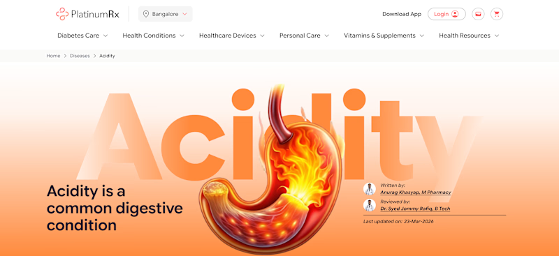
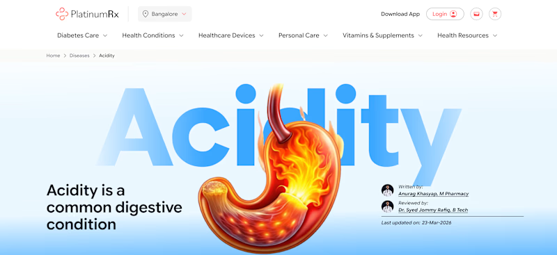
I created two versions of the same banner.
The layout and text are exactly the same.
The only difference is the color.
Which one do you like better?
A. Orange & B. Blue
0 voted
1%
0 voted
1%
0 votes
Closed
The network for creativity
Join 1.25M professional creatives like you
Connect with clients, get discovered, and run your business 100% commission-free
Creatives on Contra have earned over $150M and we are just getting started

Challenges
View all


Related posts


Which color do you think suits better the animation?
Navy Blue or Aubergine Gleam?
#aftereffects #motiondesign #videoedit
3 voted
60%
2 voted
40%
5 votes
Closed

OBSESSED with the boldness & unique feel to aubergine gleam! feels like such a standout.

A cover test for the designers here 👀
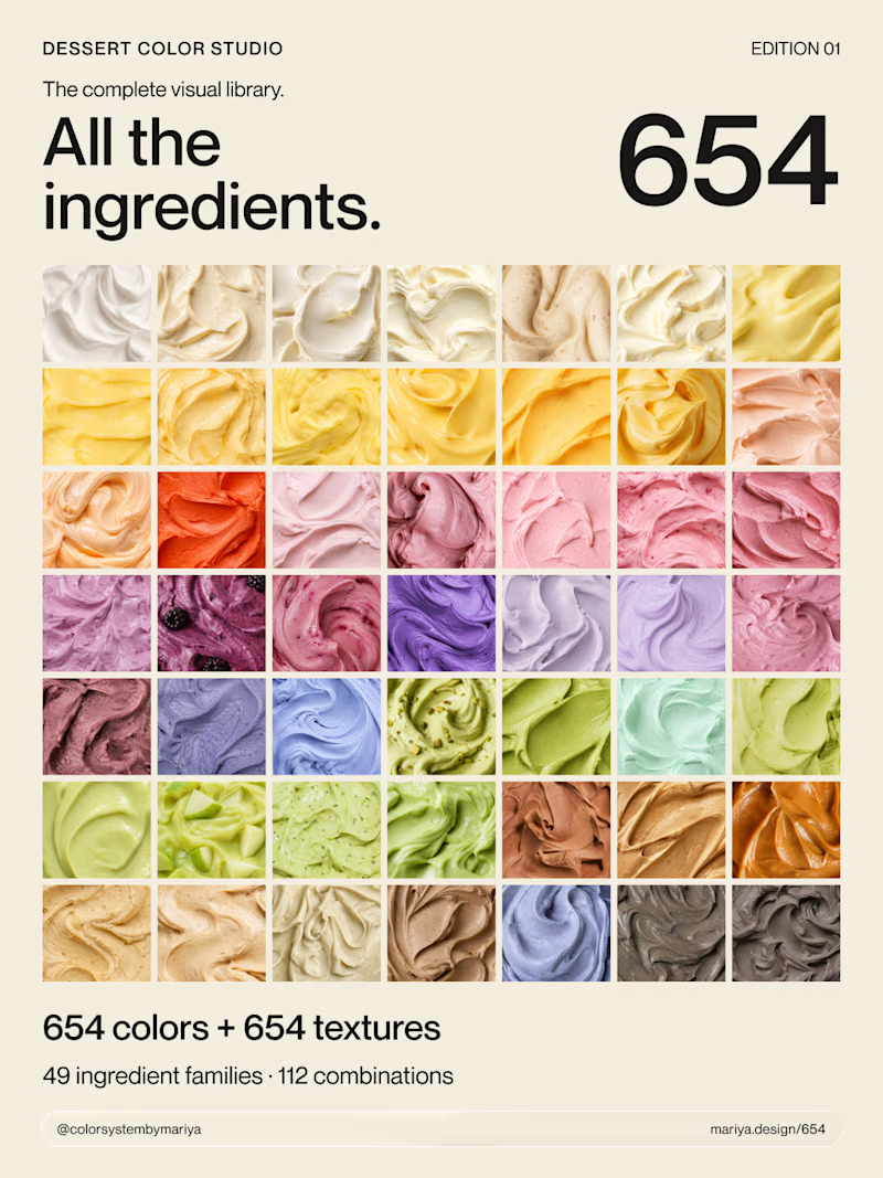
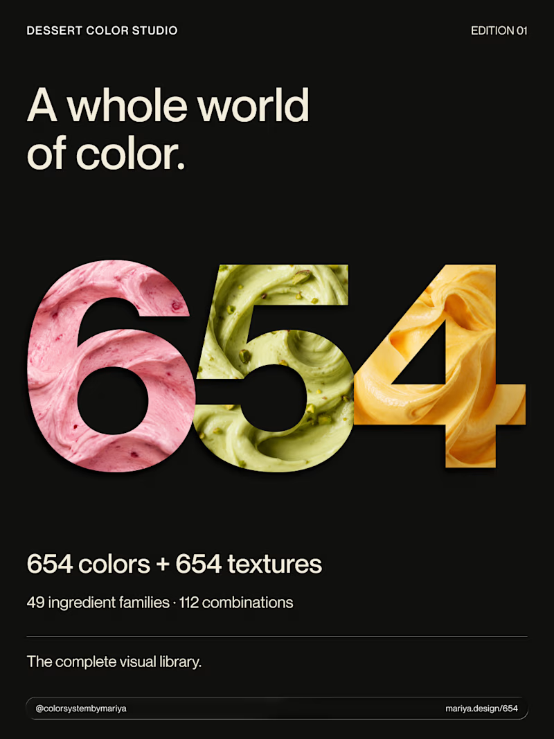
My newest product brings together 654 colors, 654 textures and 112 color combinations in one dessert-inspired visual library.
Which cover would make you click to see what’s inside: A or B?
And what made you choose that one?
7 voted
70%
3 voted
30%
10 votes
Closed

Shipping 654 colors and 112 combinations is the kind of systematic thinking that separates a pretty palette from a real product, and the cover is where that discipline needs to earn a click. A library this size has to promise a payoff on the thumbnail — the more legible cover...


Finally landed on a version the client is happy with.
Which 'A' letter do you think fits better?
27 voted
52%
25 voted
48%
52 votes
Closed

I choose Short but I don't know the difference but the design is great congrats 🎉