The network for creativity
Join 1.25M professional creatives like you
Connect with clients, get discovered, and run your business 100% commission-free
Creatives on Contra have earned over $150M and we are just getting started
Back to feedPost

Your logo is not your brand. Please stop acting like it is.
You can spend $2,000 on a logo and still have a brand that looks like absolute rubbish.
There. Someone had to say it.
A nice logo sitting on a terrible website doesn't save you. A beautiful logo next to inconsistent social media doesn't save you. A fancy logo on a cheap-looking flyer definitely doesn't save you.
Your customers don't experience your logo in isolation.
They experience your colors, typography, website, social media, packaging, graphics, messaging and every little visual detail connected to your business.
That's brand design.
So please stop redesigning the logo every six months because you think that's why nobody remembers your business.
Your logo isn't carrying your brand. Your entire brand identity is.
The network for creativity
Join 1.25M professional creatives like you
Connect with clients, get discovered, and run your business 100% commission-free
Creatives on Contra have earned over $150M and we are just getting started











Related posts


A potential customer shouldn't have to work too hard to understand what your brand stands for.
Your visual identity should communicate the right signals before anyone reads your About page or speaks to your sales team.
Think about it.
A premium skincare brand shouldn't look indistinguishable from a discount cosmetics store. A technology company shouldn't look outdated if it wants to be perceived as innovative. A financial institution shouldn't communicate uncertainty when its business depends on trust.
Every design decision contributes to perception.
Typography, colour, spacing, imagery, composition, and tone of voice all influence how people interpret a business.
My job as a brand designer is to make those signals intentional.
The goal isn't simply to make a brand look good. It's to make it look right for the market it wants to own.
#BrandPositioning #BrandIdentity #BrandDesign
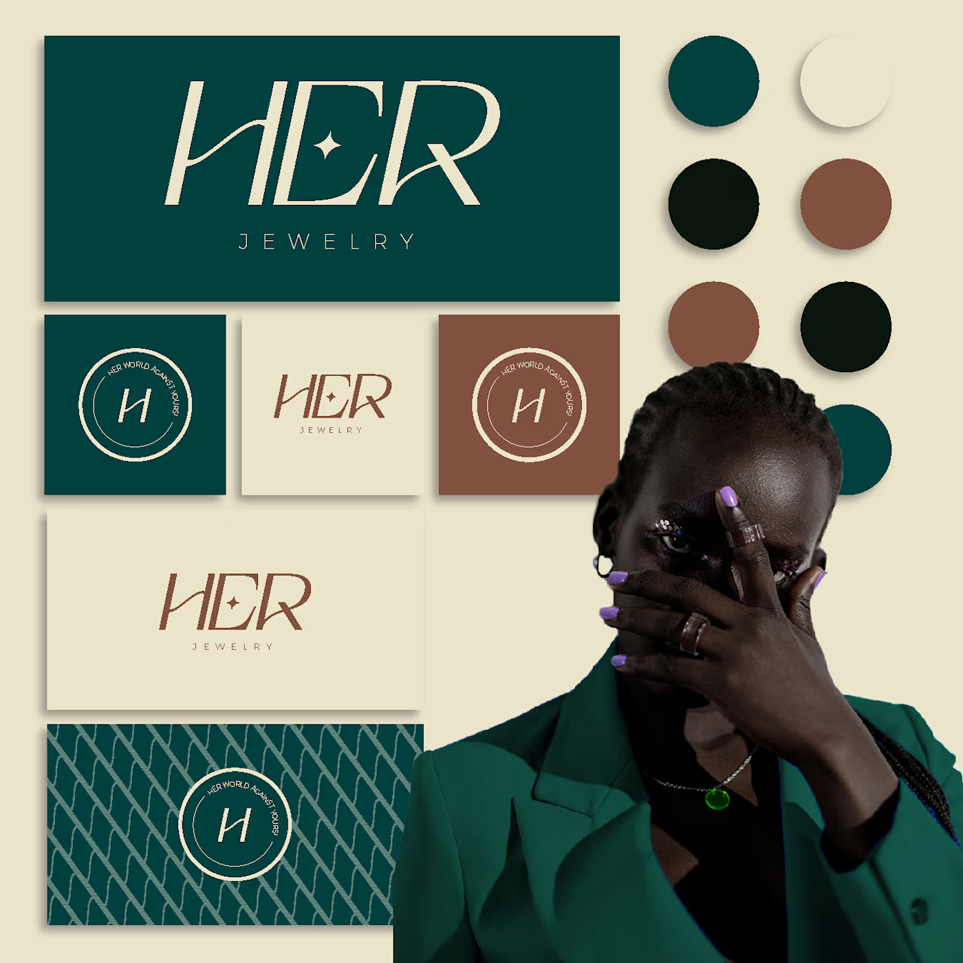
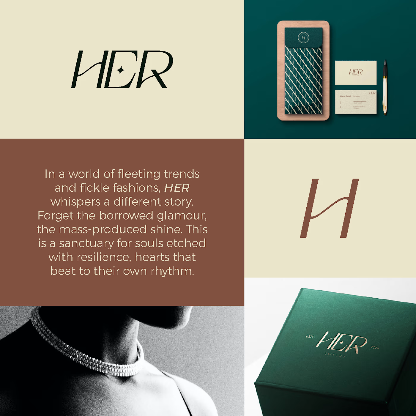
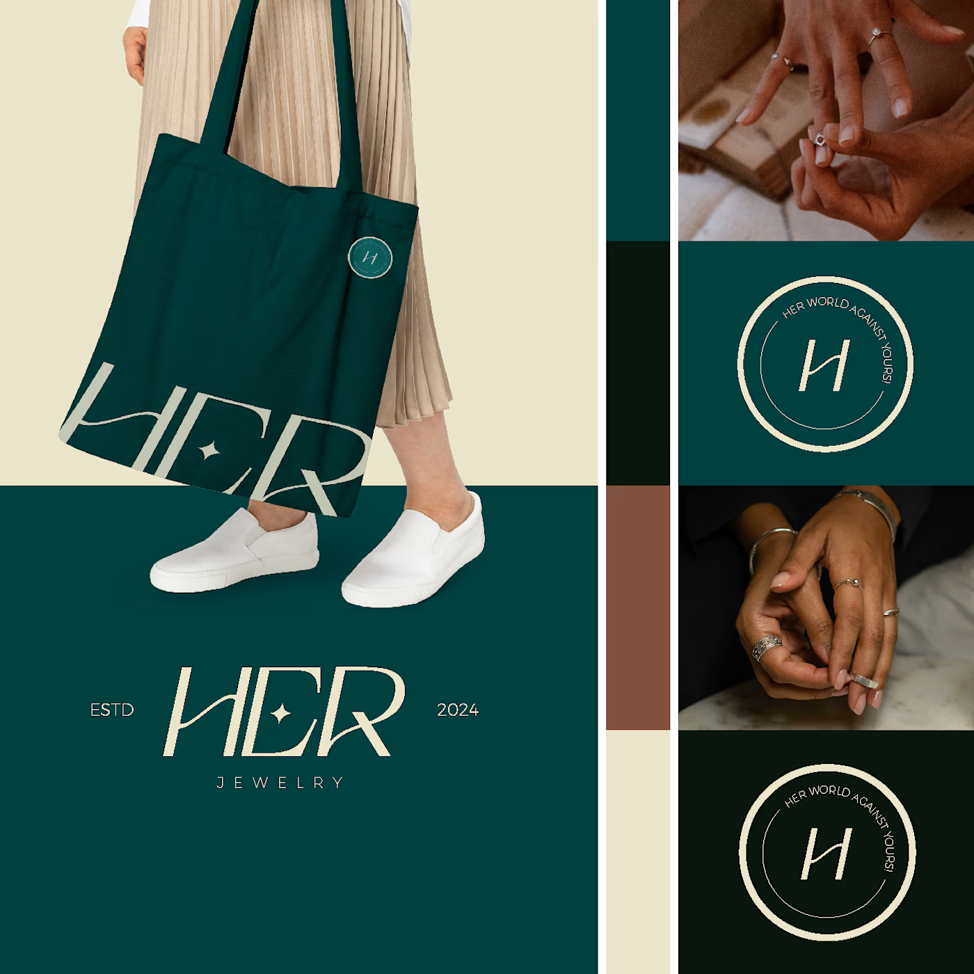




Clean and confident work! The green gradient with the mark feels very modern for fintech - trustworthy but not boring. The app screens look really polished. Curious how you landed on this mark, does it represent growth / movement?

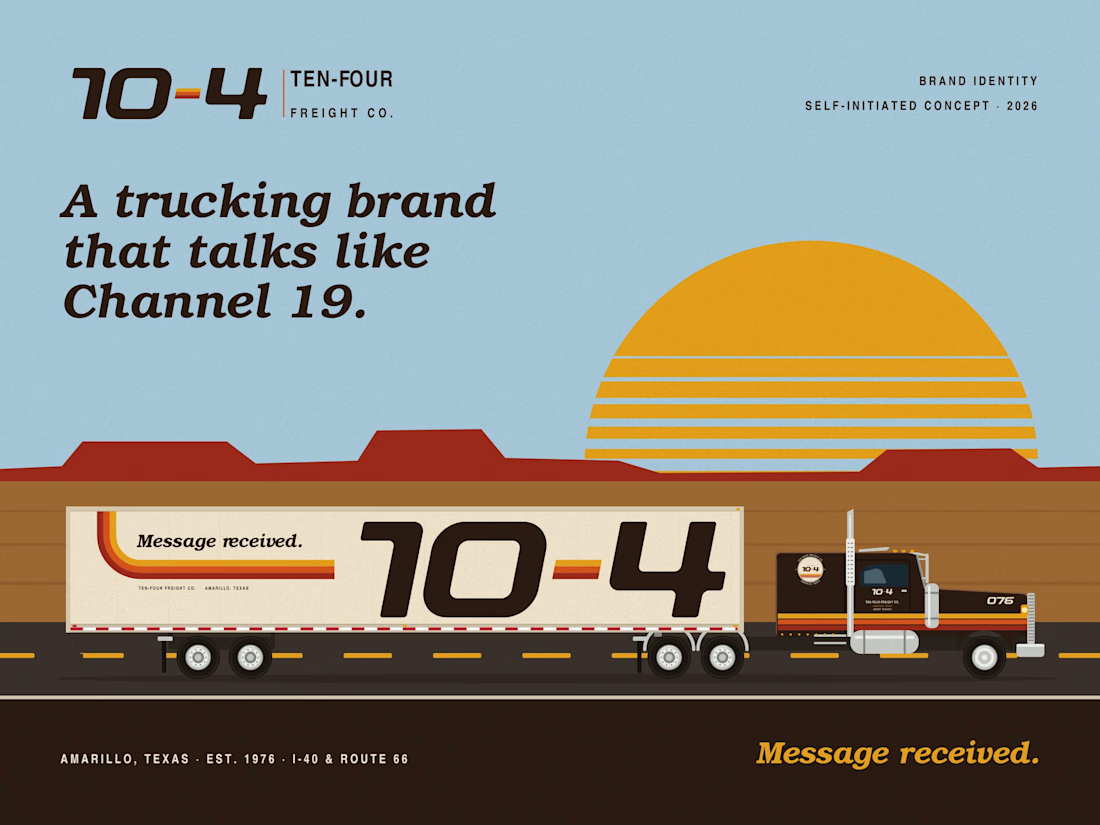
Ten-Four Freight Co.: a trucking brand that talks like Channel 19
Project description
Self-initiated concept. Ten-Four Freight Co. is a fictional dry-van carrier out of Amarillo, Texas, founded in 1976 in the middle of the CB radio craze.
Challenge
Trucking brands talk to two crowds. Shippers want loads on time. Drivers can leave any week: annual turnover at large truckload carriers ran about 90% (ATA, 2020). And the biggest ad the company owns is its trailers. The average truck covered about 86,000 miles in 2025 (ATRI).
Solution
The name is the promise. On CB radio, 10-4 means "message received." The other ten-codes became the voice: 10-20 for live tracking, 10-36 for ETAs, 10-7 for home time, "breaker one-nine" for hiring.
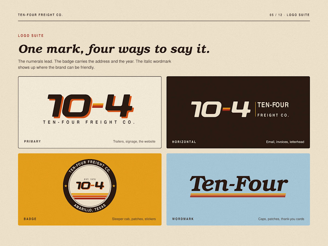
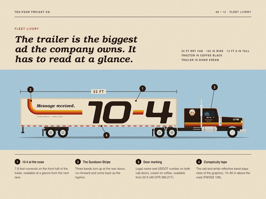
Numerals drawn on a 100-unit grid with an 11° lean, so they read at highway speed. The hyphen is a piece of the three-band Sundown Stripe that runs along every trailer.
The livery follows the rules: legal name and USDOT number on both cab doors, readable from 50 ft (49 CFR 390.21T), and no graphics over the red-and-white conspicuity tape.
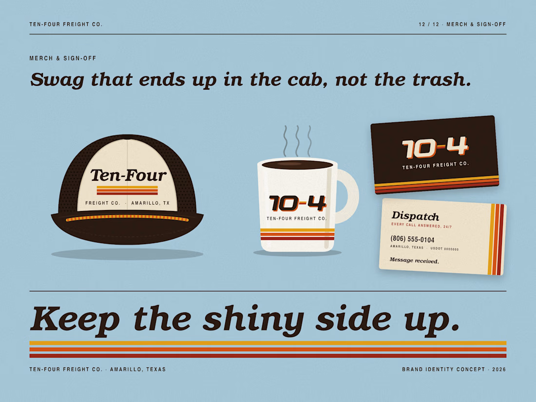
Recruiting billboard, name patches with CB handles, a tracking app, cap, mug and business cards.
Type and color
TeX Gyre Bonum (a free Bookman revival), TeX Gyre Heros Cn and the Ten-Four numerals. Coffee Black, Diner Cream, Harvest Gold, Sundown Orange, Taillight Red, Big Sky Blue.
Result
Concept work. No client, no live results.
Portfolio card
A Retro Americana identity for a fictional Texas trucking company, built on CB radio's 10-4.
Tags: Brand Identity · Typography · Fleet Livery
Large truckload carriers turn over about 90% of their drivers a year (ATA, 2020). Their biggest ad space is a 53-foot trailer.
So I branded a fictional one: Ten-Four Freight Co., Amarillo, Texas, est. 1976.
On CB radio, 10-4 means "message received." That's the promise. The other ten-codes became the voice: 10-20 for tracking, 10-7 for home time, "breaker one-nine" for hiring.
Numerals drawn on a 100-unit grid. A three-band Sundown Stripe that turns into the hyphen. Bookman italic for diner-counter warmth.
Full case study in the project.
Which "boring" industry should get the premium treatment next?
#branding #typography #retro

That's really great Vaskrsije❤️❤️. I see this design earlier and that's really great and has a strong identity 🔥🔥🔥