The network for creativity
Join 1.25M professional creatives like you
Connect with clients, get discovered, and run your business 100% commission-free
Creatives on Contra have earned over $150M and we are just getting started
Back to feedPost

Which color are you choosing? Drop your pick below! 👇
#iPhone18Pro #iPhone18ProMax #Apple #iPhone18 #Tech #Smartphone #ProductAnimation #3DDesign #MotionGraphics #TechReels #AppleDesign
The network for creativity
Join 1.25M professional creatives like you
Connect with clients, get discovered, and run your business 100% commission-free
Creatives on Contra have earned over $150M and we are just getting started






Related posts


Design and build of Polychrome, a free Framer portfolio template with coloured tabs for commercial and studio work and warm and cool colour modes.


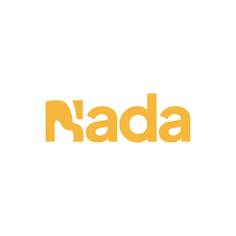
Challenge: Nada's old logo had a unique shape, but the "N" was hard to read and the design didn't connect to music.
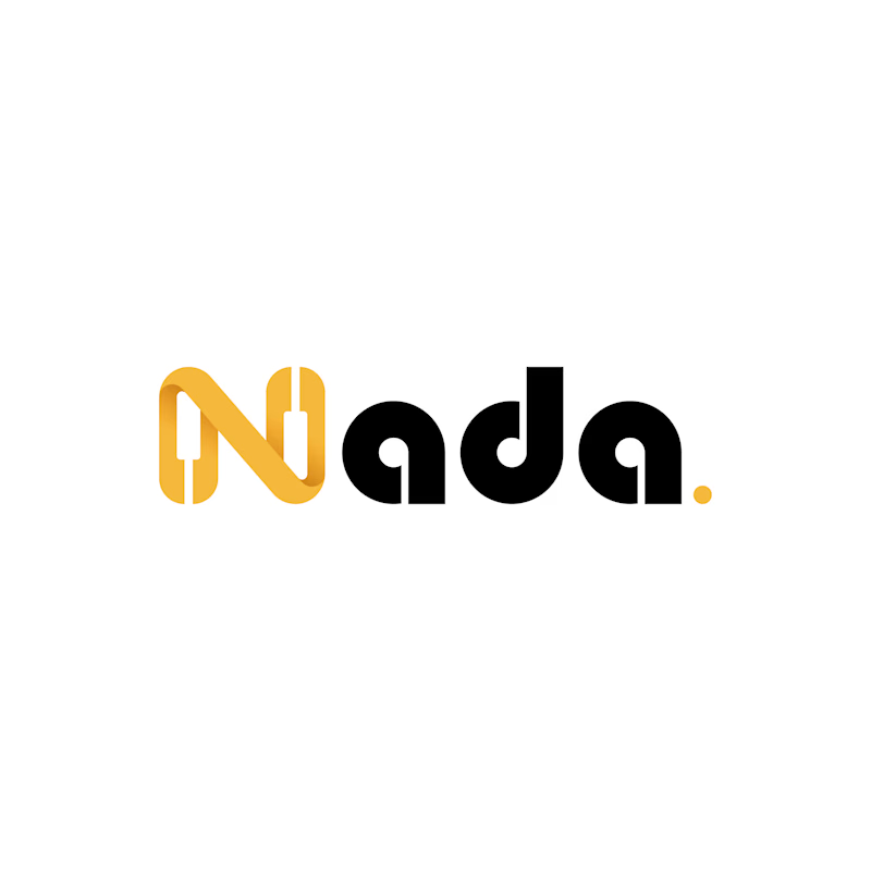
Solution: I redesigned the logo with a piano-built "N" monogram and letterforms that carry music notes. A golden dot closes the wordmark like a final note. The warm gold stays, now paired with black for a more premium look.
Result: A clearer, more memorable logo that tells the brand story at a glance. The client loved it.
1 vote
Ends in 1d