The network for creativity
Join 1.25M professional creatives like you
Connect with clients, get discovered, and run your business 100% commission-free
Creatives on Contra have earned over $150M and we are just getting started
Back to feedPost
Taste Test


working on a website for a client with a social media/content agency. i’m on the 3-step process section rn and ended up with two options for the first card. which one feels better, left or right?

2 voted
67%

1 voted
33%

3 votes
Closed

The card with the woman in it feels more aligned with the media/content agency. It shows a young woman with earbuds fits the brand more for content agency/ Gen Z/millennial clients. The floating keyword act as benefit teasers instantly communicating value from just glancing....
The network for creativity
Join 1.25M professional creatives like you
Connect with clients, get discovered, and run your business 100% commission-free
Creatives on Contra have earned over $150M and we are just getting started










Related posts


Visual identity revision for a psychology and management consulting firm


handsome works! anyway did you use any ai to generate mockups on that? or you did manual


Startfrom is our template library: 12 finished websites designed at Apollo Studio. 11 of them are available as a Framer project, an Astro theme and a Next.js app, so you choose the design first and the stack second.
For founders, studios and freelancers who want a real site to start from. Five are free.


That's incredible Alex great website template 🎉🎉🔥🔥

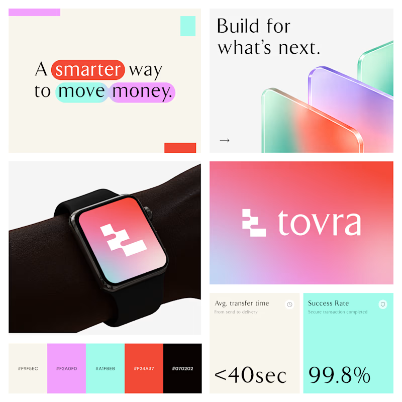
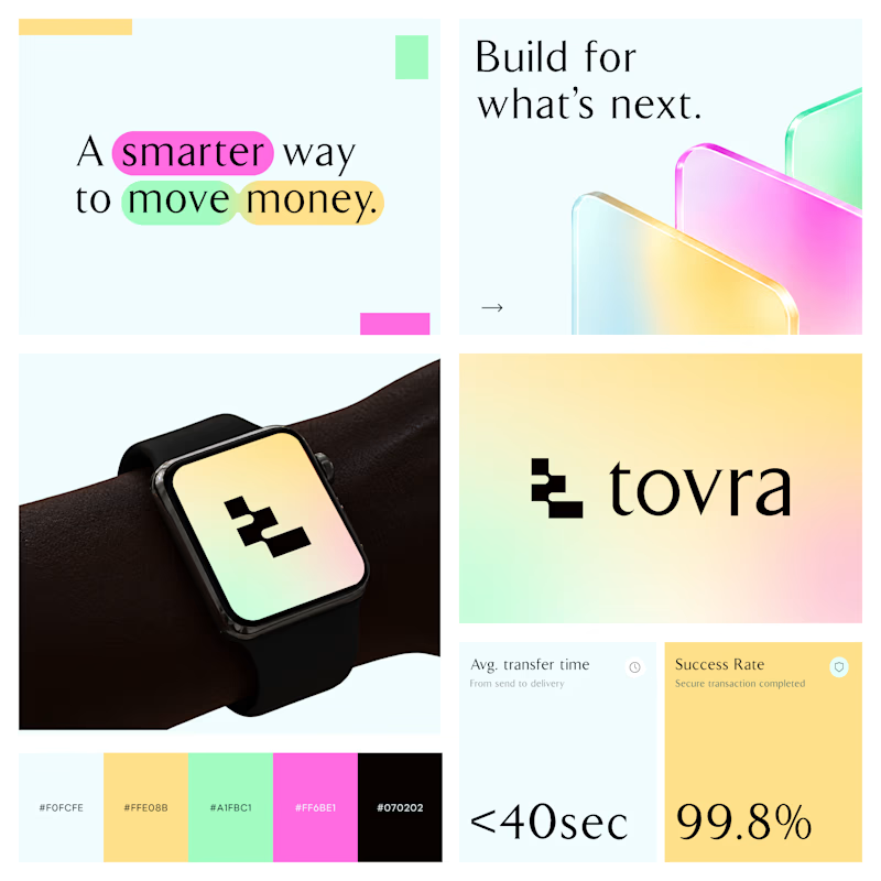
Two Color Directions. One Brand Identity.
Exploring two visual directions for Toyra, a modern fintech brand focused on making money movement smarter and simpler.
Both concepts feature bold typography, vibrant colors, playful gradients, and a clean visual identity.
Which color direction works better for Brand Option A or Option B? 👀
19 voted
40%
29 voted
60%
48 votes
Closed
