The network for creativity
Join 1.25M professional creatives like you
Connect with clients, get discovered, and run your business 100% commission-free
Creatives on Contra have earned over $150M and we are just getting started
Back to feedPost

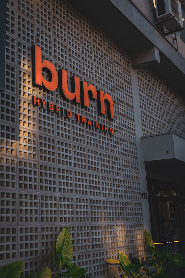
Burn was created to feel bold, energetic and instantly recognizable.
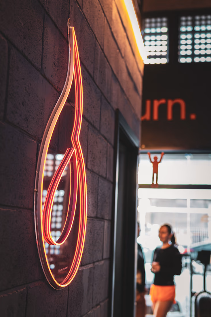
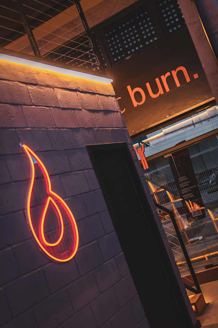
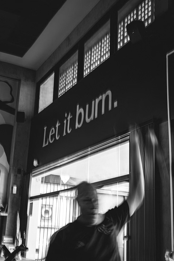
The identity was designed to work beyond the screen, becoming part of the physical experience through signage, interior graphics and branded touchpoints throughout the gym.
Seeing the system applied in the real space reinforces what a strong identity should do: create consistency, recognition and a clear sense of character wherever the brand appears.
The network for creativity
Join 1.25M professional creatives like you
Connect with clients, get discovered, and run your business 100% commission-free
Creatives on Contra have earned over $150M and we are just getting started



Related posts

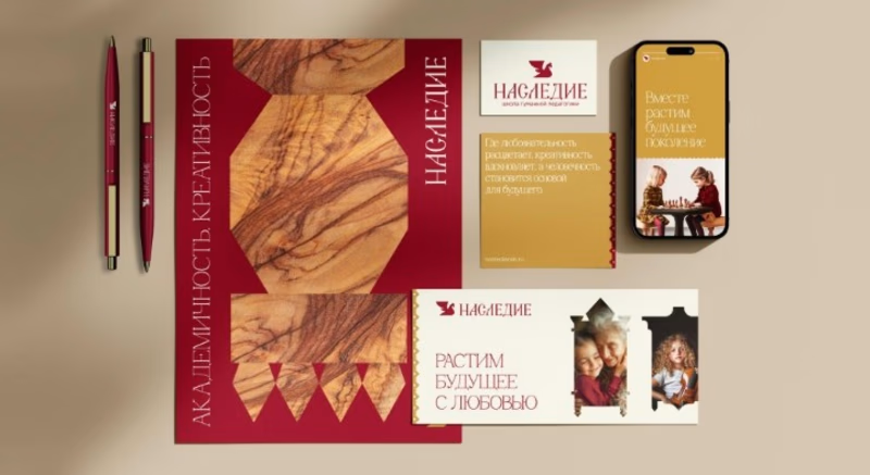
Project Spotlight НАСЛЕДИЕ Brand Identity & Editorial Design System
Excited to share a glimpse of my latest branding and visual identity project, НАСЛЕДИЕ. This design blends rich, traditional warmth with a modern editorial edge, creating an immersive visual ecosystem.
The system covers everything from bespoke typography and stationery collateral to digital mobile experiences and editorial layouts. Every asset was meticulously crafted to reflect heritage, structure and timeless elegance.
Key Highlights
Custom brand identity and typography styling
Cohesive stationery and collateral design
Editorial mobile UI/UX experience



Ovéa — care with character.
One skincare identity across bottles, jars and tubes. I designed the wordmark, pink-and-cobalt packaging system, campaign applications and digital mockups, then brought the collection into motion.
A consistent visual language, with room for each product to feel individual.
View the full case study. Building a skincare brand? Let’s talk about your identity and packaging.

Love the colour direction and the visual language. Everything feels so well thought out. The overall look is beautiful.

What if a brand identity was the only brief a video tool needed?
Dropped Altair’s world into Unit (closed beta) and got a 15s launch film with warm metals, hard shadows and one eagle.
Prompting felt closer to art direction than rendering.