The network for creativity
Join 1.25M professional creatives like you
Connect with clients, get discovered, and run your business 100% commission-free
Creatives on Contra have earned over $150M and we are just getting started
Back to feedPost


The network for creativity
Join 1.25M professional creatives like you
Connect with clients, get discovered, and run your business 100% commission-free
Creatives on Contra have earned over $150M and we are just getting started

Challenges
View all


Related posts

Another addition to my music poster collection. The song is I2I from A Goofy Movie, so I was surprised how serious the design ended up being for something spawned from a Disney film. But the lyrics are deep and they deserved to be represented as such!
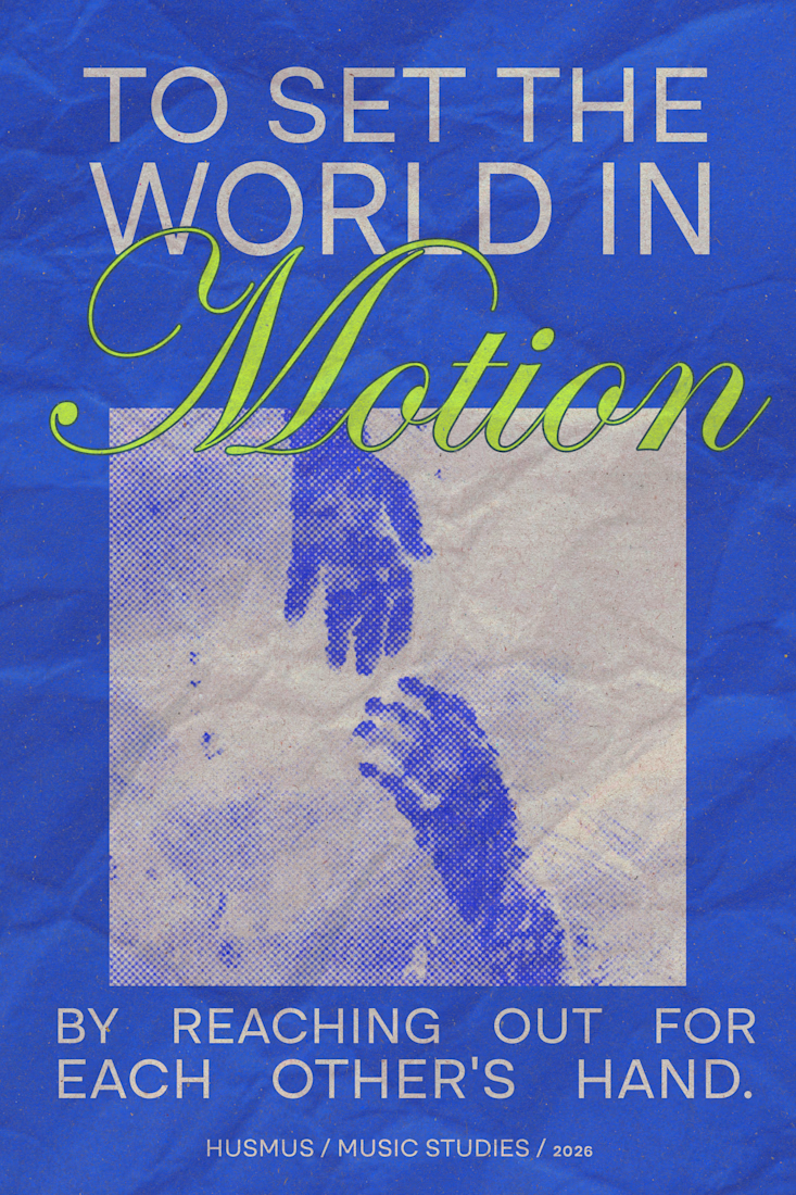


the lime green Motion word pops on that blue!

HerbalLine Women’s Day — Treatment Menu Design
Feminine & Luxurious Soft blush tones, floral elements, and elegant portrait photography create a sophisticated feminine aesthetic that complements the Women’s Day campaign.
Premium Visual Direction The combination of warm gradients, deep burgundy accents, and refined serif typography enhances the sense of indulgence and positions the treatment as a premium spa experience.
Strong Visual Hierarchy The campaign headline, treatment name, promotional price, and key benefits are clearly structured, allowing customers to quickly understand the offer and treatment highlights.
Floral Art Direction Layered botanical illustrations frame the model and create visual depth, reinforcing themes of beauty, rejuvenation, and self-care without overpowering the promotional message.
Clear Benefit Communication Key treatment benefits — Deep Hydration, Improved Elasticity, and Smoother Fine Lines — are presented in a concise and accessible format to support quick decision-making.
Overall Concept A promotional treatment menu that combines feminine elegance, premium beauty aesthetics, and clear commercial communication, designed to make the Women’s Day offer feel both exclusive and inviting.
Credit: HWG

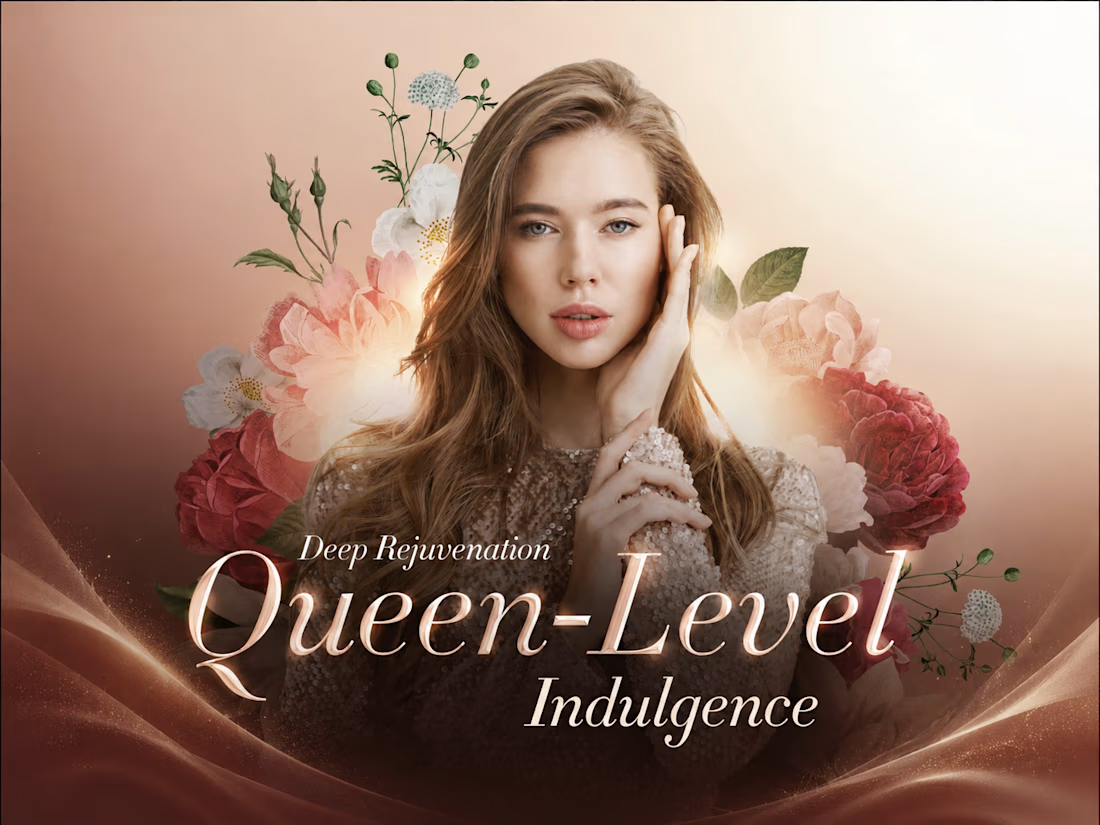
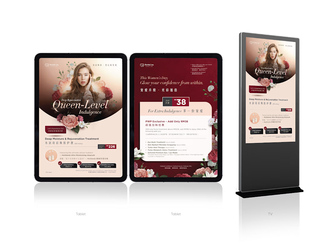

The soft blush, burgundy, and botanical direction creates a strong premium spa mood without losing clarity. I especially like how the treatment benefits are structured for quick scanning.

RAVENSCAR RACING — Independent Motorsport Brand Concept
A visual identity exploration built around performance, precision, and a cleaner future.
The concept develops a complete visual world for a modern racing brand, from the race car and driver identity to team environment, digital presence, merchandise and supporting brand assets.
The goal was to create a distinctive, cohesive motorsport identity that combines racing energy with a contemporary, performance-driven visual language.
Concept by Elza Schwibinger Concepts
Mainz, Germany
I turn ideas into identities.


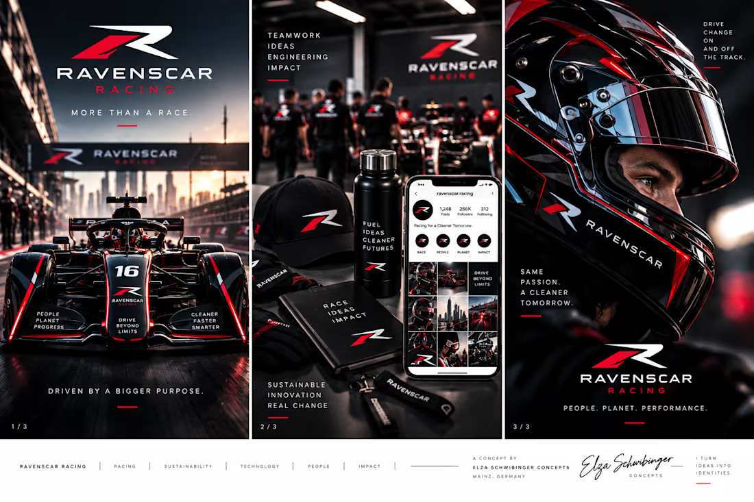
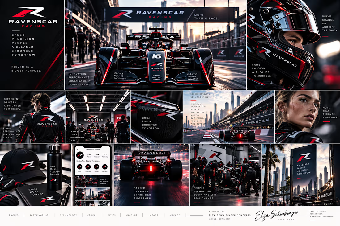
The system feels cohesive from the car graphics through the digital touchpoints—the red accents and tight black palette carry performance without becoming noisy. The supporting asset spread also makes the identity feel genuinely usable, not just a logo exercise.