The network for creativity
Join 1.25M professional creatives like you
Connect with clients, get discovered, and run your business 100% commission-free
Creatives on Contra have earned over $150M and we are just getting started
Back to feedPost

Role: Graphic Design. Promotional flyer for a hair salon, featuring service highlights, a bold purple color palette and clear contact details.


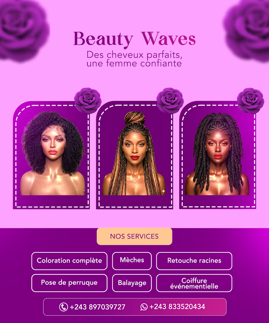

The three framed portraits on the Beauty Waves flyer make it feel premium, and that bold purple is impossible to scroll past. Did you test how the services boxes read at phone size?
The network for creativity
Join 1.25M professional creatives like you
Connect with clients, get discovered, and run your business 100% commission-free
Creatives on Contra have earned over $150M and we are just getting started



Related posts


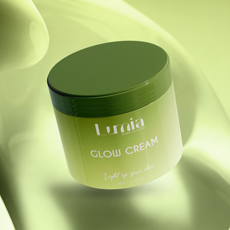
Which packaging color catches your eye first?
6 voted
46%
7 voted
54%
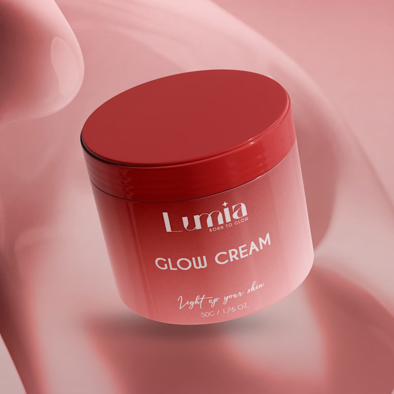
13 votes
Closed

The green version catches my eye first: the dark olive lid gives the lighter jar a clear focal point. I would also test the small white label text at thumbnail size, since the soft lighting reduces its contrast in both versions.

LUMINA - Premium Skincare Cream Packaging & Label Design
Minimalist and elegant cosmetic jar label design created for a luxury skincare brand. Focused on clean typography, premium branding, and aesthetic product presentation.
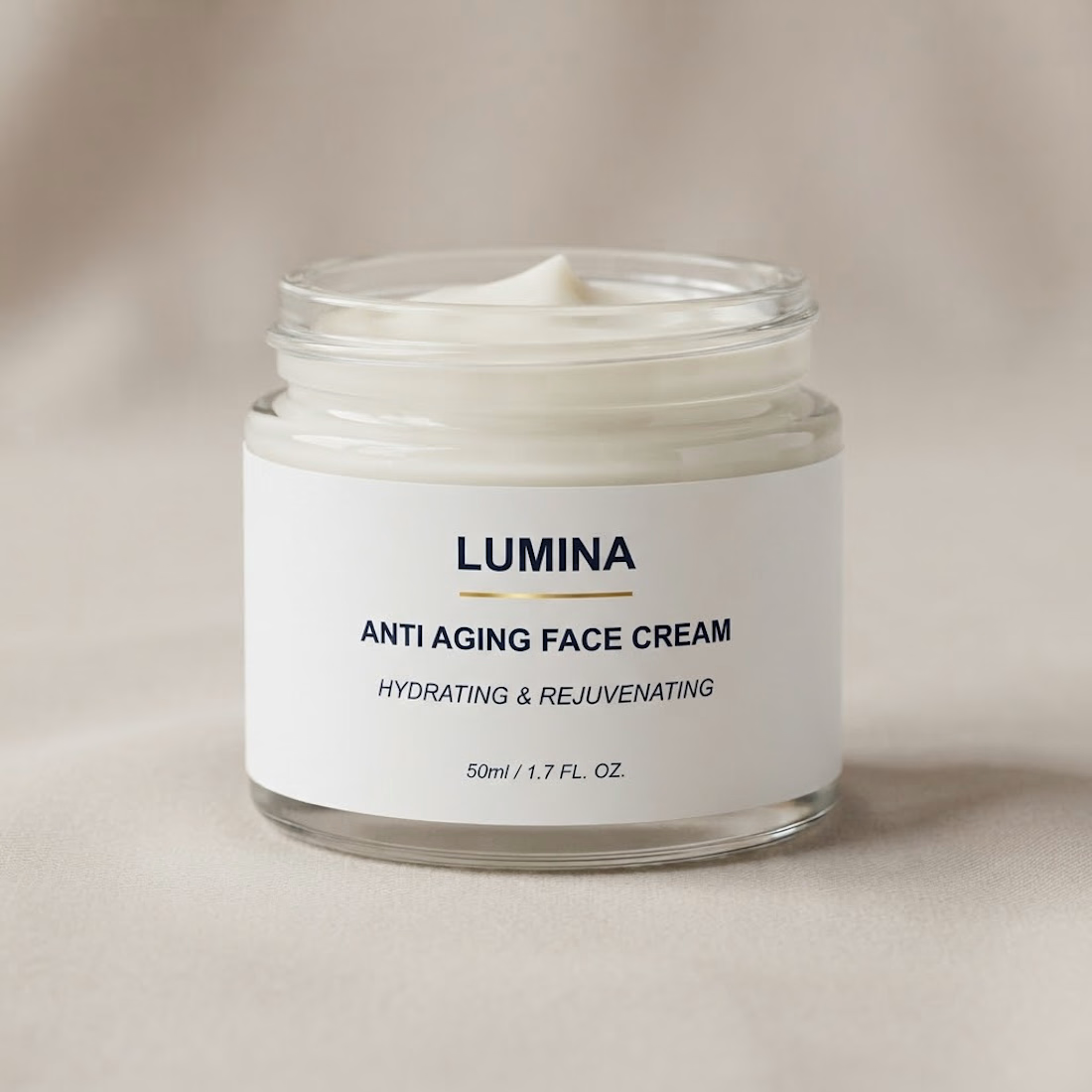

The gold rule under the wordmark does a lot of work on a label this restrained. Did you try the claim line in a lighter weight, so the product name and descriptor separate a bit more?

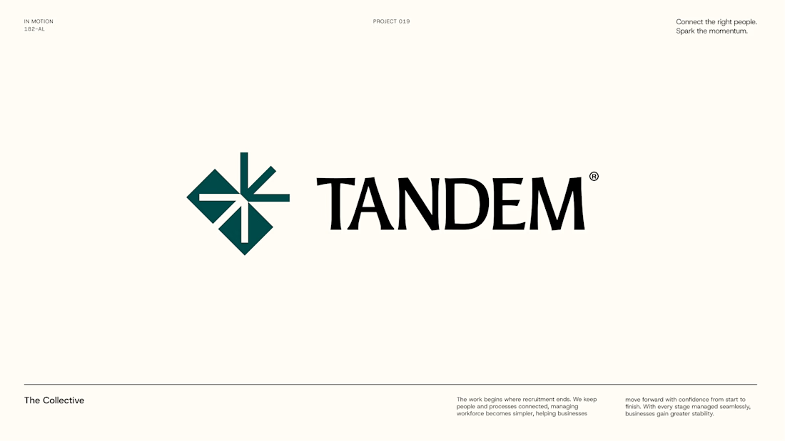
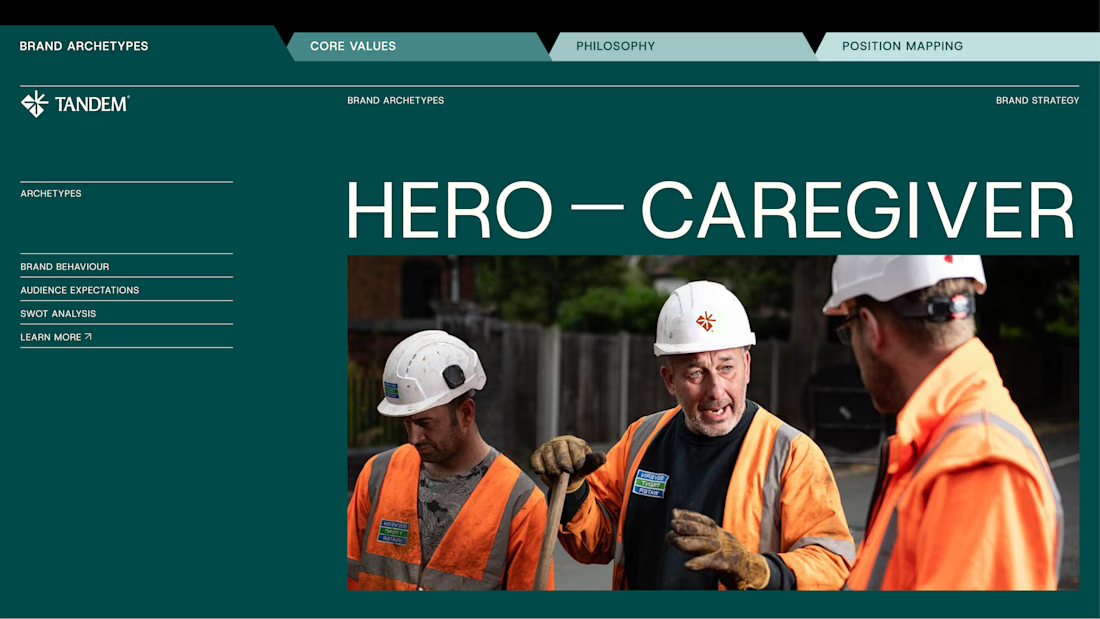
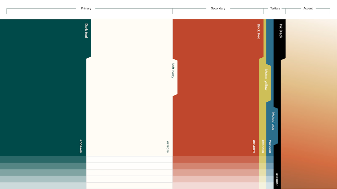
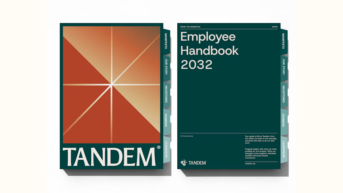
Wrapping up another brand identity project for a workforce management company.
We're currently putting together the full case study, but here's an early look at some of the visuals. Really pleased with how this one has come together!
We explored several distinct creative directions before arriving at the final identity. And there's plenty of interesting work that didn't make the cut.
While we prepare the full case study, I'm thinking of sharing some of those rejected directions and the thinking behind them.
Would you be interested in seeing what didn't make it?