The network for creativity
Join 1.25M professional creatives like you
Connect with clients, get discovered, and run your business 100% commission-free
Creatives on Contra have earned over $150M and we are just getting started
Back to feedPost
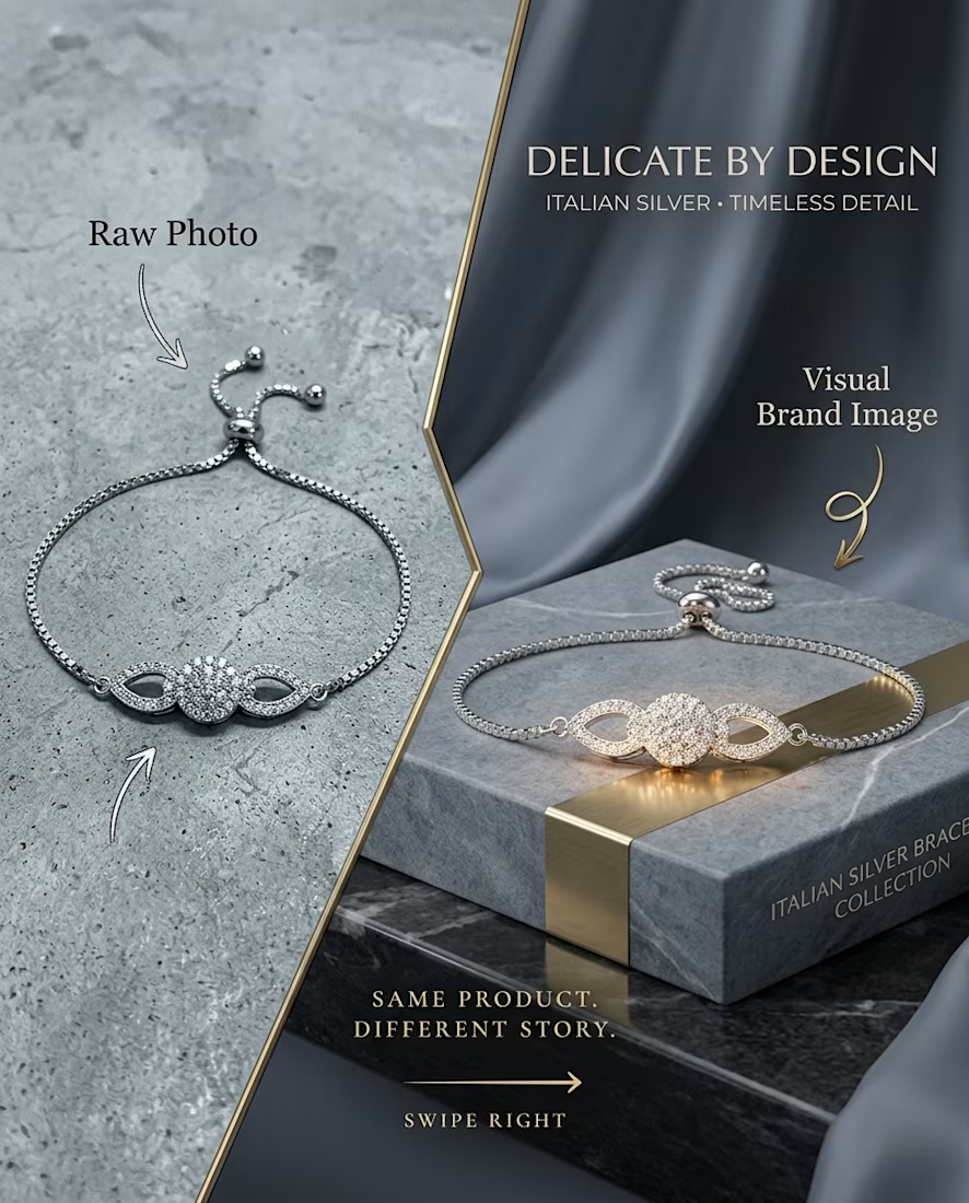
The original was a bracelet on a grey concrete surface. The detail is all there, but nothing about it says "premium."
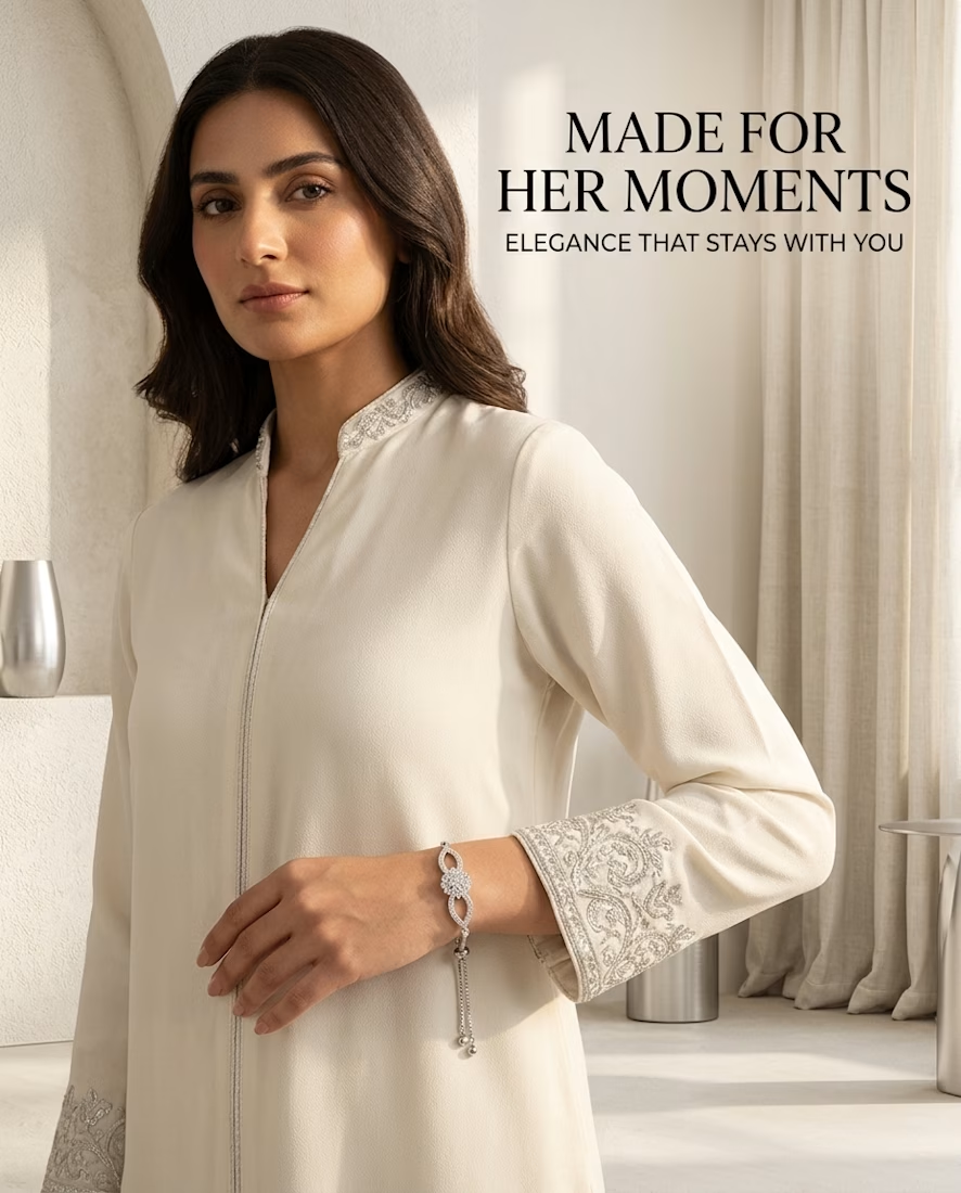
So I took the same piece and built a campaign around it. The first image shows the before and after. The next three are full ad concepts, each with its own setting, light, and mood, so you can see how one product can carry more than one story.
The bracelet stays the same in every frame. Only the world around it changes.
This is a personal concept project, not a client job. Brand names and trademarks belong to their owners.
Tools: Gemini,Nanobanana pro, GPT image 2.5


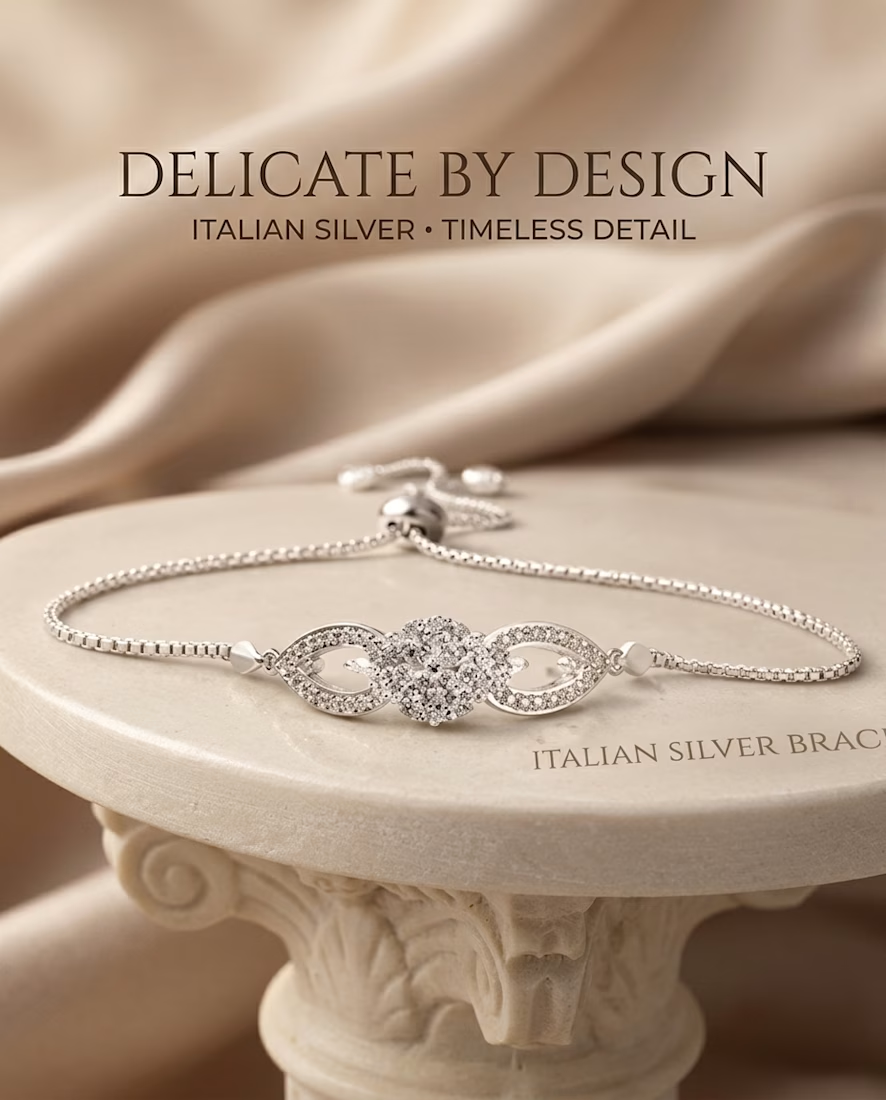
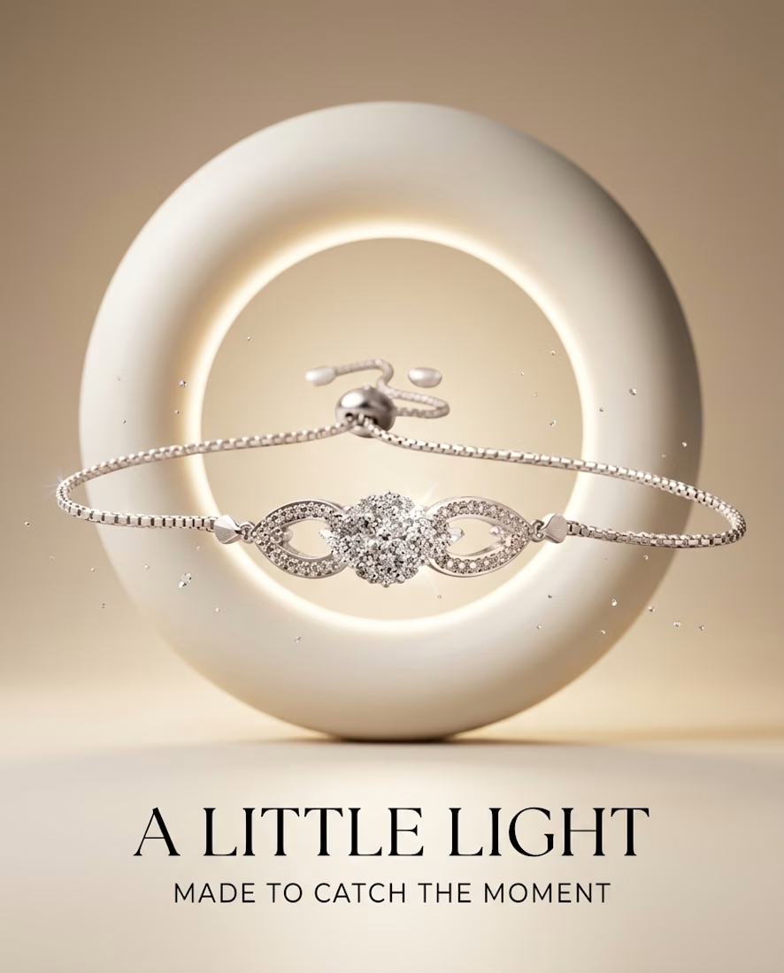

Worth naming the limit on that, though: the world around it is rentable. Any competitor can buy the same silk, the same rim light, the same stone plinth, so staging lifts perceived value right up to the point where two brands in a category stage the identical scene. The frame...

The on-model shot was definitely the ultimate test and yes, it took the most attempts. Stripping away the staging forces the drape and scale to do 100% of the heavy lifting. There's no hiding behind a beautiful stone plinth

These are pretty
The network for creativity
Join 1.25M professional creatives like you
Connect with clients, get discovered, and run your business 100% commission-free
Creatives on Contra have earned over $150M and we are just getting started










Related posts

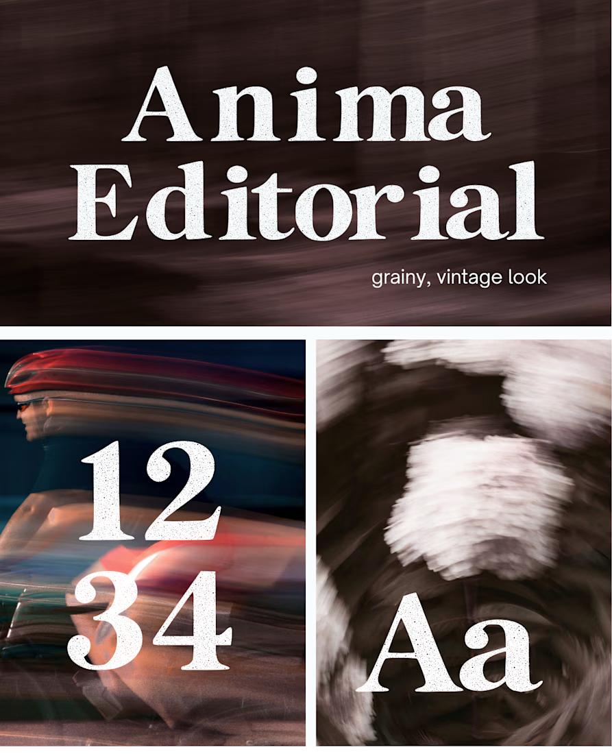
I created this font & it is free to download and use in your free or paid projects. Enjoy 🚀 find it at https://twaperdigital.com/anima-editorial



I like this font


Congrates!!
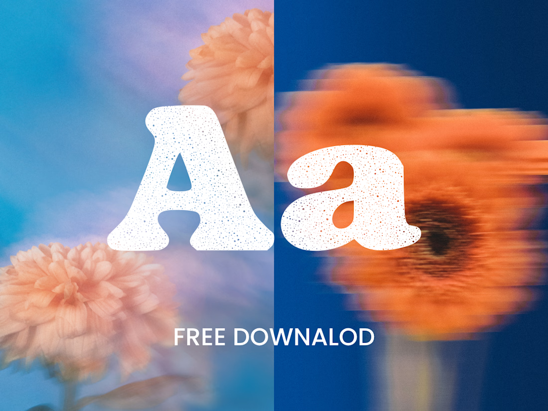
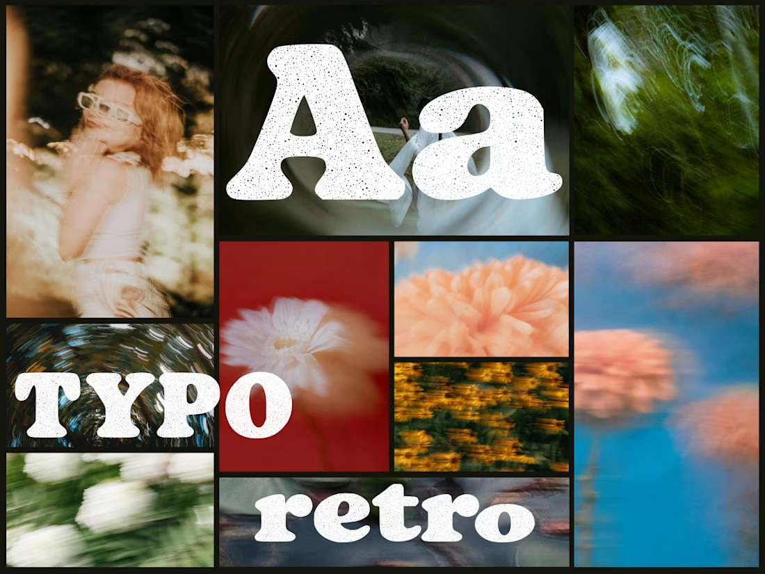
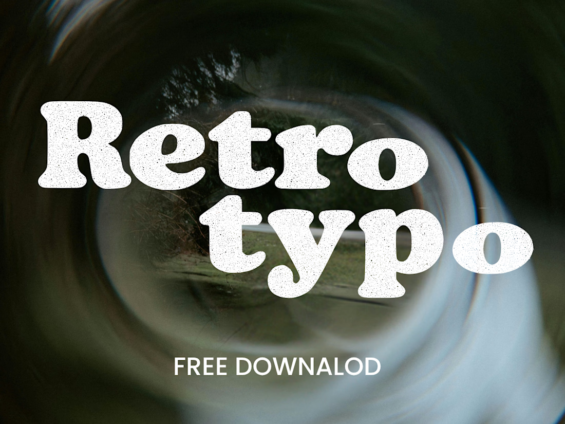
Anima is a self-initiated type design project inspired by vintage print, worn ink and analog photography.
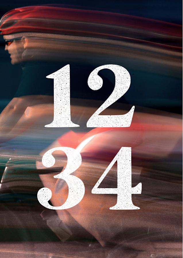
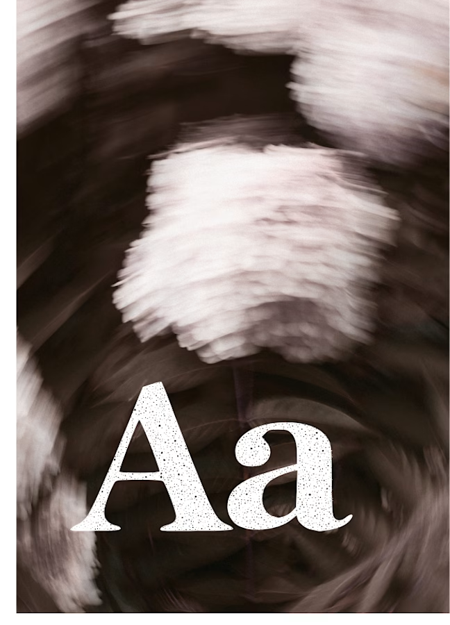
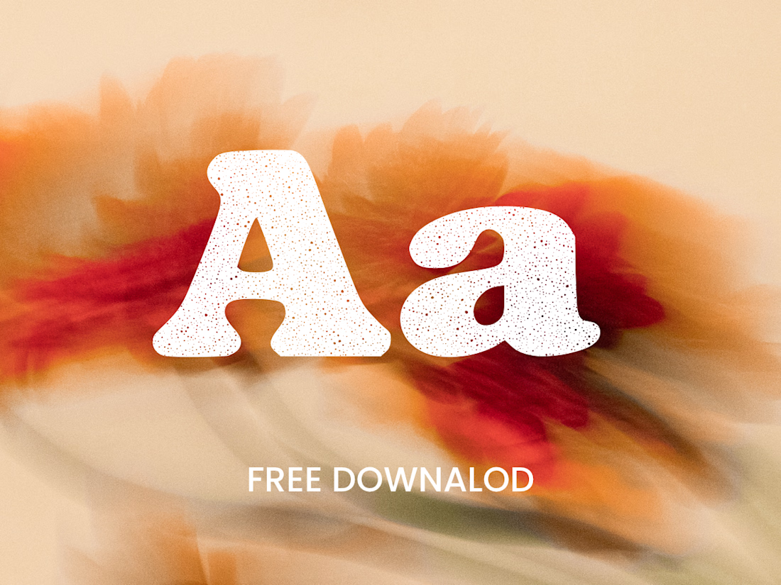
The collection includes two experimental serif typefaces: Anima Editorial, with elegant proportions and contrasting strokes, and Anima Retro, with softer, bolder shapes. Both feature grain built into the letterforms.
I developed the creative direction, custom fonts and promotional artwork, combining AI-assisted exploration with font development. The campaign pairs textured typography with motion-blurred photography to capture a warm, nostalgic mood. FREE DOWNLOAD AT https://twaperdigital.com/anima-retro


Great job Denisa the font style background and it's effects are great 🎉🎉🎉🎉
keep going Denisa🔥🔥🔥🔥