The network for creativity
Join 1.25M professional creatives like you
Connect with clients, get discovered, and run your business 100% commission-free
Creatives on Contra have earned over $150M and we are just getting started
Back to feedPost


The network for creativity
Join 1.25M professional creatives like you
Connect with clients, get discovered, and run your business 100% commission-free
Creatives on Contra have earned over $150M and we are just getting started

Challenges
View all


Related posts


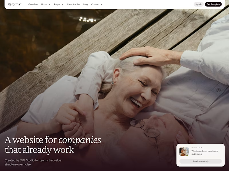
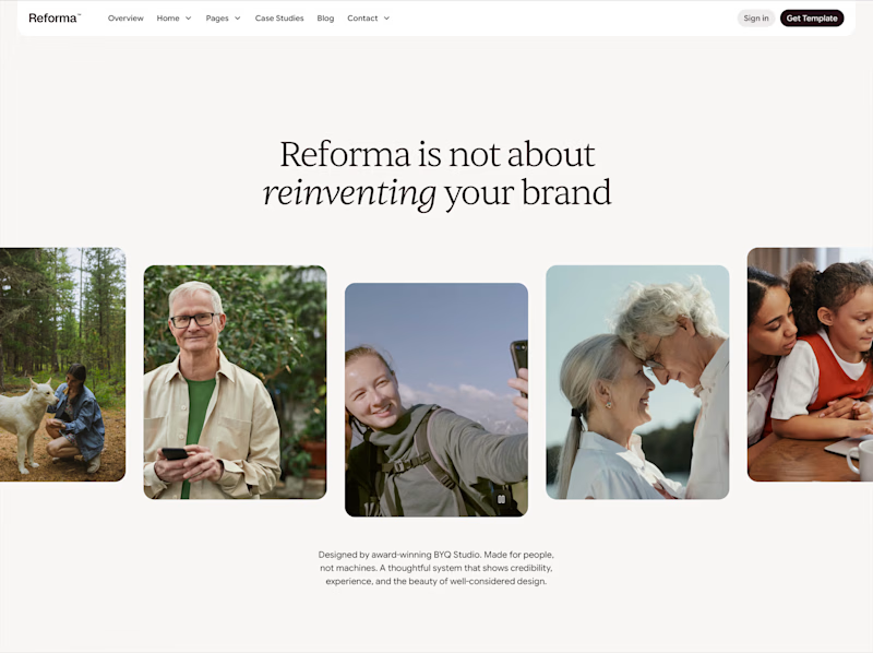

One header, two color stories.
Green: cool tones, feels productive and safe
Purple: gradient glow, feels modern and premium
Same words. Different first impression.
Which one would make you click "Get Started"?
26 voted
59%
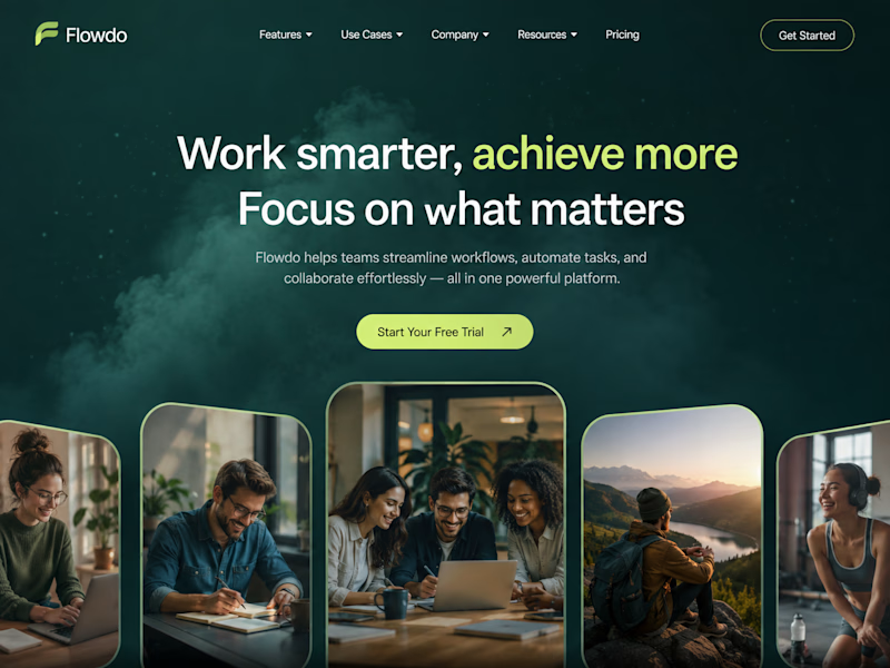
18 voted
41%
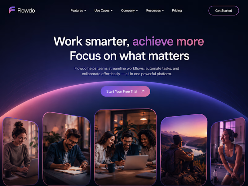
44 votes
Closed

Went with calm and focused. The copy is literally asking people to focus on what matters, so a header that competes for attention with a glow works against its own message.

The Heron chat widget is the product's main touchpoint. It floats over the architect's design software, answers questions about the model, and executes changes once approved.
Designing UI that lives inside another application changes the constraints. It has to hold legibility over dense linework, keep a small footprint, stay clearly branded without competing with the host software, and dismiss cleanly.
The product page demonstrates rather than describes. The widget is shown over a real floor plan, mid-conversation about an HVAC clearance issue, with the affected room highlighted in the drawing behind it. The surrounding layout is kept deliberately quiet so the widget holds the visual weight.

