The network for creativity
Join 1.25M professional creatives like you
Connect with clients, get discovered, and run your business 100% commission-free
Creatives on Contra have earned over $150M and we are just getting started


The network for creativity
Join 1.25M professional creatives like you
Connect with clients, get discovered, and run your business 100% commission-free
Creatives on Contra have earned over $150M and we are just getting started





Related posts


Very nice

"We can't afford a data analyst."
I've heard this from 3 different startups this year.
So I built one.
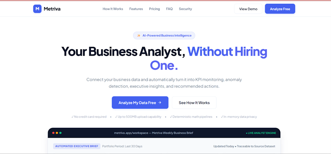
Metriva is an AI-powered business analyst that:
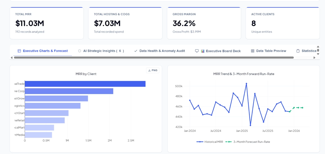
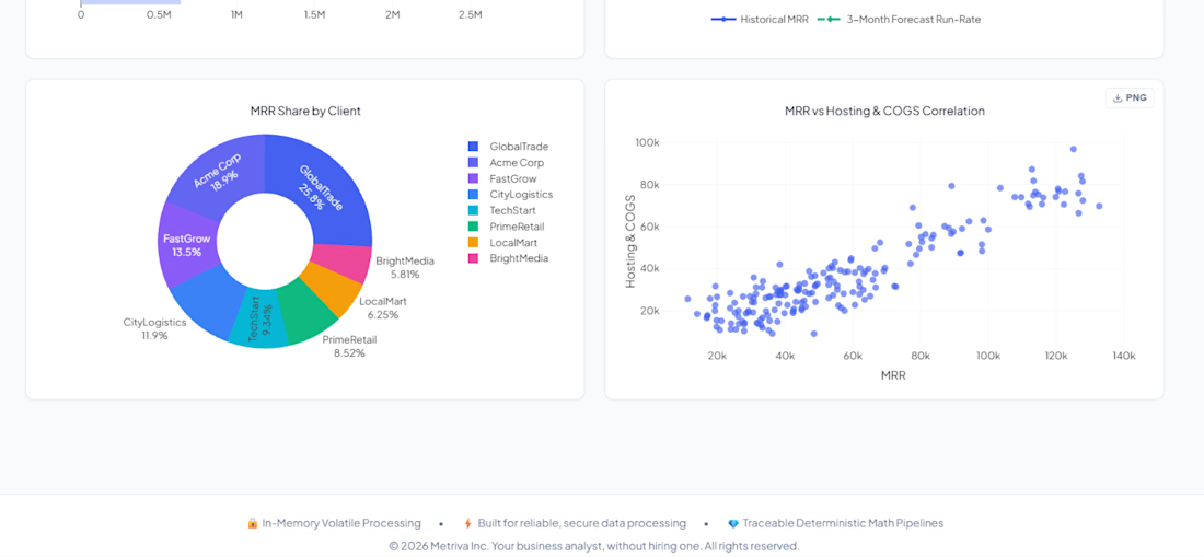
📊 Turns messy spreadsheets into executive dashboards
🧠 Writes C-level business briefs automatically
📈 Forecasts trends + detects anomalies
💬 Answers questions about your data in plain English
🎯 Finds your Pareto 80/20 — who drives 80% of your revenue?
No SQL. No Python. No data team.
Just upload your file and get answers.
Built with Flask, vanilla JS, and a lot of late nights.
🔗 Try it: metriva.ai1.vercel.app
#AI #BusinessIntelligence #Founder #IndieHacker #DataScience

The brief-writing piece is interesting — curious how you handle the validation step. AI-generated language tends to sound confident even when the underlying data is sparse or the trend is ambiguous. One pattern that helps: have the model output a confidence signal alongside the...

Personal Portfolio Website Design
A bold and visually expressive personal portfolio website crafted for creative professionals to build a memorable online presence, showcase their best work, and stand out with confidence.


Excellent work. I would like to hire you.