The network for creativity
Join 1.25M professional creatives like you
Connect with clients, get discovered, and run your business 100% commission-free
Creatives on Contra have earned over $150M and we are just getting started
Back to feedPost
Self - Portraits: Hybrid Workflow
Process: 2-3 raw base photos > AI generates 4K+ multi-look setups > rigorous manual retouching & color-grading. Tools: AI generation, Photoshop.
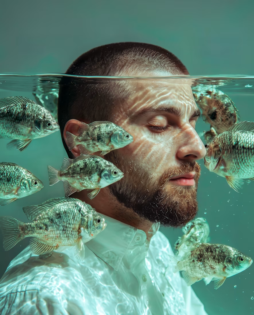
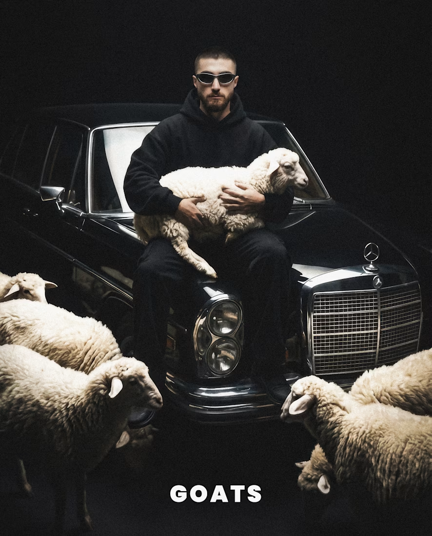



Check the full project here: https://issamaaz.com/issa-self-portraits

issamaaz.com
Issa Maaz | Photographer & Graphic Designer, Beirut - Issa - Self Portraits
Photographer and graphic designer in Beirut. I shoot on real optics and build with generative AI — commercial campaigns, brand identity, and personal series.
The network for creativity
Join 1.25M professional creatives like you
Connect with clients, get discovered, and run your business 100% commission-free
Creatives on Contra have earned over $150M and we are just getting started








Related posts

I created a modern camera showcase template designed to highlight a product in a sleek and engaging way. The template can be customized for different brands by changing the colors, text, logo, product visuals, and other design elements. My goal was to create a flexible design that can be adapted to different products and brand identities while keeping the animation clean and professional.


Great template, looks easy to customize and adapt! Best of luck!


Some flavors take you back to a place. Some bring a memory to life.
Ferma Kumbusha is a beverage branding concept built around the connection between flavor, culture, and the moments we carry with us. From the packaging to the typography and visual details, every element works together to tell a story that feels authentic, distinctive, and full of character.
Because great branding doesn't just catch your eye. It makes you feel something.
#BrandIdentity #PackagingDesign #BeverageBranding #VisualIdentity #BrandDesign


Flavour and memory is a strong idea for a beverage brand because it gives the packaging a story to carry rather than a flavour to announce. The typography is doing most of that work here. Is Ferma Kumbusha a concept or heading to shelves?

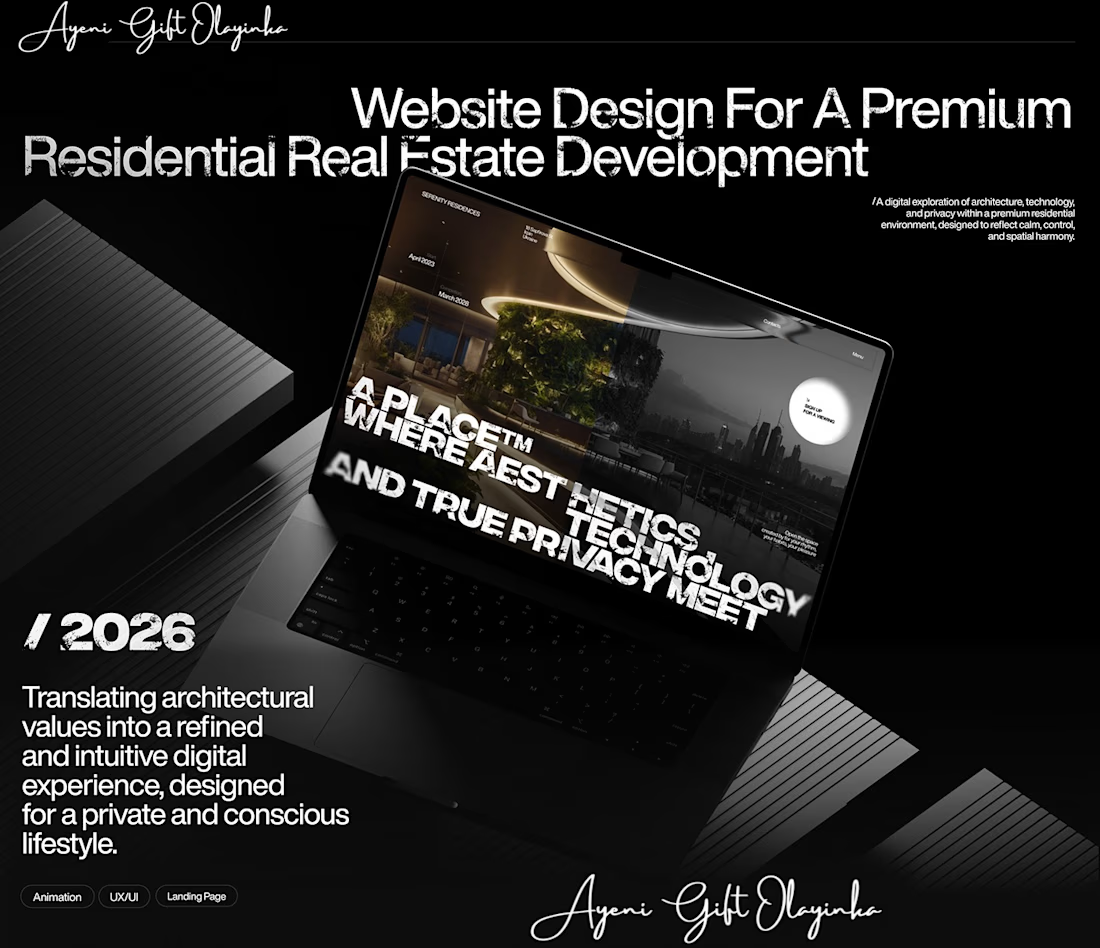
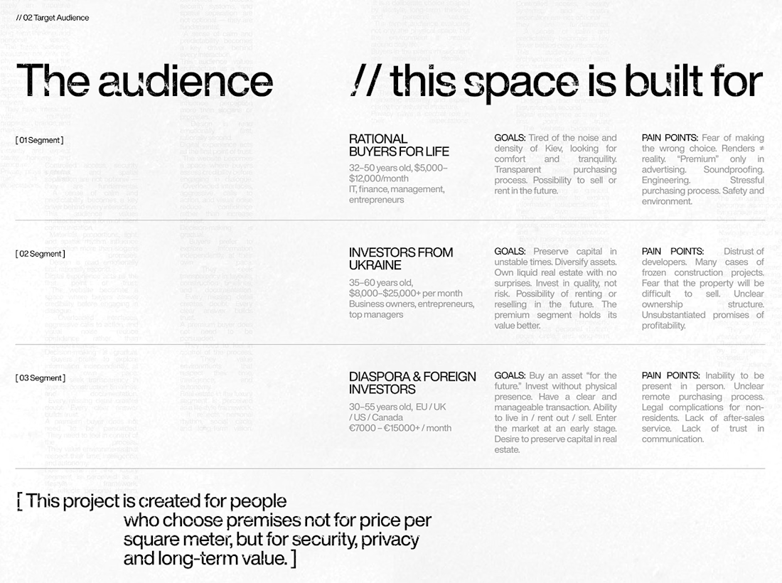
What makes someone stop scrolling and imagine themselves living in a property?
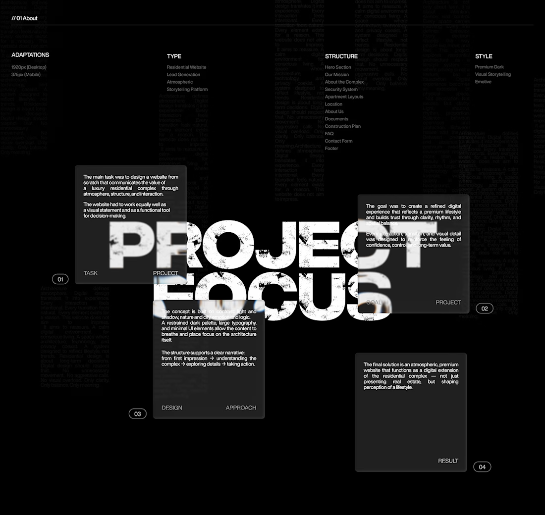
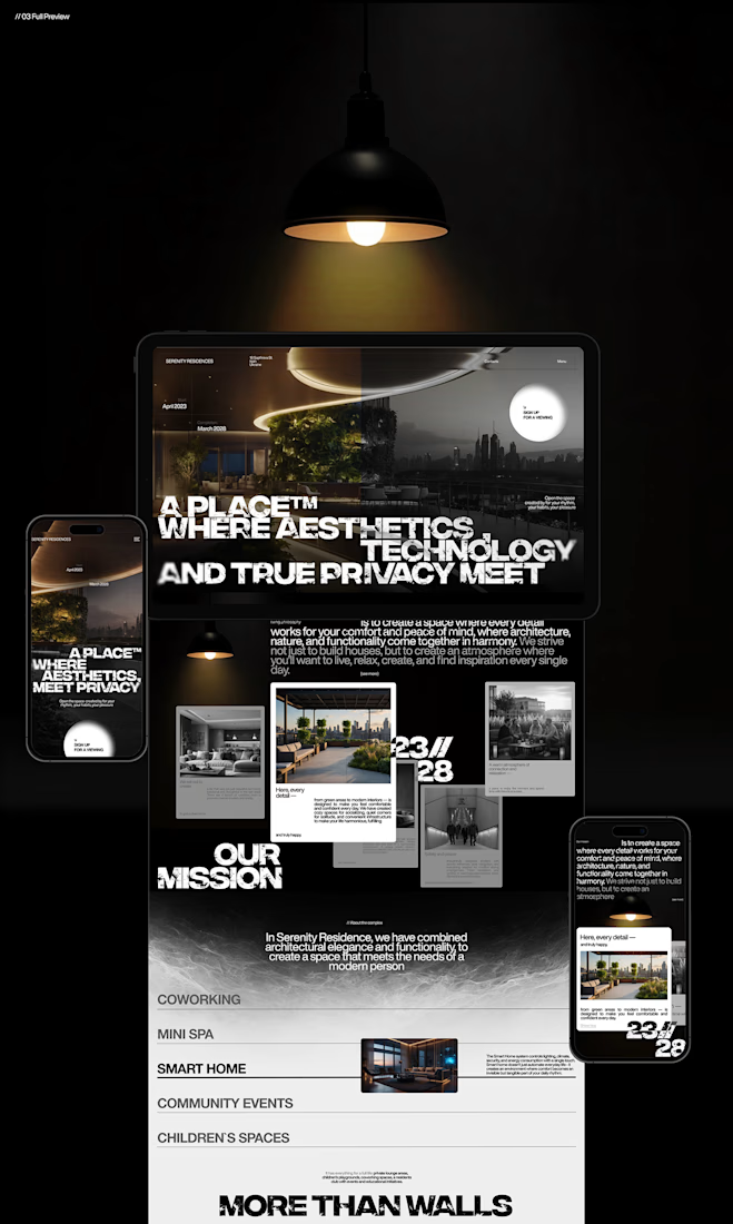
That's something I kept in mind while working on this luxury real estate website concept.
I wanted the design to feel premium without making the experience complicated. The focus was on strong visuals, clean layouts, and a clear structure that lets the properties speak for themselves.
I also paid attention to how visitors move through the website, from their first impression to exploring the properties and taking the next step.
Because when someone is looking for a home, the experience matters just as much as the presentation.
I couldn't fit every screen into this post, so I'll share more of the design in the comments. 👇
I'm curious: when you visit a real estate website, what makes you want to explore further?
#WebDesign #Architecture #LuxuryRealEstate #UIUXDesign #RealEstate #Figma



nice work