The network for creativity
Join 1.25M professional creatives like you
Connect with clients, get discovered, and run your business 100% commission-free
Creatives on Contra have earned over $150M and we are just getting started
Back to feedPost


🔍 Your logo might look great on a presentation board. But does it work in the real world?
Before approving a logo, I believe it should pass five practical tests:
1. Small-size test: Is it still recognizable as an app icon or social profile image?
2. Black-and-white test: Does it remain clear without relying on color?
3. Variation test: Does it work in horizontal, stacked, and compact layouts?
4. Application test: Does it look right on a website, stationery, packaging, or signage?
5. Consistency test: Can your team use it correctly without guessing which version to choose?
A professional identity is more than one attractive logo. It needs a visual system that works consistently wherever customers interact with your business.
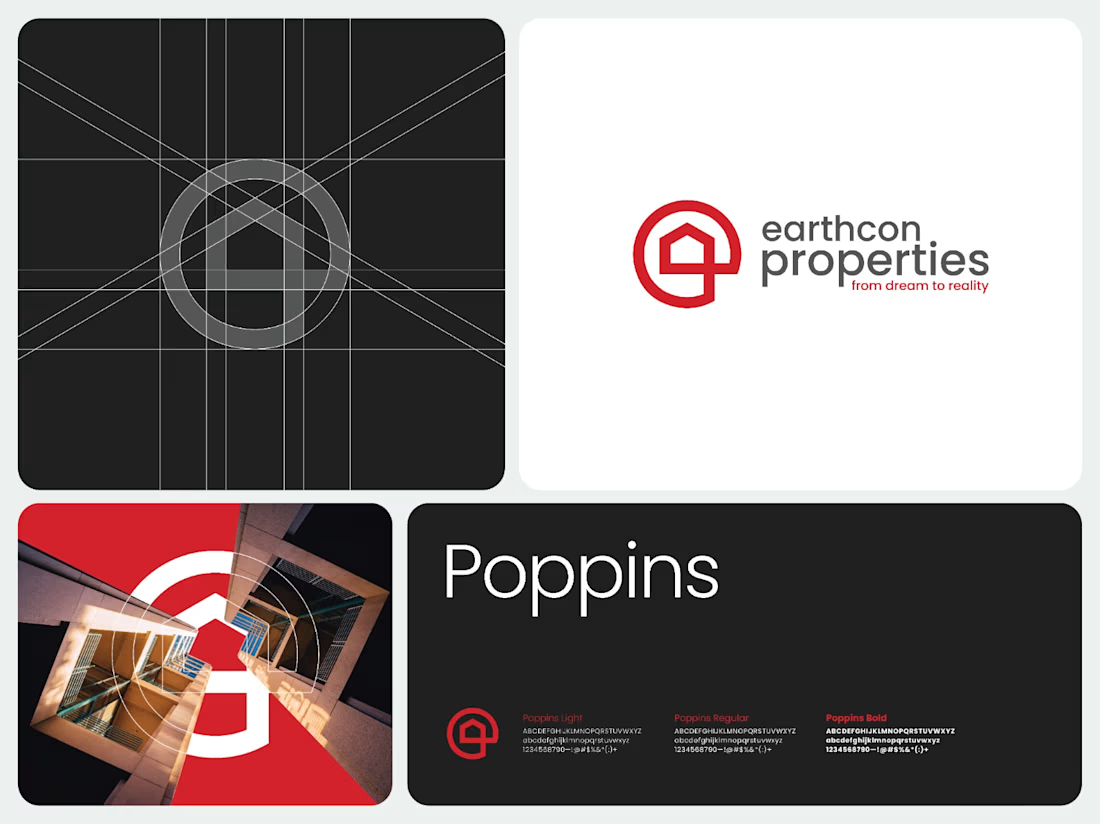
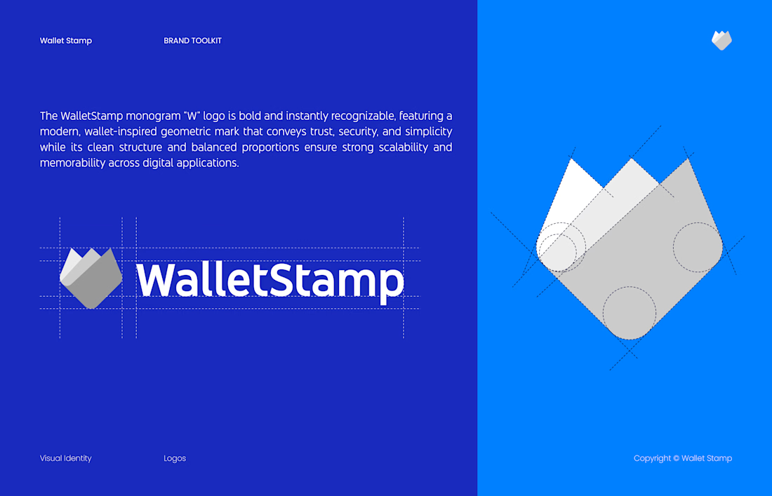
This is the approach I bring to brand identity projects like MyRyd, Turn, and WalletStamp.
👇 Building a new brand or considering a refresh? Send me your current logo or website. Let's identify what your brand actually needs.
Explore my Complete Brand Identity Design service.
The network for creativity
Join 1.25M professional creatives like you
Connect with clients, get discovered, and run your business 100% commission-free
Creatives on Contra have earned over $150M and we are just getting started
Related posts

A little behind-the-scenes look at a brand identity coming together.
I'm currently working on a new identity for a coworking space in Austin, TX, with a vintage-inspired direction, warm colors, and a logo that brings a bit of nostalgia into a modern setting.

Carrying the vintage idea onto the coasters and the dot pattern gives the identity somewhere to live besides the logo.

more glimpses of iki 🍵
the project is almost finished, and i should be wrapping everything up next week.
it’s been a fun one to work on, especially seeing how the initial concept has evolved into a complete visual identity.
excited to share the final result soon :)
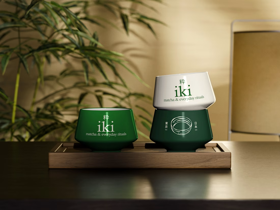
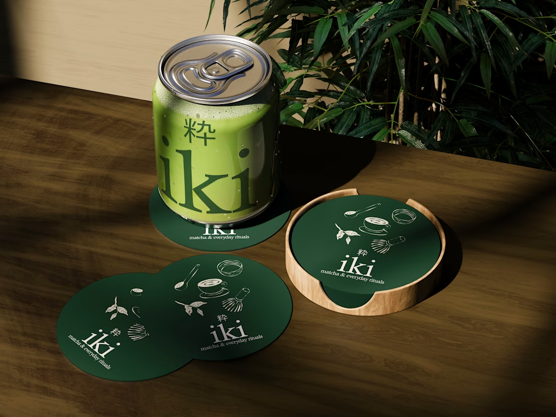
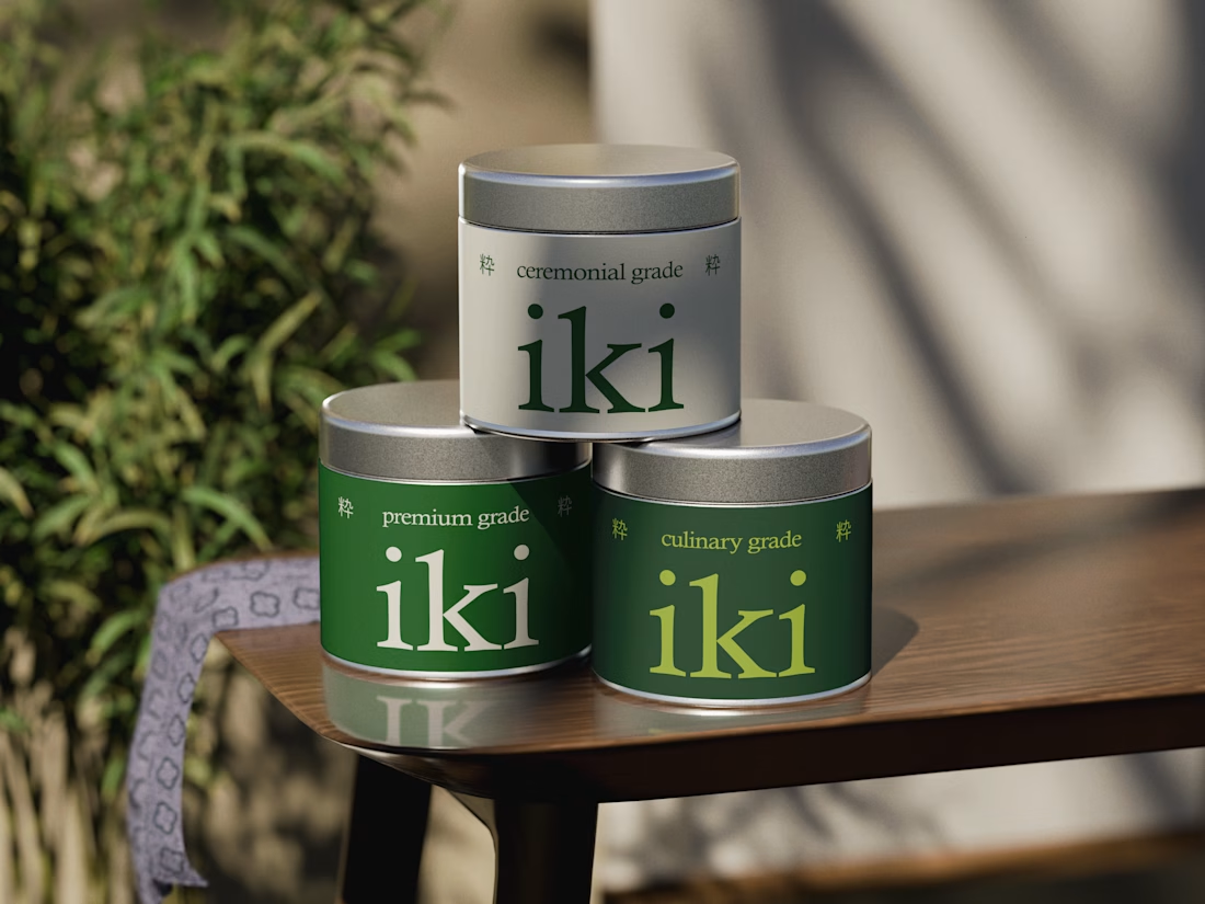
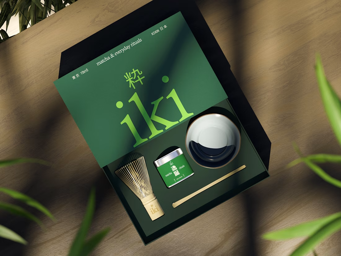

A complete brand identity system that brings visual direction, social media, and web design into one clear, consistent brand experience across every touchpoint.


