The network for creativity
Join 1.25M professional creatives like you
Connect with clients, get discovered, and run your business 100% commission-free
Creatives on Contra have earned over $150M and we are just getting started
Back to feedPost

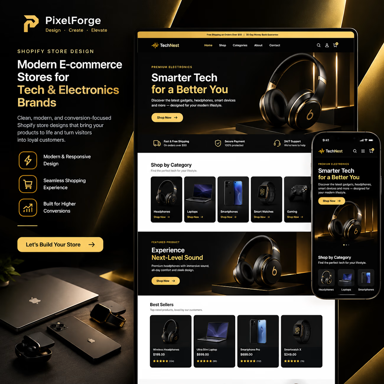
🖤✨ Shopify Store Design | Modern Electronics E-commerce Concept
A great online store should do more than display products — it should create an experience that builds trust and inspires customers to shop.
For this concept, I explored a clean, premium black-and-gold design for a modern electronics brand, combining bold product visuals, organized product categories, and a responsive desktop and mobile layout.
What this design focuses on:
🛍️ Modern Shopify storefront design
🎨 Premium black-and-gold visual identity
📱 Responsive desktop and mobile layouts
🎧 Engaging product presentation
⚡ Simple navigation and a smoother shopping experience
My goal is to help e-commerce brands present their products professionally and create storefronts that look polished, feel intuitive, and support business growth.
Need a professional Shopify store for your brand?
Let's bring your vision to life with PixelForge.
📩 Send me a message to discuss your project.
#ShopifyDesign #EcommerceDesign #ShopifyStore #WebDesign #PixelForge
The network for creativity
Join 1.25M professional creatives like you
Connect with clients, get discovered, and run your business 100% commission-free
Creatives on Contra have earned over $150M and we are just getting started



Related posts


What if finding the perfect lash style was easier than ever? ✨
I’ve been exploring how a beauty eCommerce store can deliver a better shopping experience through thoughtful UI/UX design and conversion-focused strategies.
For this independent redesign concept, I explored a more engaging way to help beauty shoppers discover products, navigate collections, and make confident buying decisions.
A few things I focused on:
1. Clean, premium beauty storefront design.
2. Better product discovery and navigation.
3. Curated product collections.
4. A lash-finder quiz concept to guide shoppers.
5. Clear product presentation and shopping actions.
6. A responsive experience across devices.
My goal with this concept was simple: make the shopping journey feel effortless while keeping the brand visually engaging.
Because a beautiful store is great, but a store that makes shopping easier is even better.
Shopify founders and beauty brand owners: What's more important to you when designing a beauty store — visual experience or product discovery?
#Shopify #ShopifyDesign #ShopifyCRO #EcommerceDesign #UIDesign #UXDesign #ConversionOptimization


This is amazing. I would love to see more of your designs

A beautiful Shopify store is great. But does it make people want to shop?
Take a look at my latest e-commerce design project for Amora Renae, a luxury hair extension brand.
I wanted the experience to feel as premium as the products themselves.
From the bold pink hero section and elegant product collections to the detailed product pages and responsive layouts, every design decision was made to bring the brand's identity to life while keeping the shopping journey intuitive.
But here's where I need your honest opinion:
If you were the customer visiting this store for the first time, what would catch your attention first?
The homepage and overall visual identity 🎨
The product presentation and collections 🛍️
The product page experience
The mobile shopping experience 📱
And for the designers here, what would you improve?
I genuinely want to hear different perspectives. Let's talk design, user experience, and what makes an online store memorable.
#Shopify #EcommerceDesign #WebDesign #UIDesign #UXDesign


Love the creativity behind this. The visual identity feels consistent and well thought out.

Halden - Landing Page Concepts
Halden sells to grid operators, and there were two good ways to pitch it: tell them what's coming, or show them everything happening now. Rather than pick one on instinct, I designed the landing page as an A/B test so real traffic decides.
The two pages share one 12-column grid, the same section order, type system and components. Each variant changes only its message, its hero visual and its light color, so any difference in demo requests comes from the pitch and not the layout.
The work was building a system flexible enough to carry two different stories without either one feeling like the backup version.
Forecasting (act before demand spikes) vs metering (see and bill every kilowatt)
Primary metric: Demo requests from the hero CTA
4 voted
57%
3 voted
43%
7 votes
Closed

I'd pick Forecasting. "From meter reading to early action" tells a grid operator what they get in one line. Did you write both hero lines before designing the visuals?