The network for creativity
Join 1.25M professional creatives like you
Connect with clients, get discovered, and run your business 100% commission-free
Creatives on Contra have earned over $150M and we are just getting started
Back to feedPost

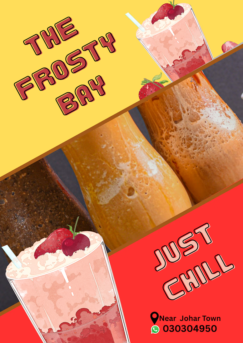
Chill mode: ON 🧊🍓
Presenting “The Frosty Bay”, a vibrant poster design for a fictional smoothie and shake spot near Johar Town. Bold typography, a diagonal color-block layout, and juicy visuals to make you crave a cold sip. Just chill! 😎
The network for creativity
Join 1.25M professional creatives like you
Connect with clients, get discovered, and run your business 100% commission-free
Creatives on Contra have earned over $150M and we are just getting started





Related posts

A little creative experiment I'm working on ✳️
Playing with bold typography, playful motion, and unexpected interactions for a UGC creator portfolio.
Still a work in progress, but having way too much fun with this one.


The big stacked WORK / RESULTS / RATES menu next to the loose purple stickers keeps the portfolio playful while the navigation stays easy to scan. Do the stickers react on hover, or are they tied to scroll?

This one made me stop scrolling....
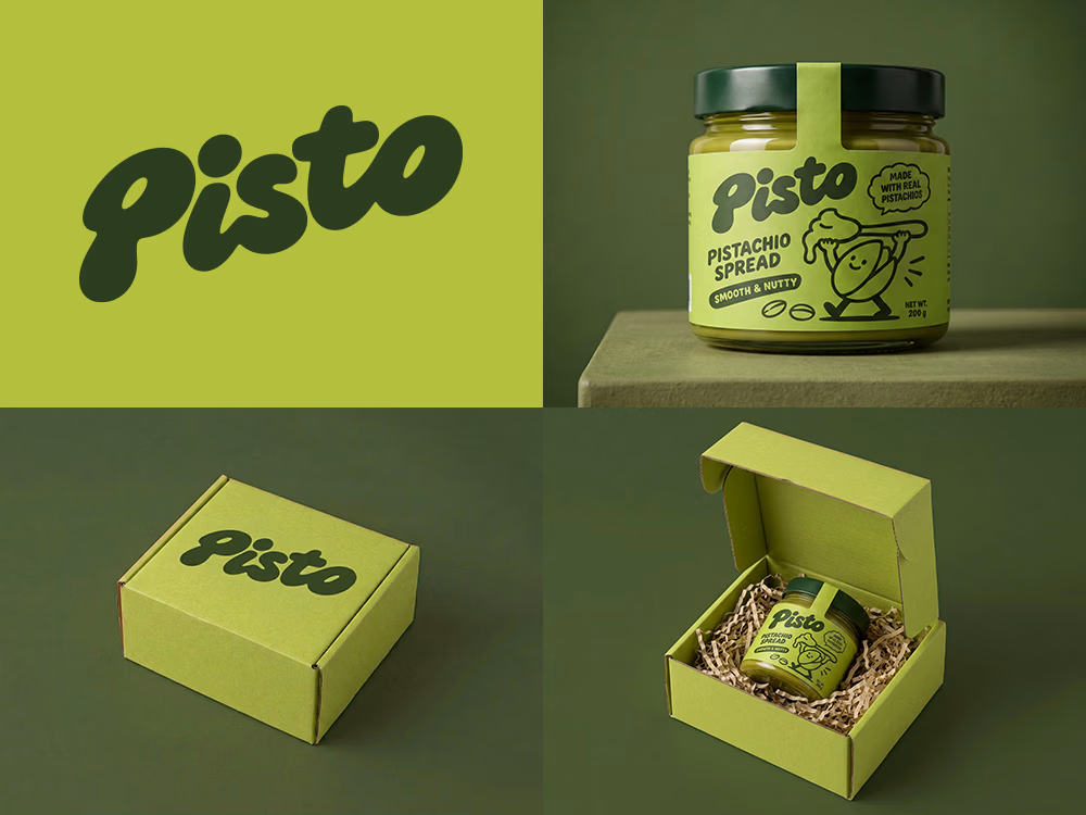
Love the playful wordmark and that olive-pistachio palette.
Sharing so others can enjoy it on their feed a little longer. 🙌

Can AI create a professional-looking logo?
I tried to create a logo concept for a pistachio spread brand using Recraft Logo Maker.
After answering a few questions about the brand and going through several variations, I finally landed on a logo that felt right and captured the fun,...

Wow

A new motion design project in the works.
Exploring a more dynamic way to showcase a ride-hailing app through a combination of 3D city environments, interface animation, and smooth transitions.
The idea is to turn a simple ride-booking experience into a visually engaging journey.
Still a work in progress. More coming soon.


The pickup and drop-off card floating over the dark street grid already reads as "a trip" before any UI shows up, nice start. Are you bringing the real booking screens in over the map later, or keeping the UI as cards in 3D space? The route line could be the thread that ties both together.