The network for creativity
Join 1.25M professional creatives like you
Connect with clients, get discovered, and run your business 100% commission-free
Creatives on Contra have earned over $150M and we are just getting started
Back to feedPost


Great prsentation and animations, wish you the best in challenge !

This was great, goodluck buddy!


Awesome storytelling
The network for creativity
Join 1.25M professional creatives like you
Connect with clients, get discovered, and run your business 100% commission-free
Creatives on Contra have earned over $150M and we are just getting started



Related posts

We can't wait to kick off the Video.js Skins Design Challenge!
Check out the guidelines to get started on your submission 🎥


Not all designers have enough courage to post rejected concepts, here's mine 😏
I understand that it looks too generic, though it looks like what the client was aiming for,
anyways, working on a new concept rn!

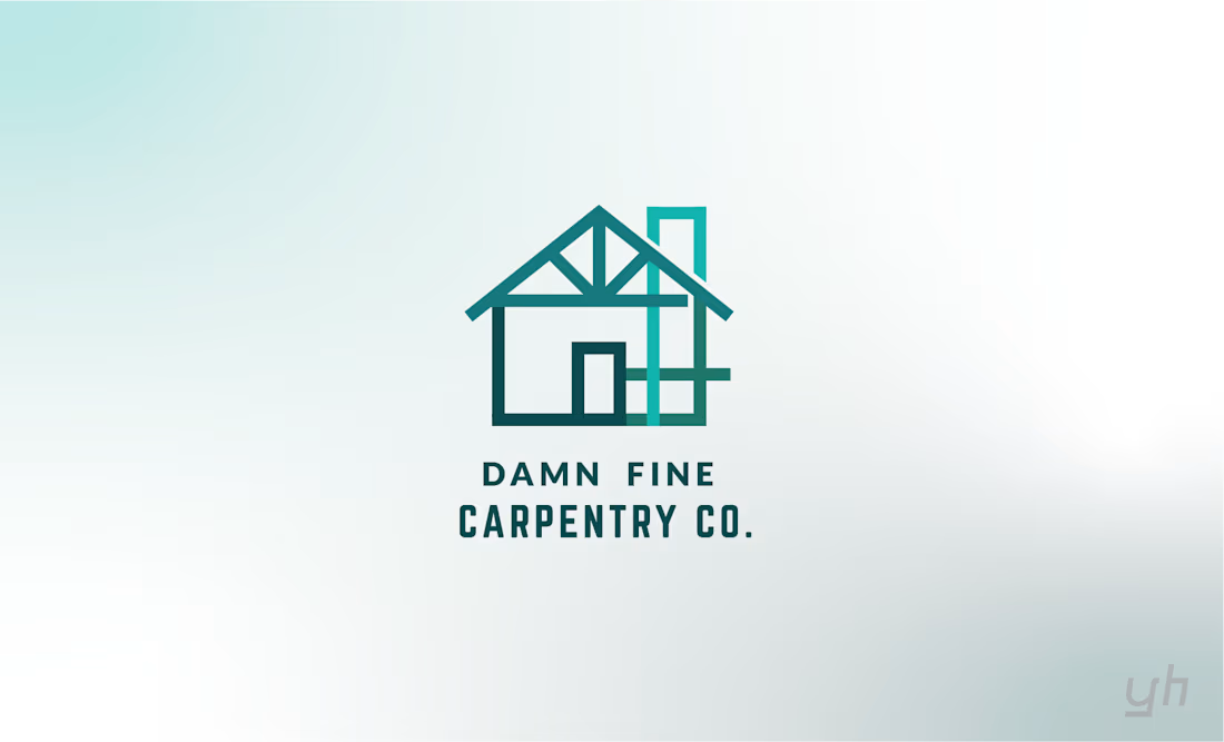

The timber-frame lines in the roof make the carpentry read instantly, which is probably also why it felt safe to the client. Was their feedback about the mark itself, or about wanting one more distinctive detail?


The green gradient bars sweeping in behind "Build your agentic workforce" make the line feel like it's moving forward, and the $100 limit card is a clean UI beat. Which of the four took the longest to get right?