The network for creativity
Join 1.25M professional creatives like you
Connect with clients, get discovered, and run your business 100% commission-free
Creatives on Contra have earned over $150M and we are just getting started
Back to feedPost

Hushku — a notification management app that gives users full control over their digital attention.
The problem:
We get 80+ notifications a day across 30+ apps. Every app fights for our attention, and we have zero control over what gets through and what doesn't. The result: constant interruptions, scattered focus, and notification fatigue. We don't have a notification problem — we have an attention problem.
The solution:
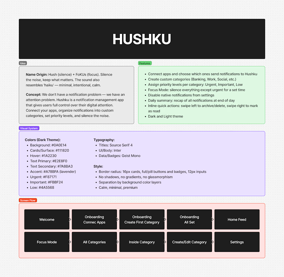
Hushku centralizes all notifications into one app and lets users organize them on their own terms. Users connect their apps, create custom categories (Banking, Work, Social — whatever matters to them), and assign priority levels to each category:
Urgent — notifications get through immediately
Important — visible in the feed but don't interrupt
Low — silenced, check when you want
The app also includes Focus Mode (silence everything except urgent for a set time), the ability to disable native notifications from connected apps, and a daily summary that recaps all notification activity.
Why I wanted it to exist:
Every notification app I've tried either blocks everything or lets everything through. None of them let me decide what matters on my own terms. I wanted an app where I define the categories, I set the rules, and my phone only interrupts me when I've decided it should. Hushku is that app.
How I built it:
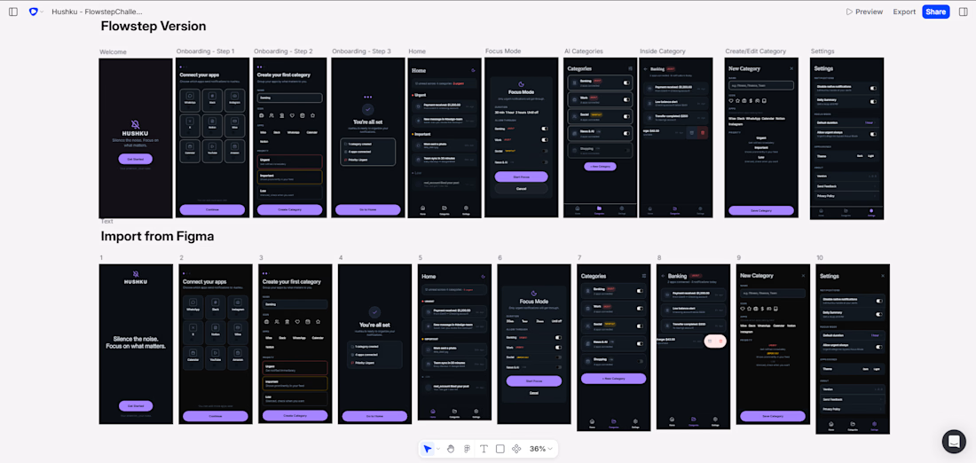
I started by planning the full product in FigJam — concept, name origin, features, visual system, and screen flow. Then I generated each screen individually in Flowstep with detailed prompts specifying exact colors (hex codes), typography rules, spacing, and content. After generation, I exported to Figma to refine consistency across all screens, then imported back to Flowstep to build the final clickable prototype.
The name Hushku comes from Hush (silence) + FoKUs (focus). The visual identity follows the same philosophy: dark, calm, minimal — nothing fights for your attention except what you've decided matters.
Screens: Welcome, Onboarding (3 steps: connect apps, create first category, confirmation), Home Feed, Focus Mode, All Categories, Inside Category, Create/Edit Category, Settings.
Proyect Link
Link to post

Love the choice of colors!
Thanks bro 😍
My pleasure!


this is such a great idea!
Thank you Isabel! It's a product I really wish existed — excited to see what the judges think 🙌😊
The network for creativity
Join 1.25M professional creatives like you
Connect with clients, get discovered, and run your business 100% commission-free
Creatives on Contra have earned over $150M and we are just getting started
Related posts


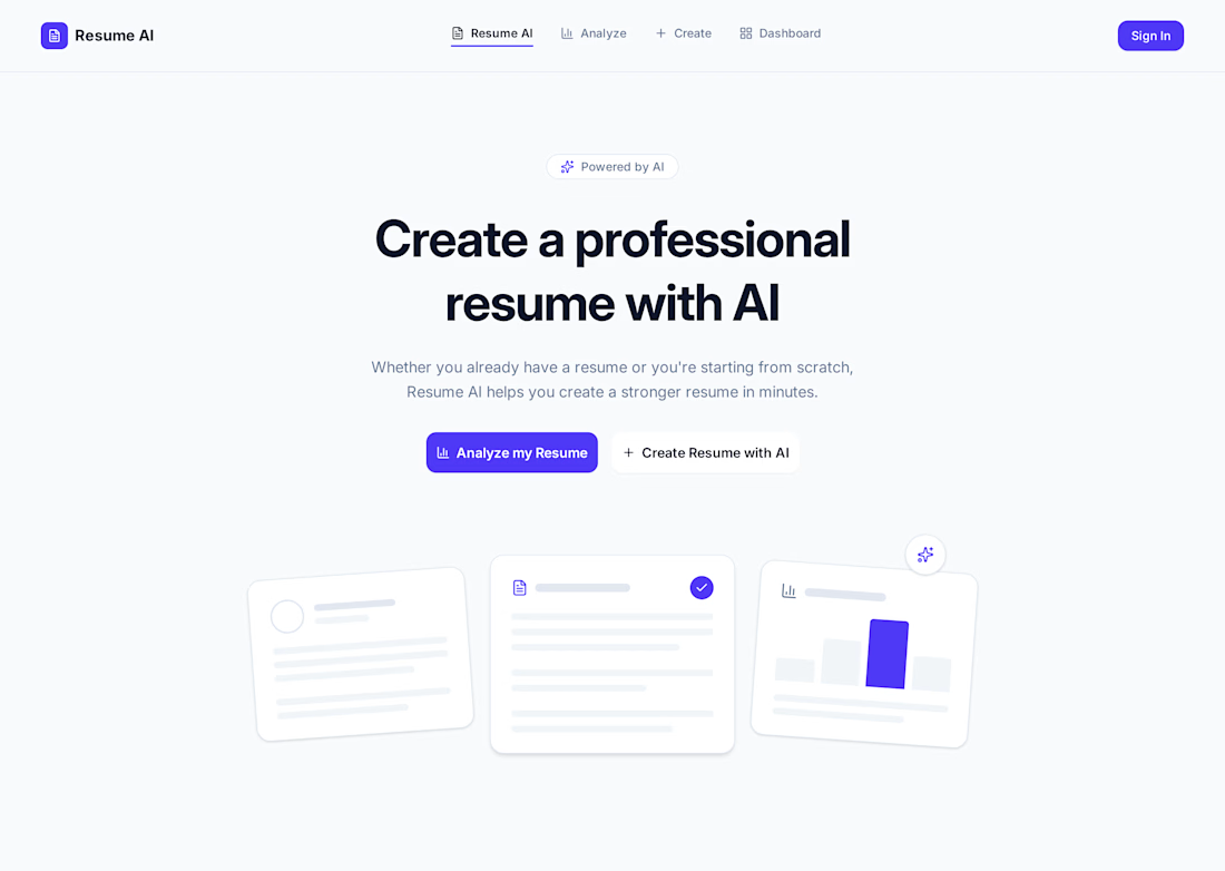
What if creating a great resume took just a few minutes?
That's the idea behind Resume AI — a simple AI-powered tool that helps you either build a resume from scratch or improve the one you already have. No complicated prompts, just a guided experience that makes the process easier for everyone.
Had a lot of fun bringing this idea to life in Flowstep, from the first prompt to a fully interactive prototype. 🚀
Thanks, @flowstep_ai, for the awesome challenge!
#FlowstepChallenge #ProductDesign #UXDesign #AI #Prototype

project link: https://app.flowstep.ai/file?activeFileId=c8f98ac8-2246-4a9b-a7fb-4447863cc4d7
linkedin post link: https://www.linkedin.com/posts/christa-maria-el-hage-34901127b_flowstepchallenge-ugcPost-7485658897421238273-OWL0/?utm_source=share&utm_medium=member_ios&rcm=ACoAAEQqyakBs9q6sTNWuVY-vt7pjEQqhDaCeUk
ReturnEasy is an AI-powered purchase management platform that helps users organize online orders, track return deadlines, monitor refunds, and manage warranties in one place. I built it because online shopping has become easier, but managing receipts, return policies, and refunds is still frustrating and time-consuming. ReturnEasy gives users a smarter way to protect their purchases and never miss important deadlines again.
#flowstepchallenge
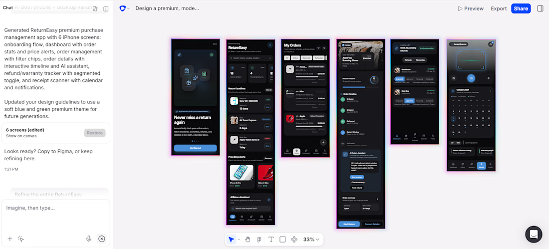

I have created 3D animation of this product, this is my submission for competition and if you like it rate it out of 10










Trending

Claude
Claude has entered the design space. How are you using Claude Design?

Contra University
Learn from expert creatives how to earn more using next-gen AI tools.
creativeaiflow
Creative AI workflows are evolving. What tools do you use, and what are their strengths and weaknesses?
freelancerlife
Freelancer life is wins, pivots, and everything in between. What’s yours right now?