The network for creativity
Join 1.25M professional creatives like you
Connect with clients, get discovered, and run your business 100% commission-free
Creatives on Contra have earned over $150M and we are just getting started
Back to feedPost


The network for creativity
Join 1.25M professional creatives like you
Connect with clients, get discovered, and run your business 100% commission-free
Creatives on Contra have earned over $150M and we are just getting started





Related posts

5 fonts on one website is a cry for help.
Every extra typeface is a new voice arguing in the same room. Pick two — one with character, one that shuts up and works — and commit.
Typography isn't decoration. It's the tone of voice your brand speaks in before a single word is read.


Pick two and commit is the right call. Which pairing do you reach for most on web projects?

✨ Modern Fashion Poster Design - STYLE ✨
Designed a clean, high-fashion poster concept focusing on bold typography and minimalist aesthetics.
Concept: Modern Fashion | Define Your Style
Tool: Canva / Photoshop
Style: Luxury, Minimal, Editorial
Open to feedback and freelance work!
#GraphicDesign #PosterDesign #FashionDesign #Canva #ContraCommunity


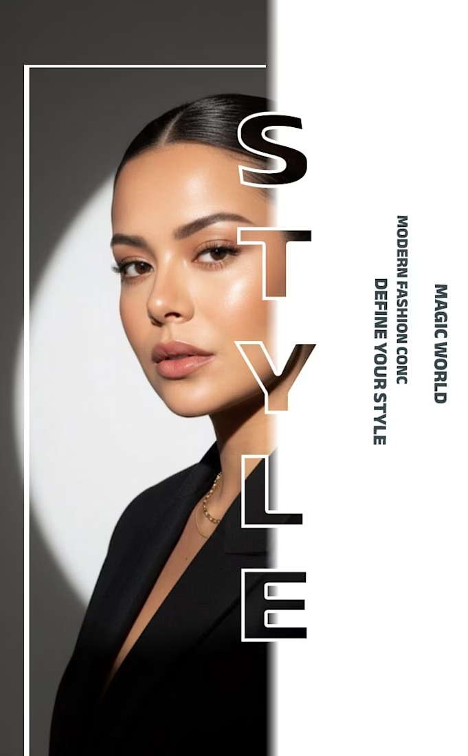
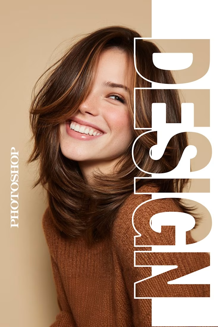
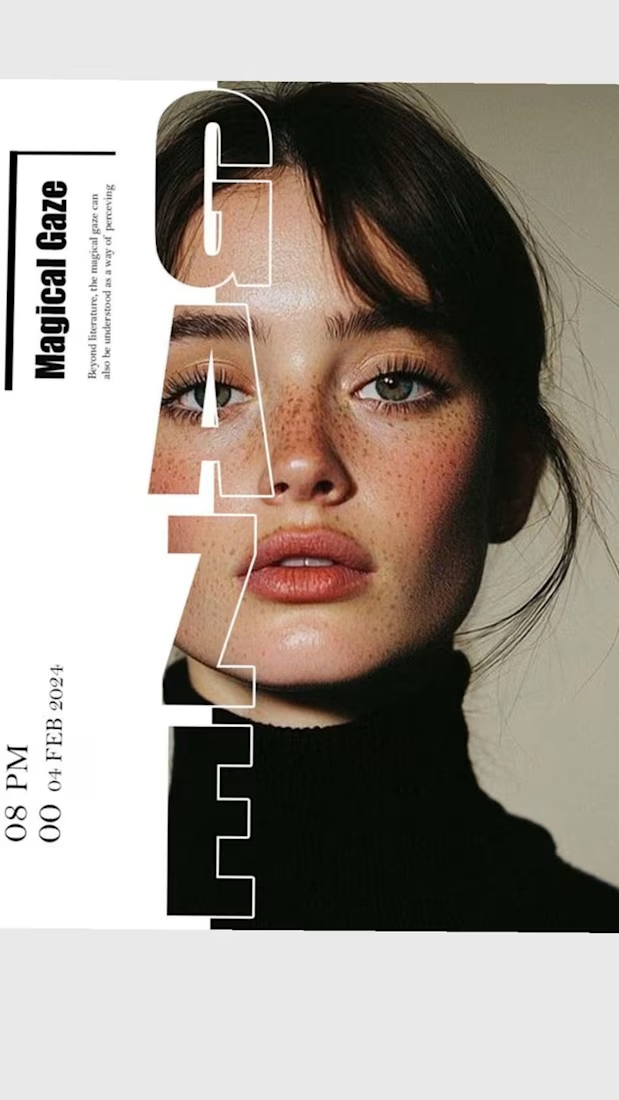

The way you let the bold type dominate the empty space really drives the luxury feel.

Very well looking composition, good sinergy

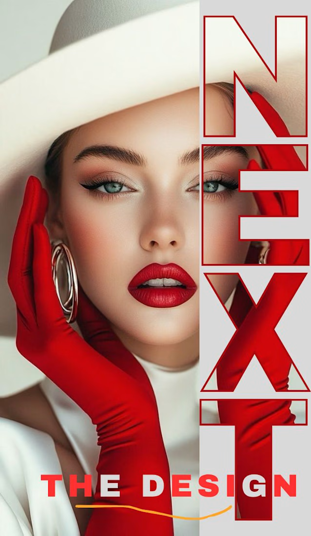
Safe or bold, which one actually makes you stop scrolling? 🤔
Sans: the serif, tight tracking, one accent color playbook every skincare brand is running right now.
Bold: the same idea, redesigned with attitude. 💅
25 voted
32%
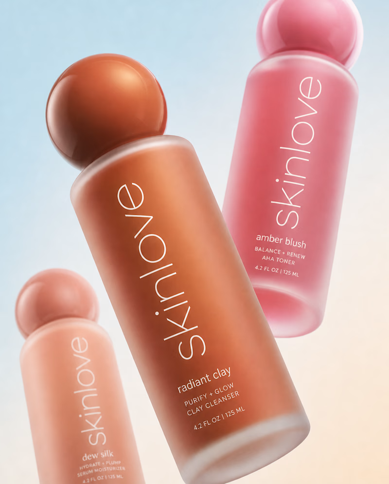
53 voted
68%
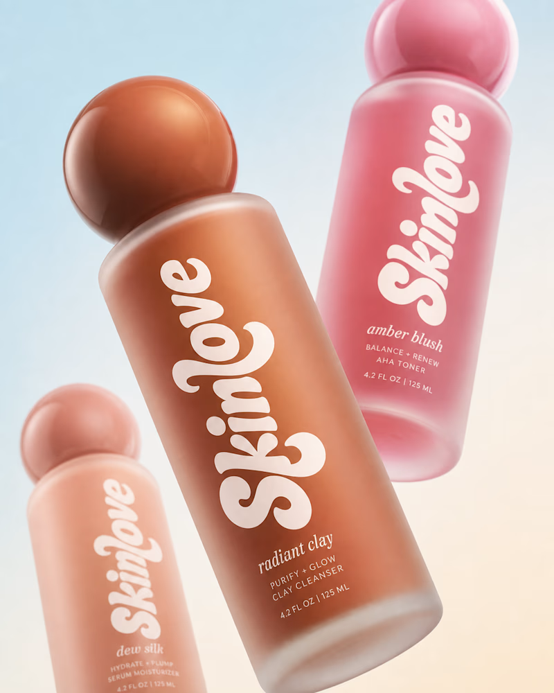
78 votes
Closed