The network for creativity
Join 1.25M professional creatives like you
Connect with clients, get discovered, and run your business 100% commission-free
Creatives on Contra have earned over $150M and we are just getting started
Back to feedPost

This swimwear grid feed is all about that effortless, sun-drenched vibe!
It uses a transformation-first style so your dream clients can practically feel the ocean breeze and see themselves living their best beach life in your pieces.
By mixing gorgeous beach day shots with authentic, UGC-style visuals, we’ve created a bright, playful, and totally scroll-stopping grid that moves away from that boring "service-based" look.
It was designed to capture that relatable summer glow-up and make sure your dream client falls in love with the brand the second they land on your profile.


The network for creativity
Join 1.25M professional creatives like you
Connect with clients, get discovered, and run your business 100% commission-free
Creatives on Contra have earned over $150M and we are just getting started





Related posts

A pool that seems to float above the mountains deserved more than a list of services.
Chris Wellness Spa sits 1,790 m above sea level in Campos do Jordão, Brazil, with a suspended pool that blends into the Mantiqueira range. My brief was a website where guests could discover each treatment and choose their pause before arriving.
So I started with water.
🌊 One concept: the ocean. Flow, tide, depth and calm.
🔹 10 treatments, 10 names: seven from the sea (Thalassa, Maris, Azure…) and three from crystals that hold the color of water (Aquamarine, Citrine, Opaline).
✳️ 10 symbols, drawn in the same family as the spa's mark: petals and circles that repeat like water returning to the shore.
📸 Art direction and image curation: every photo was chosen to feel like the same calm, from the infinity pool to the therapist's touch.
The result is a menu you can feel before you book, built to be found on Google and cited by AI assistants.
Full case study in my profile → Chris Wellness Spa
What's the most unusual brief you've turned into a brand concept?

Naming the treatments after the sea and crystals is a lovely touch. The petal symbols tie it together well.


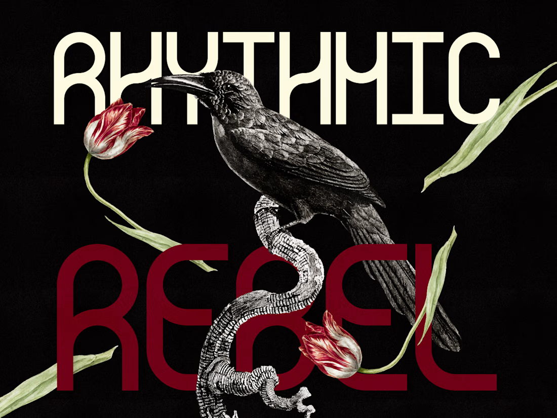
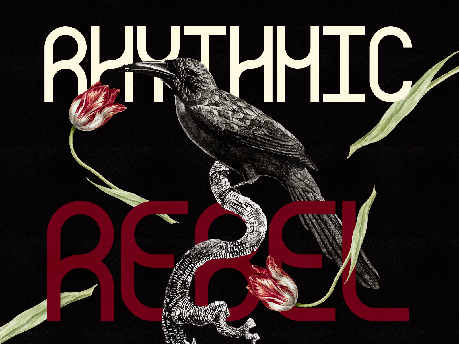
A grid-based monospace typeface blending clean, flowing forms with a subtle rebellious edge. Designed to bring character to identities, layouts and more.
➡️ LICENCE IT HERE ⬅️


See full case study here: https://contra.com/p/ZWZoZAXR-rhythmic-rebel-typeface

A little creative experiment I'm working on ✳️
Playing with bold typography, playful motion, and unexpected interactions for a UGC creator portfolio.
Still a work in progress, but having way too much fun with this one.


The big stacked WORK / RESULTS / RATES menu next to the loose purple stickers keeps the portfolio playful while the navigation stays easy to scan. Do the stickers react on hover, or are they tied to scroll?