The network for creativity
Join 1.25M professional creatives like you
Connect with clients, get discovered, and run your business 100% commission-free
Creatives on Contra have earned over $150M and we are just getting started
Back to feedPost
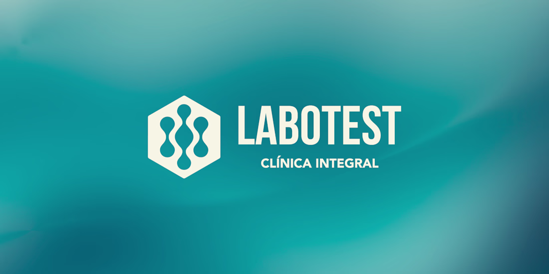
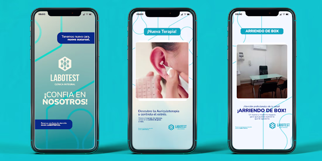
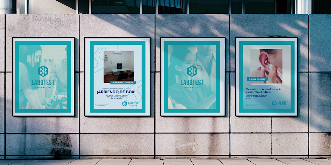
Labotest is a local Chilean healthcare company experiencing steady growth, now expanding across three regions of the country. The opening of its new branch presented the perfect opportunity to unify and modernize its visual identity.
This project is more than a rebrand — it’s a statement of purpose. Labotest seeks to position itself as a reliable and human-centered solution for the health of the communities it serves.
The new identity reflects that commitment: a clear, approachable, and competitive brand built to represent trust, care, and professional excellence. Through this system, Labotest strengthens its visual consistency across all platforms, while reaffirming its mission to bring health closer to people.

@Verdugo Graph great work
Appreciate it, thank you! 🙏
@Verdugo Graph super cool work!!
Thanks a lot, Celia! Really glad you liked it 🙌
@Verdugo Graph the teal color palette is perfect for healthcare! 👨⚕️ Consistent branding across touchpoints is spot on
Thanks Rayan! Exactly — the teal tone was chosen to convey trust and calm, which fits healthcare perfectly. 💡
@Verdugo Graph Love the brand’s color palette
Thank you, Fatemeh! The color palette was a key part of the brand’s message, so I’m happy it stands out. 💙
The network for creativity
Join 1.25M professional creatives like you
Connect with clients, get discovered, and run your business 100% commission-free
Creatives on Contra have earned over $150M and we are just getting started
Trending
Claude
Claude has entered the design space. How are you using Claude Design?
Contra University
Learn from expert creatives how to earn more using next-gen AI tools.
MagicPath
The canvas is infinite, and exploration is becoming the workflow. How are you using MagicPath?
creativeaiflow
Creative AI workflows are evolving. What tools do you use, and what are their strengths and weaknesses?
freelancerlife
Freelancer life is wins, pivots, and everything in between. What’s yours right now?