The network for creativity
Join 1.25M professional creatives like you
Connect with clients, get discovered, and run your business 100% commission-free
Creatives on Contra have earned over $150M and we are just getting started
Back to feedPost
From screens to experience. ✨
A closer look at the Sage Bio website - designed to make complex health data feel simple, intuitive, and human.
From lab testing and biomarker insights to AI-powered health guidance, every interaction was designed around one idea:
Make health data easier to understand.


Very Well!

Thank you!

Thank you!

Biomarker panels usually break at the out-of-range moment — the number is easy, the "what now" is the design problem. Curious how you handled a result that's flagged but not urgent.
The real UX challenge isn’t surfacing the out-of-range number; it’s helping users understand what it means and what to do next – especially when it’s flagged but not urgent. Separating severity from urgency feels key here.

Wonderfull!
Thank you!
The network for creativity
Join 1.25M professional creatives like you
Connect with clients, get discovered, and run your business 100% commission-free
Creatives on Contra have earned over $150M and we are just getting started





Related posts


Upgoating this..... Converting complex healthtech Figma components into a seamless, high-trust Webflow build is no easy feat—really smooth execution!

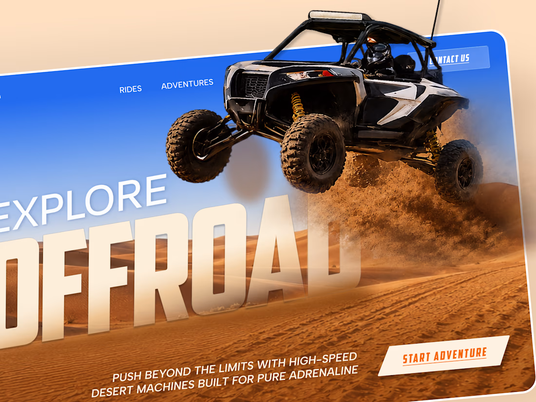
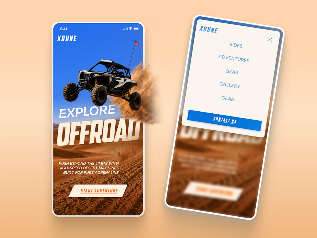
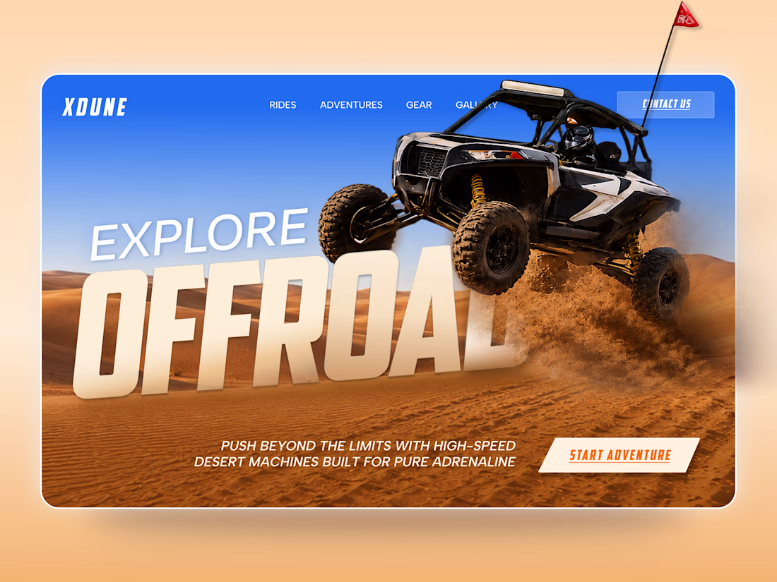
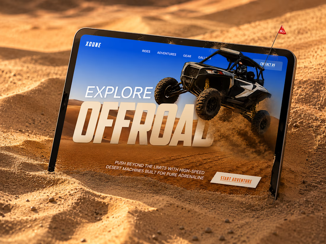
XDUNE — Off-Road Adventure Landing Page
A bold landing page concept built around speed, freedom, and off-road adventure 🔥
The visual direction combines desert landscapes, oversized typography, and a dynamic vehicle composition to make the experience feel energetic from the first screen
Special attention was given to:
• Strong action-focused hero composition
• Bold typography and clear hierarchy
• Desert-inspired visual atmosphere
• Adventure-focused CTA
• Responsive mobile experience
• Simple and clean navigation
The result is a high-energy landing page that feels fast, adventurous, and made for people who want to get off the road
Looking to create a bold website for an automotive, outdoor, or adventure brand? Let’s connect 🚀


love the vibe