The network for creativity
Join 1.25M professional creatives like you
Connect with clients, get discovered, and run your business 100% commission-free
Creatives on Contra have earned over $150M and we are just getting started
Back to feedPost

Need a fast, modern, and high-performing website? I can help you build or improve your WordPress site.
💻 Services Offered:
✔️ Custom WordPress Website Development
✔️ Elementor / Page Builder Design
✔️ Website Redesign & Improvements
✔️ Speed Optimization
✔️ Bug Fixes & Layout Issues
✔️ Mobile Responsive Design
✔️ SEO-Friendly Setup
⚡ Clean design. Fast loading. Fully responsive.
🎯 Perfect for business, portfolio, or eCommerce websites.
📩 Let’s build your website today—message me now for a free consultation!


The network for creativity
Join 1.25M professional creatives like you
Connect with clients, get discovered, and run your business 100% commission-free
Creatives on Contra have earned over $150M and we are just getting started
Related posts

Proper Form — Social Media Branding System
A flexible social media system created for Proper Form as part of the wider brand identity.
The template system was designed to adapt across different post formats, banners and platforms while maintaining a consistent visual language.
Rather than repeating one rigid layout, the system gives the brand room to vary composition, imagery and content while remaining clearly recognizable.
Created by Lepisov Branding in collaboration with Creative Mints.
Logo design: Ilya Gorchanyuk
Creative direction: Dmitry Lepisov
Brand identity + social system: Lepisov Branding × Creative Mints


This is how a social system should work: strong enough rules that the brand reads at thumbnail size, loose enough that the feed never looks copy-pasted. Do you hand clients a Figma kit for this, or build it in something their team edits themselves?


We’re testing two filtering layouts for a template library.
Top Filters
The filters are placed above the content. This option feels lighter, leaves more space for the cards, and works well when there are only a few main categories.
Sidebar Filters
The categories remain visible in the sidebar. This makes the available options easier to scan and works better for more complex filtering, but takes up some of the content space.
Which layout would help you find the right template faster?

24 voted
39%
37 voted
61%
61 votes
Closed

Such a clean presentation. You can tell a lot of thought went into this.

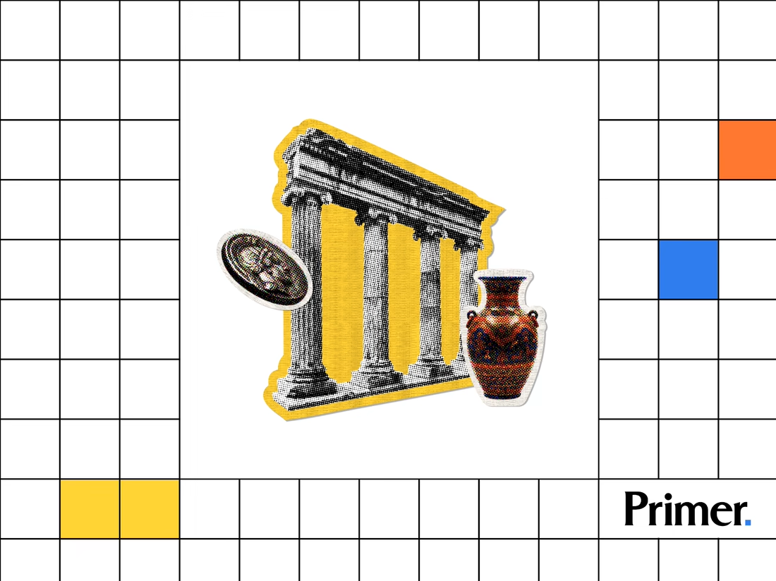
Just posted a new case study featuring the thumbnail artwork I designed for Primer.com. Check it out! 📚

Nice! Thumbnail artwork can make such a difference in how content catches attention. Looking forward to seeing how you approached this project!