The network for creativity
Join 1.25M professional creatives like you
Connect with clients, get discovered, and run your business 100% commission-free
Creatives on Contra have earned over $150M and we are just getting started
Back to feedPost

The gasp.
That half-second when the doors open and someone sees the room for the first time.
A mother with her hand over her mouth. A groom who forgets to breathe. A guest whispering “oh my god” to no one.
You can’t plan a gasp. But you can design for one.
The fear is that it won’t happen. Every host carries it quietly: what if it just looks like a hall with flowers?
An empty venue. Bare walls. A vision you can’t quite see yet.
Lumière turns that fear into the reveal. Event design, styling and production that turn an ordinary room into another world.
So we built their website to give you a preview of that moment.
Candlelight on the very first screen. “An atmosphere is not an accident.” A before-and-after slider where a plain venue becomes somewhere you’d cross a city to stand inside. Four calm stages, and one line that finally lets you breathe: “On the day, the planning becomes invisible.”
What you get isn’t a prettier room.
It’s walking in, hand on your heart, thinking: it’s exactly how I felt it would be.
Don’t plan a party. Plan the gasp.
#BuildingInPublic #WebDesign #UXDesign #CreativeDirection #BrandDesign


The network for creativity
Join 1.25M professional creatives like you
Connect with clients, get discovered, and run your business 100% commission-free
Creatives on Contra have earned over $150M and we are just getting started





Related posts


Does your coaching program look like a method, or like a list?
A client of ours teaches a three-stage method for course creators. In the first draft it lived in a bullet list, and nobody remembered it.
So we gave it a shape:
One line connects the stages. A visible path tells the reader there is an order, and that they are somewhere on it.
The middle stage gets the weight. Stage two is where the real work happens, so it's the only dark card. The eye lands there first.
Every stage is a verb. Map, Build, Launch. A method people can repeat is a method people buy.
A list explains. A path promises progress.
How do you show a method on a sales page?

I've spent years obsessing over the stuff nobody notices on a website. Until it's missing.
AI can now build a whole site in an afternoon. I think that's great.
But it still can't decide what feels right.
I don't think AI is the problem. It just stops at "it works". The last part, the spacing, the type, the way things move when you scroll, still needs someone who cares about it.
That's the part I've always loved doing. So I made a small thing around it: you bring the site AI built, I finish it in Webflow.
It's called Verdikt https://verdikt.studio


Agreed. AI gets you a working layout fast, but spacing and type rhythm are where it still feels off. I'd add forms and mobile checks to that list too. What's the most common fix people bring you?

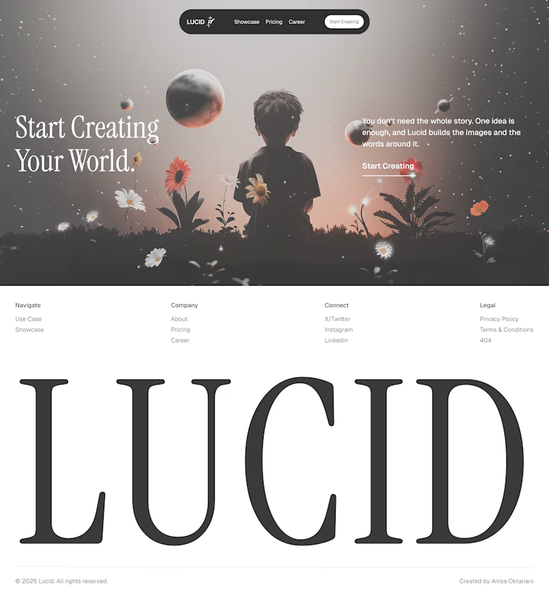
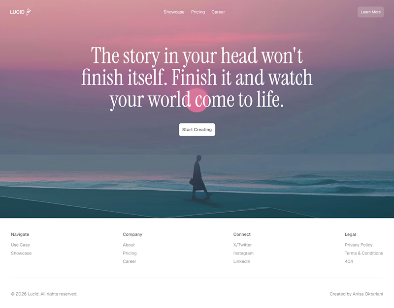
Same company, two different concepts for an AI storytelling platform. Which one suits better?
31 voted
86%
5 voted
14%
36 votes
Closed

Left!