The network for creativity
Join 1.25M professional creatives like you
Connect with clients, get discovered, and run your business 100% commission-free
Creatives on Contra have earned over $150M and we are just getting started
Back to feedPost
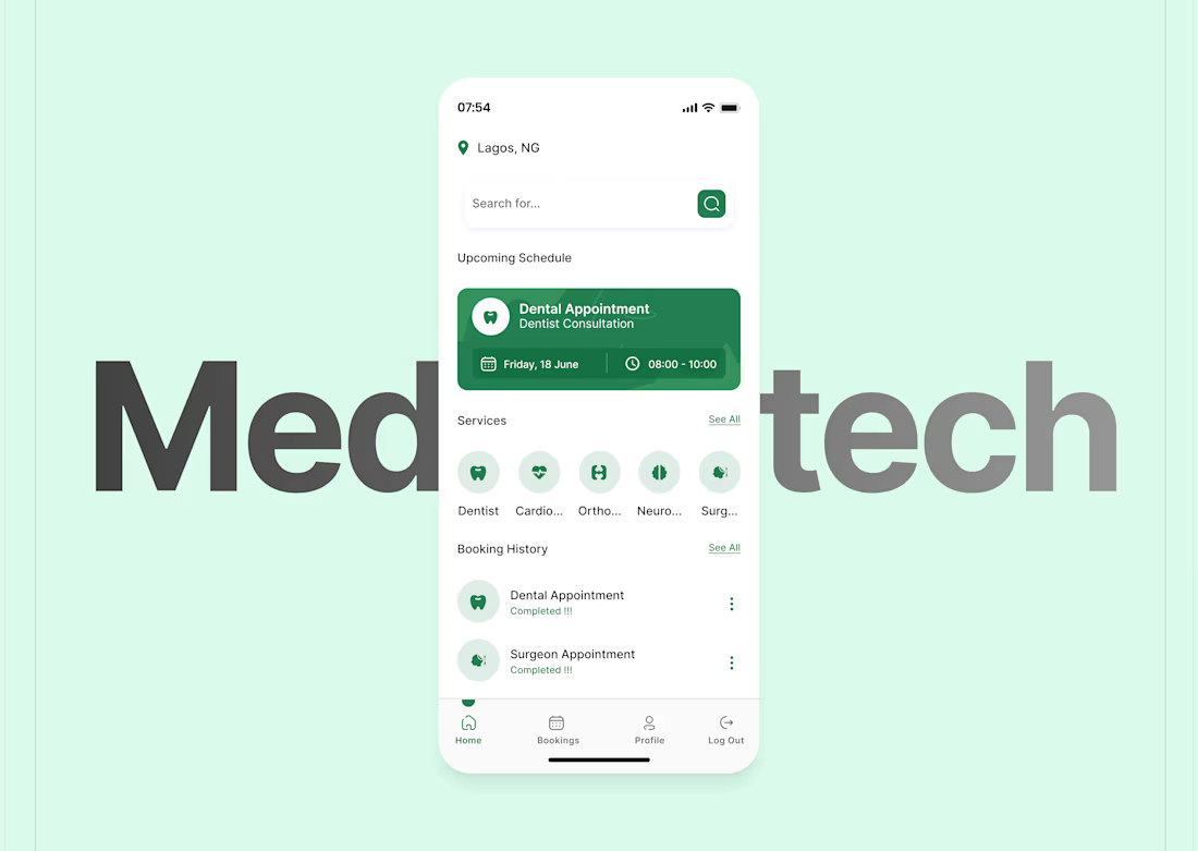
Most healthcare apps try to feel “advanced.”
This one tries to feel calm.
When someone opens this screen, they’re not exploring.
They’re checking.
They’re confirming.
They’re making sure nothing went wrong.
So the design leads with reassurance:
• Your appointment is set
• Here’s the time
• Here’s what’s next
No urgency.
No noise.
No pressure to “do more.”
In healthcare UX, calm isn’t a nice-to-have.
It is the feature.


Pretty clean work David 😍

Thanks bruh :)
The network for creativity
Join 1.25M professional creatives like you
Connect with clients, get discovered, and run your business 100% commission-free
Creatives on Contra have earned over $150M and we are just getting started
Related posts


I like the first option more. It balances all the graphic elements well.

What if web typography felt more like a magazine layout? 📖
Pretext is making text layout insanely fast, which means the kind of editorial, print-style design we love is finally possible on the web…and interactive.
For creative freelancers, that’s huge.
No more rigid text blocks - now it’s: • text flowing around elements • dynamic, real-time layouts
I tested it by generating my own layout in Magicpath using a custom prompt - ended up building an interactive “Pretext Layout Demo” where a draggable orb reshapes the layout in real time. As it moves, the text flows, splits, and wraps around it, turning a static page into something that actually feels alive.
🤔 Curious how you’d use something like this - or where you see this going next?


Love the imagery, especially the first one with the ascii-like effect. 🤩


Trending


FLORA
Reusable workflows are replacing one-off prompts in creative AI. Share what you're building in FLORA.
portfolioreview
The best portfolios tell a story, not just show a grid. Share yours for feedback.
brandguidelines
Brand guidelines are becoming living systems. What are you building for your clients?
freelancerlife
Freelancer life is wins, pivots, and everything in between. What’s yours right now?
aivideo
AI video tools are moving at warp speed. Which ones are you experimenting with?