The network for creativity
Join 1.25M professional creatives like you
Connect with clients, get discovered, and run your business 100% commission-free
Creatives on Contra have earned over $150M and we are just getting started
Back to feedPost

Squire - Finance AI - Homepage
Hey everyone!
Sharing the homepage we designed for Squire, a finance AI platform built to make financial operations feel clearer and more connected. We kept the layout clean and used focused dashboard previews to make the product feel approachable while still showing depth. What catches your eye first?


The network for creativity
Join 1.25M professional creatives like you
Connect with clients, get discovered, and run your business 100% commission-free
Creatives on Contra have earned over $150M and we are just getting started
Related posts

If a doctor has to hunt for a patient’s vital signs, the dashboard is getting in the way of care.
Doctors don’t need another dashboard. They need the full patient picture at a glance.
In healthcare, confusing UX isn’t just frustrating. It can delay understanding when every second matters.
DocuVerse brings vital signs, patient metrics, and health trends into one clear view, making complex health data easier to scan and understand.
Less searching. More clarity. Better informed decisions.
That’s what healthcare UX should deliver.
Would you design a healthcare dashboard for more data, or better decisions?


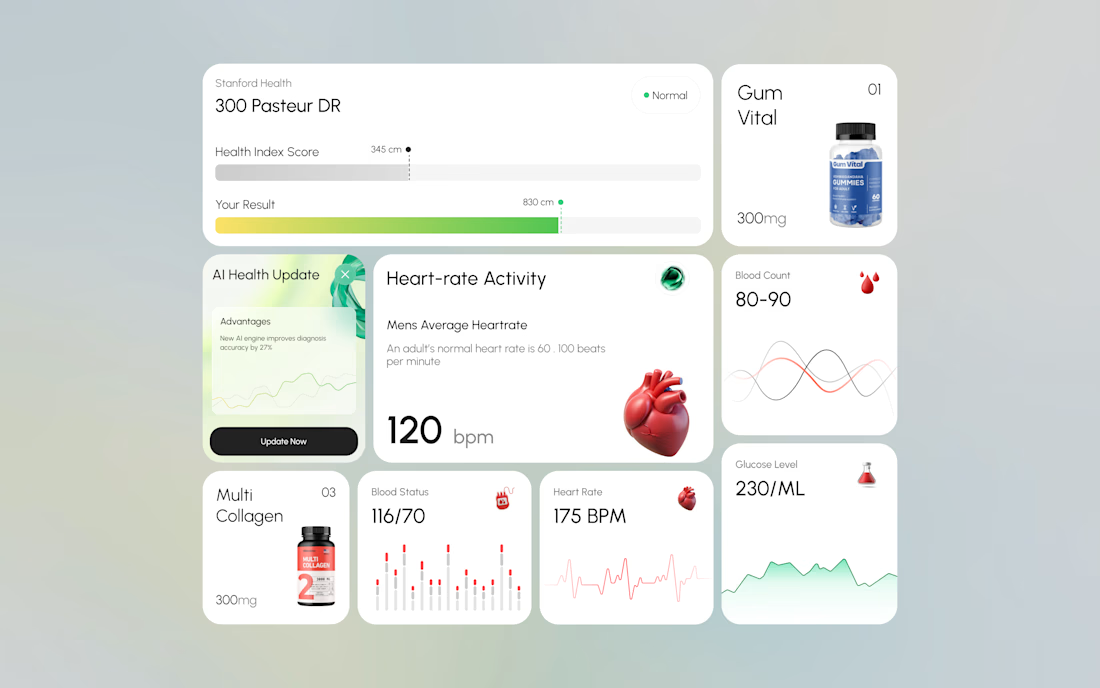
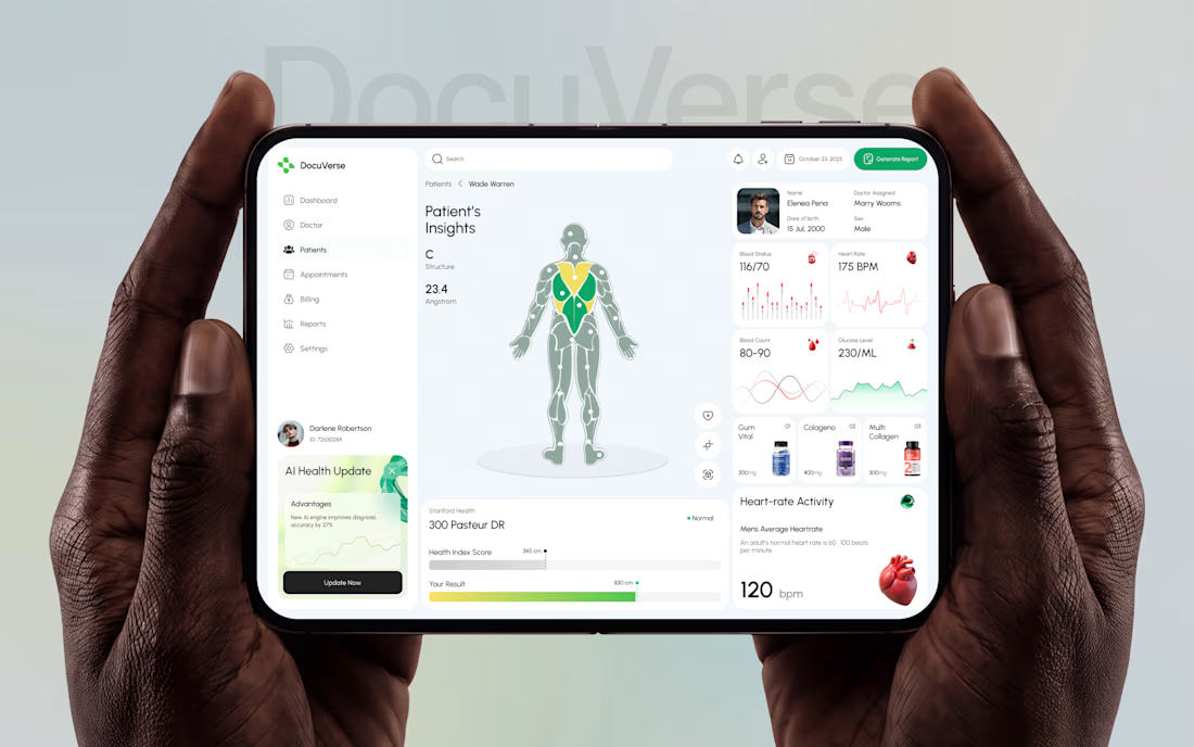

A clearer patient overview can make complex health data feel far less overwhelming. That’s thoughtful UX.


We’re choosing the motion for an AI analytics product demo, and I can’t decide.
Both clips show the same flow. Someone asks a question in plain English. The agent checks permissions, plans the query, runs it past guardrails and builds the dashboard.
1. A walks you through each step as it happens.
2. B skips the steps and drops you straight onto the result.
A shows the work. B shows the speed. For a landing page I keep going back and forth.
Which one would make you trust the product more? Comment A or B, and tell me why.
3 voted
100%
0 voted
0%
3 votes
Closed

I think according to your query the output should consist on a list of clients with late invoices rather then showing charts etc,

AI Freight landing page design completed for 5U AI.
They raised $3.2M recently.
I'm open for the new projects. 🤝

this is amazing website. smooth animation love the visual


