The network for creativity
Join 1.25M professional creatives like you
Connect with clients, get discovered, and run your business 100% commission-free
Creatives on Contra have earned over $150M and we are just getting started
Back to feedPost

Customer Assistant at Veo


The network for creativity
Join 1.25M professional creatives like you
Connect with clients, get discovered, and run your business 100% commission-free
Creatives on Contra have earned over $150M and we are just getting started
Challenges
View all


Related posts




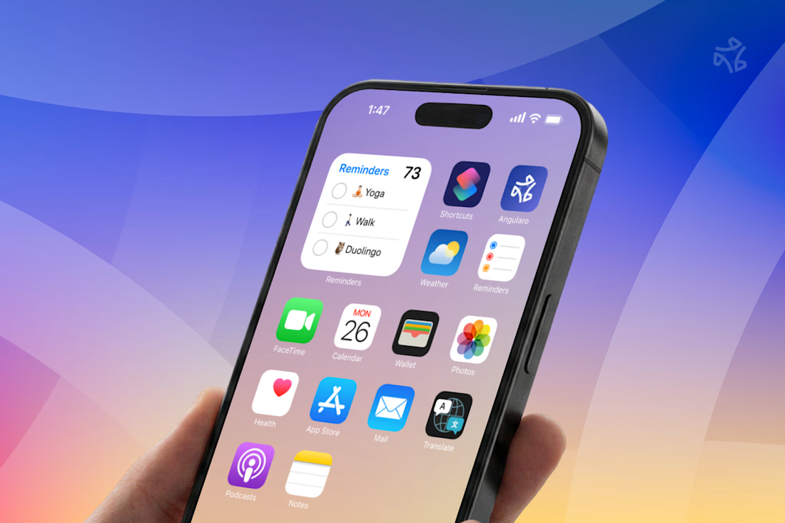
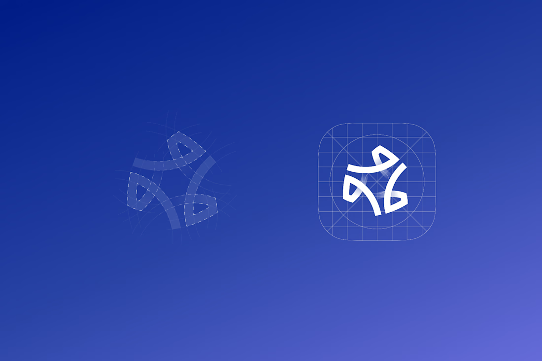

The wide counters are what let it survive the home screen — in that grid of other app icons it still reads as one shape instead of collapsing into noise, which is the real test for a CRM mark. Is the gradient locked to the logo, or does it shift across the product surfaces?

Design doesn't stop at the product.
You can build a great product, launch a great brand, and still need a strong way to make people notice it, understand it, and remember it.
I'm Damilola, a Product Designer who also creates social and marketing designs that help brands communicate with intention.
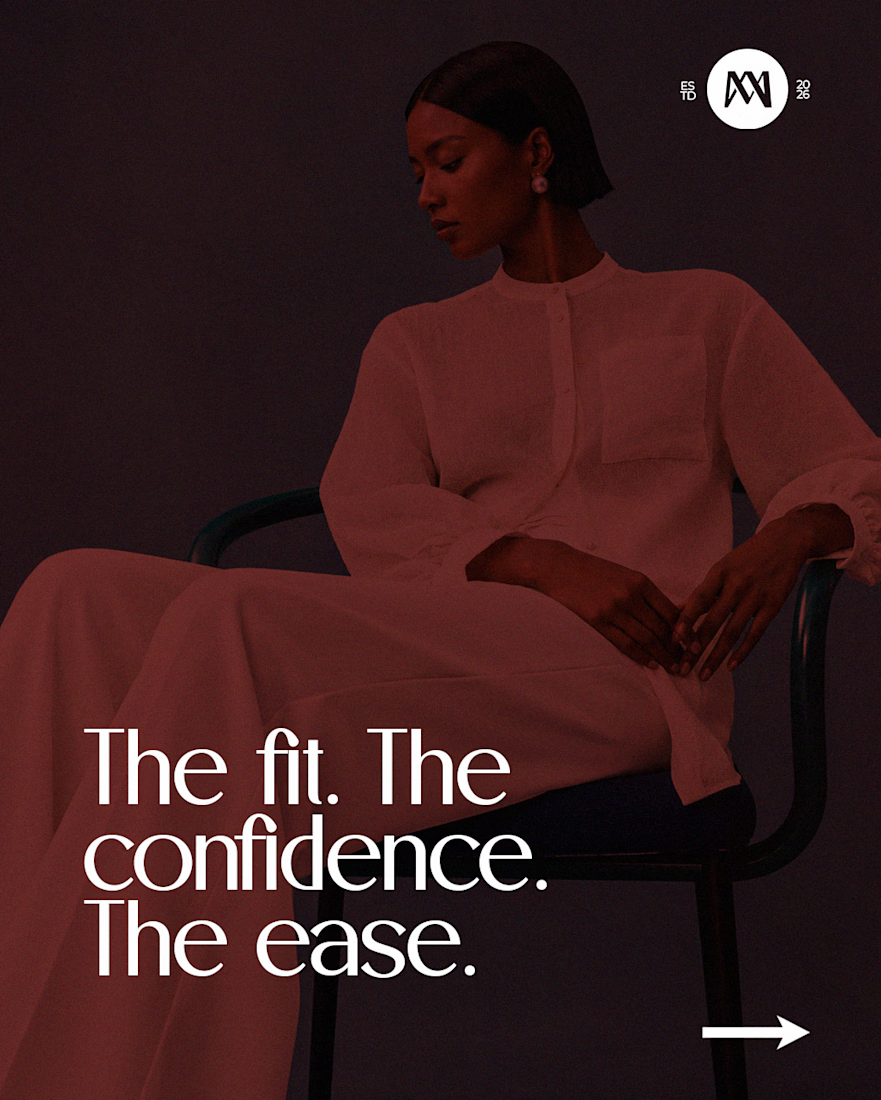
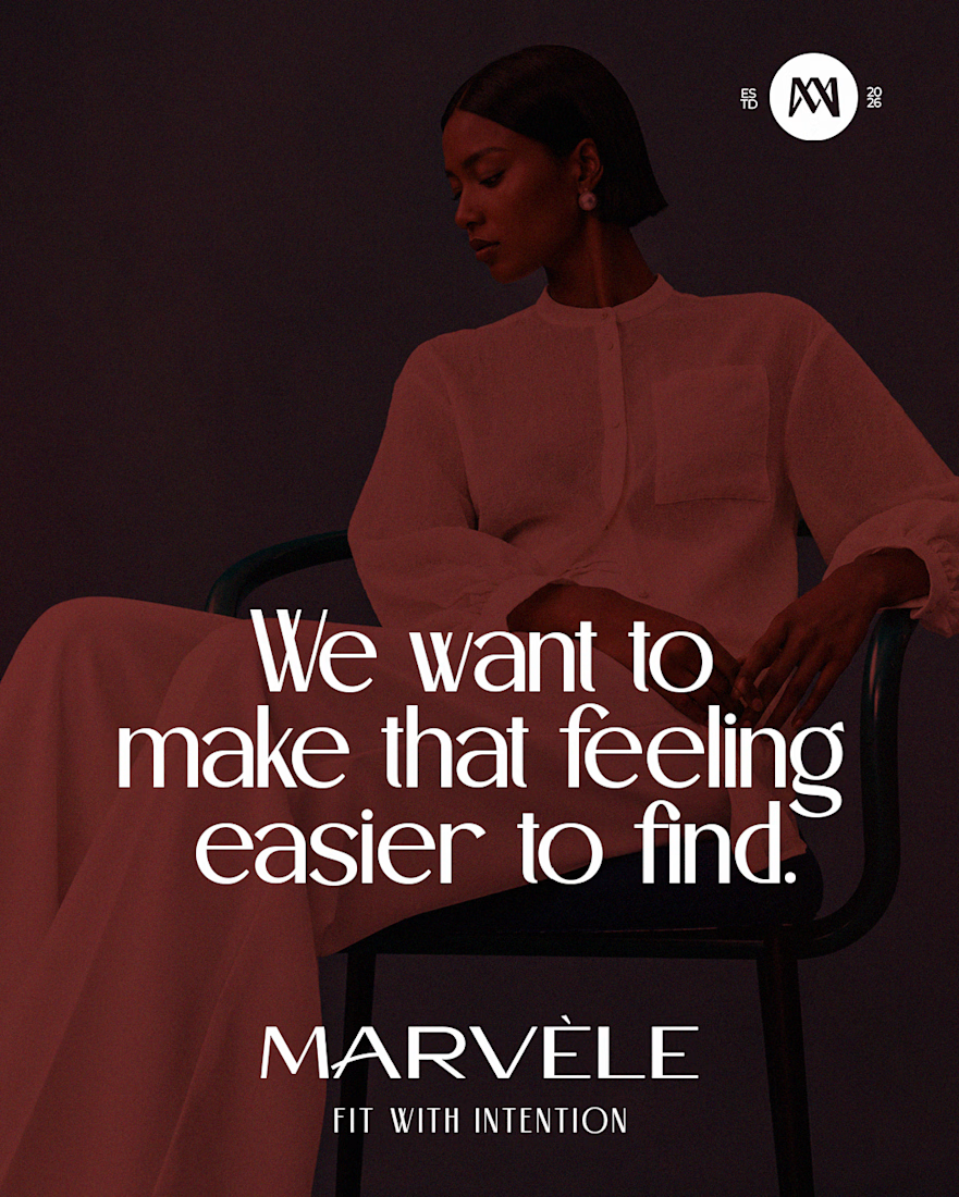
These are a few pieces I created for Marvèle, a women's fashion brand focused on elevated, intentional dressing.
The goal wasn't simply to make the feed look good.
It was to translate the brand's personality into visuals — from the imagery and typography to the messaging and overall art direction — so every piece feels like part of the same brand.
Because once you've built something worth choosing, you need to communicate why it's worth choosing.
So yes, I'm a Product Designer. Social Media Designer.
When your brand needs strong visual communication beyond the product, I can help with that.
What's your take on these designs?
I'd love to hear what you think.

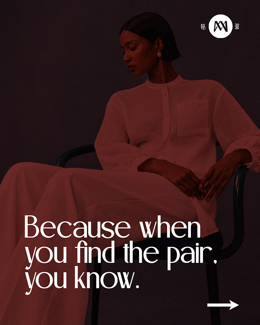

"Once you have built something worth choosing , you also need to communicate the why" that's very deep the way a product is being communicated is really important.

So Smooth


A one-take cinematic journey through time, from the past to the future, and into collapse.
Built entirely with Seedance 2.5 using continuous camera motion and seamless environment transitions to explore how time evolves around a single character.
Workflow: Generated in CapCut...