The network for creativity
Join 1.25M professional creatives like you
Connect with clients, get discovered, and run your business 100% commission-free
Creatives on Contra have earned over $150M and we are just getting started
Back to feedPost

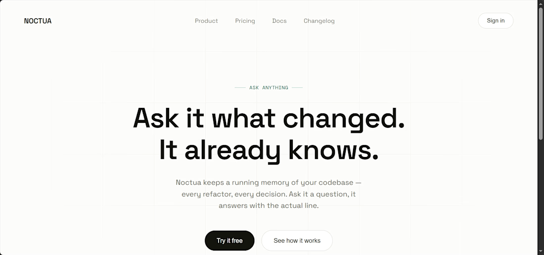
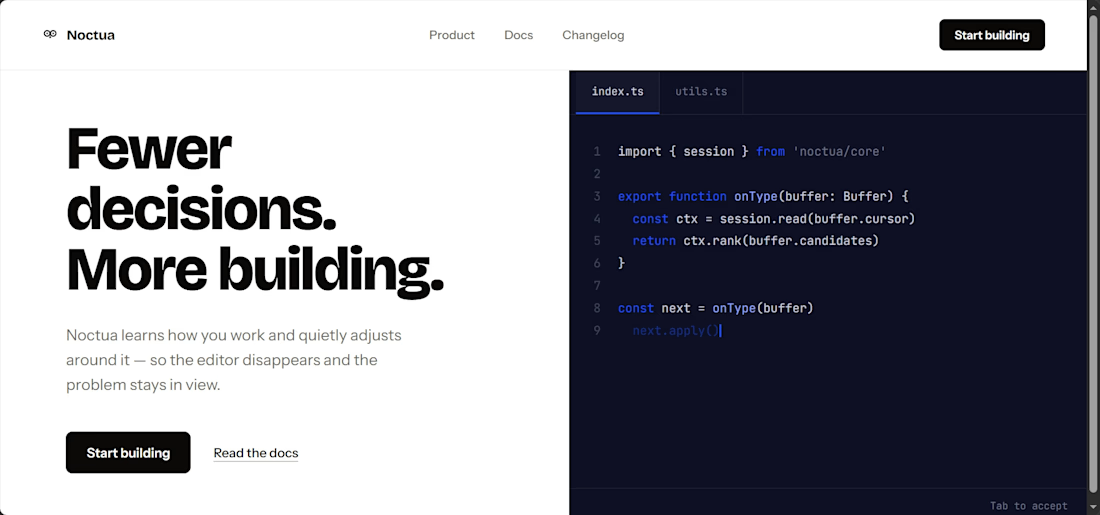
I explored two landing page directions for Noctua, an AI code editor. One side features a dark-mode code preview next to bold copy; the other goes for a clean, centered layout with subtle structural grids.

The network for creativity
Join 1.25M professional creatives like you
Connect with clients, get discovered, and run your business 100% commission-free
Creatives on Contra have earned over $150M and we are just getting started

Challenges
View all


Related posts

Just came across this website and really liked the way they’ve combined clean design with immersive interactions.
The smooth animations, typography, transitions, and product storytelling make the whole experience feel premium without being overwhelming.
Website: otsuka-air.jp
What stood out to me:
• Smooth and thoughtful interactions
• Clean visual hierarchy
• Strong product storytelling
• Minimal yet engaging UI
• Great use of motion throughout the experience
Would love to know what you guys think about this design approach.
What’s your favorite detail on this site? 👀


Amazing!

Pet shopping, with a little more personality. 🐾
Introducing WIGGLE CLUB — my latest pet-commerce website concept.
Bold typography, cobalt blue, acid-yellow accents and editorial photography bring the brand to life across the shopping experience.
The design includes:
✦ Detailed desktop and mobile layouts
✦ Reusable Figma components and Auto Layout
✦ A connected design system
✦ Product discovery, wishlist and checkout prototype flows
From the homepage to the smallest shopping detail, the goal was a playful brand experience with clear, practical navigation.
What catches your eye first—the typography, photography or layout?
#WebDesign #Figma #UIUXDesign #EcommerceDesign #DesignSystem


awesome
Your website has the right to remain silent.Unfortunately, so do your enquiries.
⚖️ If finding your contact button takes six pages and a witness statement, something needs to change.
So I put a website on trial.
The charges? Hiding the next step. Turning a simple purchase into homework.
Mistaking confusion for “exclusivity.”
Behind the courtroom jokes is a practical design principle: people should understand what you offer, why it matters and what to do next.
This MONOFORM concept explores that through architectural imagery, detailed product layouts and a clearer mobile experience.
I design and build with Framer, Webflow and Next.js.
Planning a launch or redesign? Send me your current website and what you need it to do.
What website feature deserves a day in court?
My vote: pop-ups that appear before you’ve read a single sentence.
MONOFORM is a fictional brand concept.
#WebDesign #Framer #Webflow #Nextjs


I don't think that the website has the right to remain silent honestly. Otherwise - why do you do it, right? Although I bet it was a rethorical!