The network for creativity
Join 1.25M professional creatives like you
Connect with clients, get discovered, and run your business 100% commission-free
Creatives on Contra have earned over $150M and we are just getting started
Back to feedPost

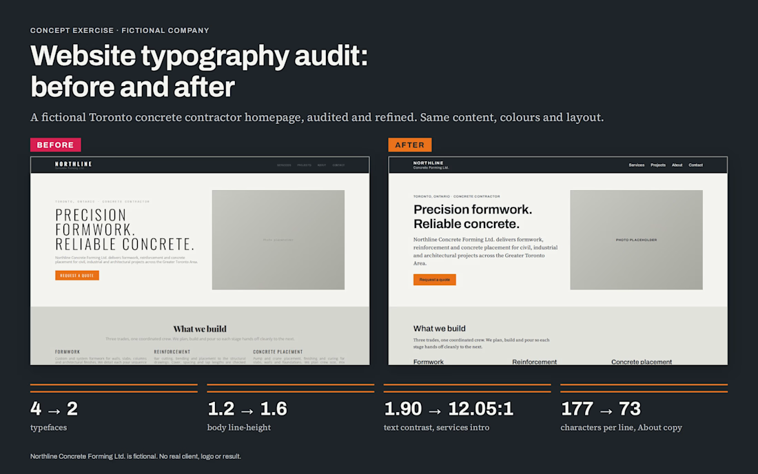
A typography audit I did as a concept exercise for a fictional Toronto concrete contractor, Northline Concrete Forming Ltd. It is not client work. No real company, logo or result is shown.
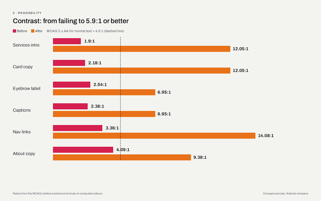
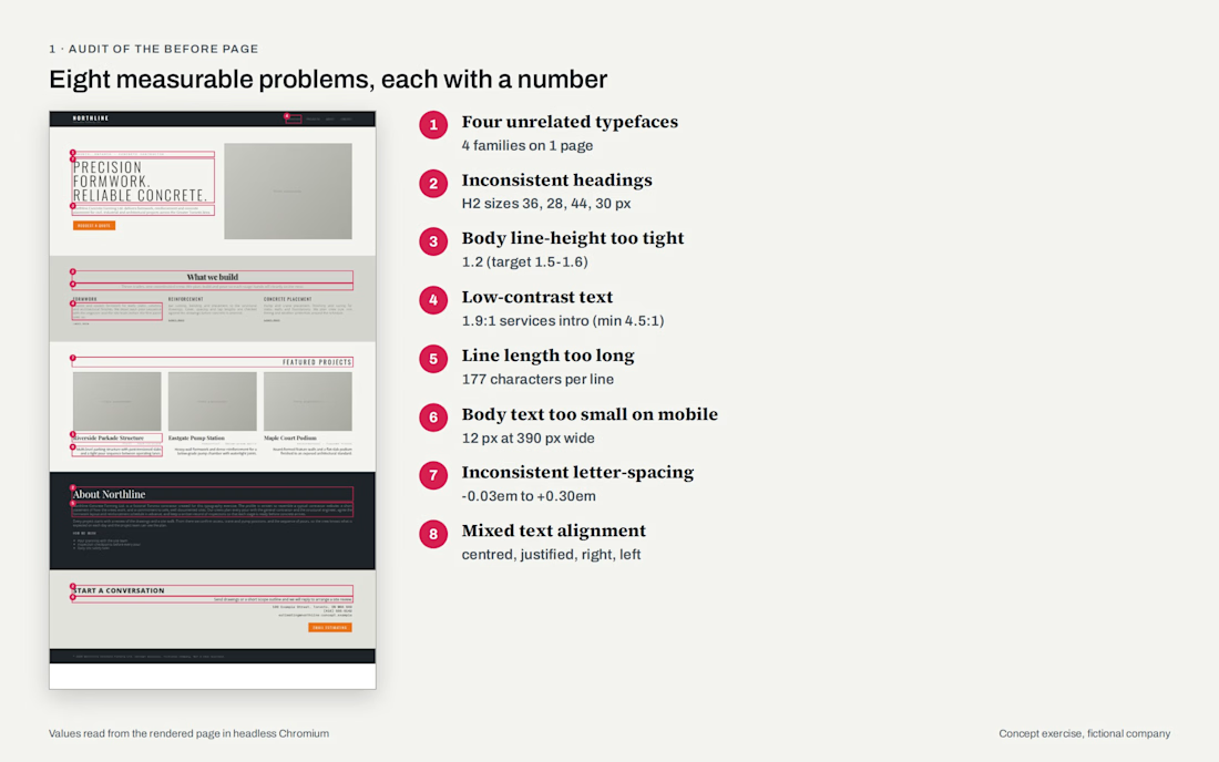
I built a deliberately weak homepage, then audited it the way I'd audit a real site. I measured eight problems: 4 typefaces, 1.2 body line-height, 1.90:1 text contrast, lines of 177 characters, 12px body text on phones, uneven letter-spacing and mixed alignment.
Then I fixed the typography only. The content, colours and layout stayed the same. The fix is two free Google Fonts (Archivo and Source Serif 4), a fluid type scale from 360px to 1440px, body line-height 1.6, a 60-character line length and contrast of at least 5.9:1 for secondary text.
For handoff there is a drop-in CSS file and a Figma style specification, with style names that match the CSS variables, so a designer and a developer use the same names.
Live: northline-type-audit.netlify.app
Built with HTML/CSS, Figma-ready specs and Claude. All numbers were measured in a browser.



The network for creativity
Join 1.25M professional creatives like you
Connect with clients, get discovered, and run your business 100% commission-free
Creatives on Contra have earned over $150M and we are just getting started





Related posts

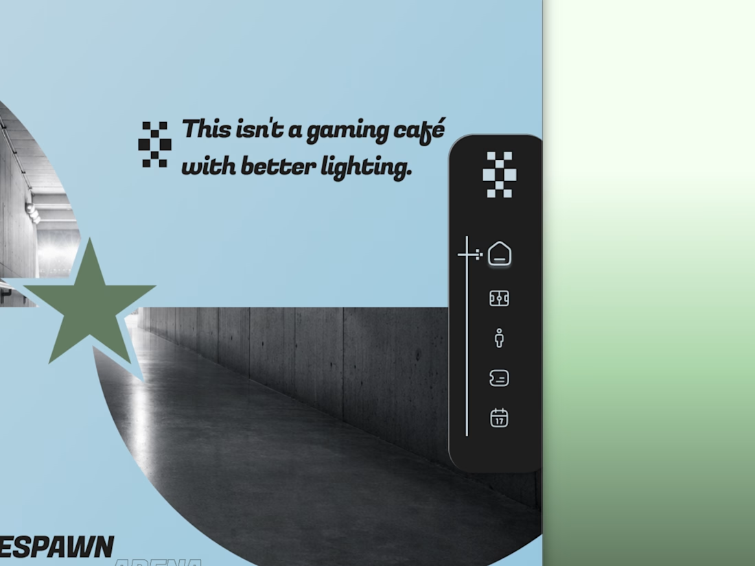
Every esports brand reaches for neon and a mascot.
RESPAWN ARENA reaches for a scoreboard.
Case study on the stadium-grade identity — typography, system, the whole build — dropping soon.

Meet Creative Square, a logo for university students. Same mark, two personalities: loud and energetic, or calm and editorial. Which one would you pick?
13 voted
48%
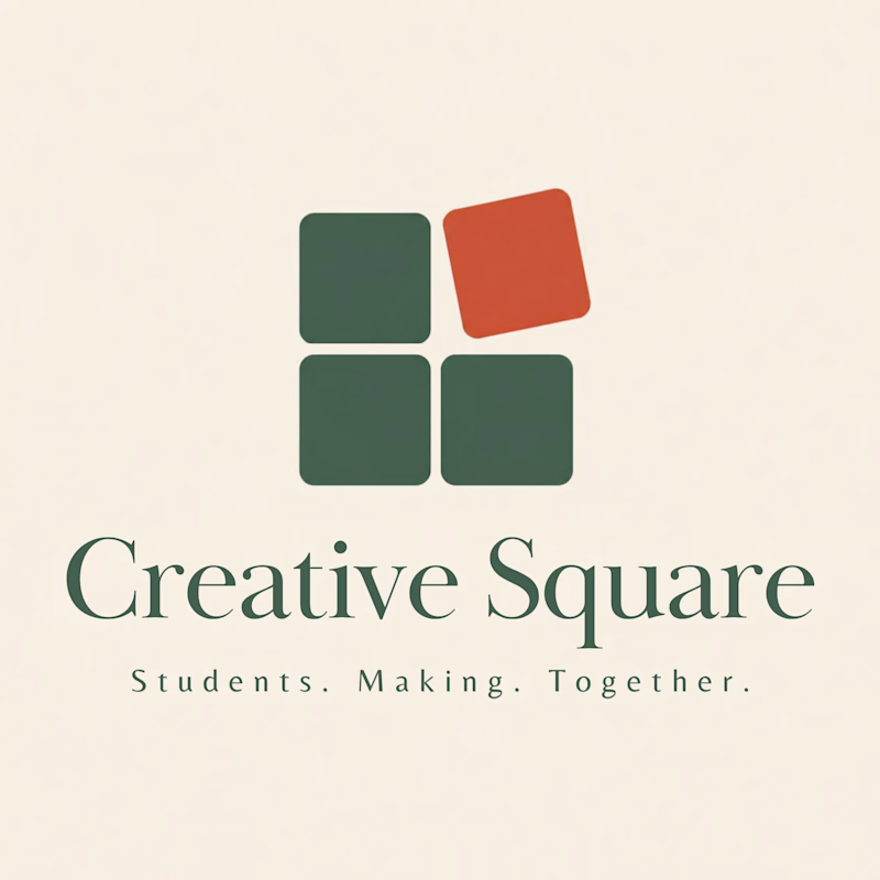
14 voted
52%
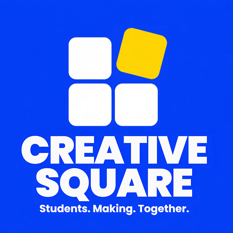
27 votes
Closed

The bold are so attractive that's incredible I choose it ❤️❤️

I just released FAR ENOUGH, a free Framer template for luxury travel. 🌴
Minimal on the surface, a lot of motion underneath:
→ an endless drag-to-explore masonry grid
→ a 3D Instagram carousel
→ a scroll-driven curtain gallery
→ an image trail that follows your cursor
→ light and dark mode with one click
10 pages, 4 CMS collections, fully responsive, with a reduced-motion fallback. Every animation is editable in the properties panel, no code needed.
Made for travel studios, villas, retreats and anyone who wants a site that feels far away in the best way.
Free on the Framer Marketplace: https://www.framer.com/marketplace/templates/far-enough/
Live preview: https://farenough.framer.website
#Framer #FramerTemplate #WebDesign #FreeTemplate


Nice website bro