The network for creativity
Join 1.25M professional creatives like you
Connect with clients, get discovered, and run your business 100% commission-free
Creatives on Contra have earned over $150M and we are just getting started
Back to feedPost

I did not approach Flowmetric’s mobile experience as a smaller version of the desktop website... Once the design moved across different viewport sizes, new decisions appeared
Headlines needed different compositions
Product interfaces had to reorganize
Information that could sit side by side on desktop needed a clear sequence on mobile… Navigation needed its own hierarchy
Pricing plans couldn’t rely on the same four column presentation… CTA prominence, spacing and content order also had to be reconsidered
This continued during development because the browser exposed conditions that weren’t always obvious inside fixed Figma frames
Responsive implementation is still design work... The screen changes, so sometimes the decision has to change with it
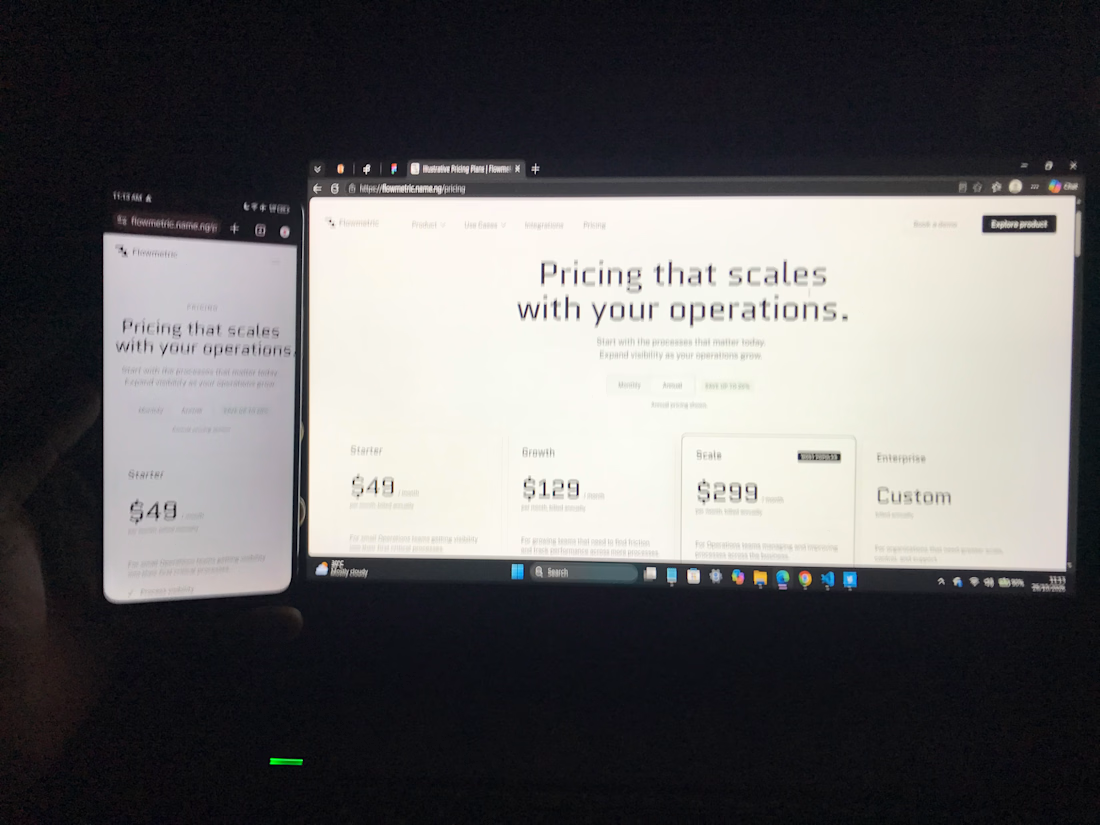
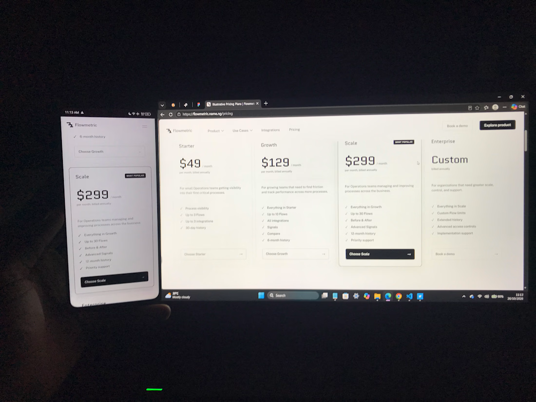
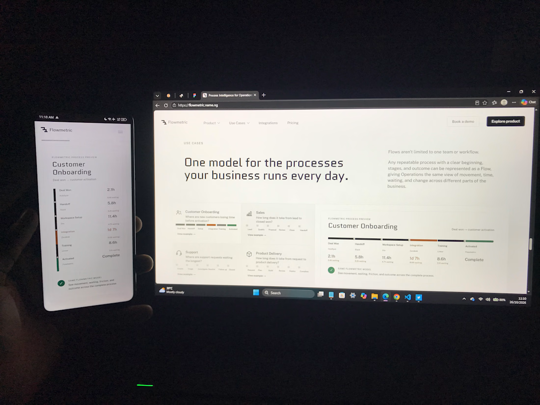
The network for creativity
Join 1.25M professional creatives like you
Connect with clients, get discovered, and run your business 100% commission-free
Creatives on Contra have earned over $150M and we are just getting started



Related posts

Kajabi Website Design for Online Coaches & Courses
Designed a Kajabi website concept for online coaches and course creators who need a clear, professional way to present their programs and learning offers.
The website focuses on presenting course information, highlighting program benefits, and guiding visitors toward enrollment or the next step. The layout combines clear content structure, engaging sections, responsive design, and strategically placed calls to action to create a smooth experience across desktop and mobile.
The goal is to help coaches communicate the value of their programs and give prospective students a clear path from discovering the offer to taking action.
#Kajabi #KajabiWebsiteDesign #WebsiteDesign #OnlineCourse #CourseCreator #OnlineCoaching #CoachingWebsite #CourseWebsite #LandingPageDesign #SalesPageDesign #WebDevelopment #Elearning

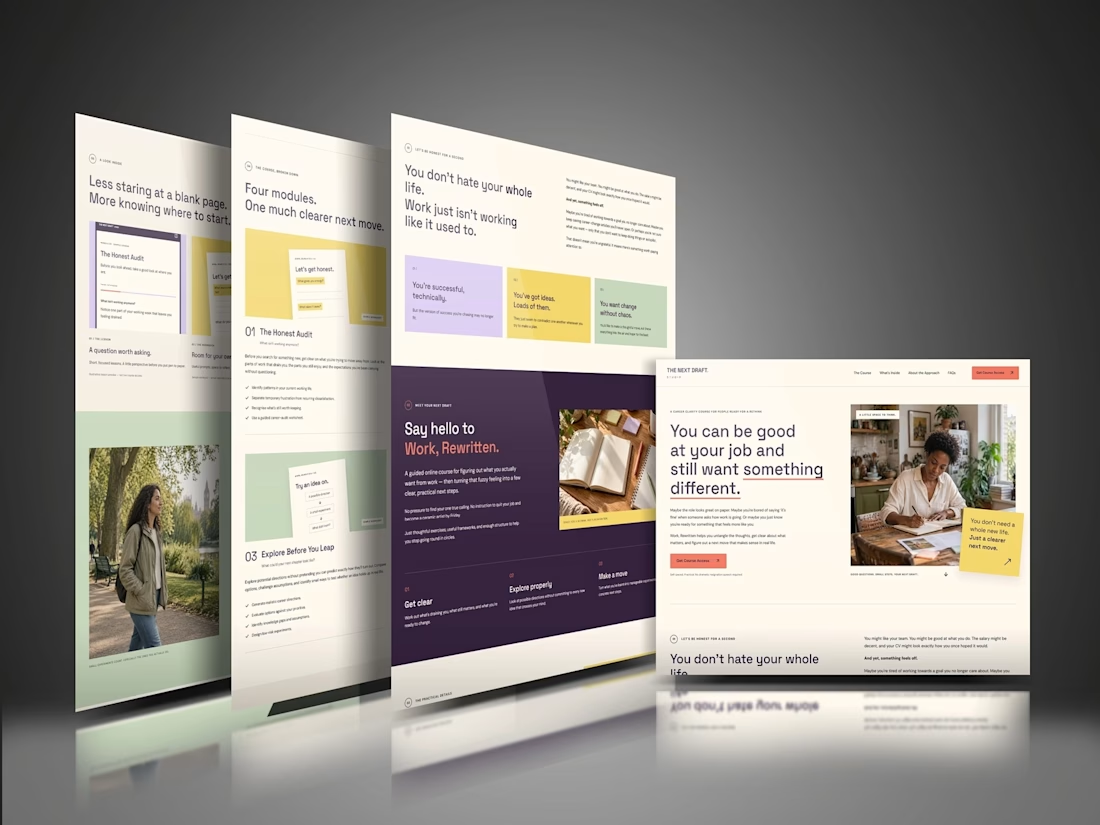

The “Four modules. One much clearer next move.” line makes the course feel manageable before someone gets into the details. That’s a useful choice for coaches whose offers can otherwise feel overwhelming. For this concept, would the main CTA go straight to enrollment, or let visitors preview a lesson first?


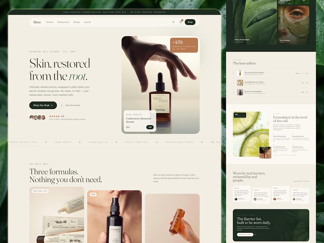
Skincare E-commerce Website · UI/UX · Responsive Design
Skincare shopping can quickly become overwhelming. With multiple products, ingredient lists, reviews, and routines to consider, customers need more than attractive product photography. They need a clear way to explore their options.
For Sēve., the design direction focuses on creating a calm, editorial shopping experience that makes skincare discovery feel more considered.
Design focus:
- Responsive website design
- Product and category discovery
- Ingredient-focused content sections
- Best-selling product presentation
- Customer review and trust sections
- Clear navigation and shopping CTAs
- Consistent visual hierarchy across screen sizes
Visual direction
Warm neutrals and deep green create a calm, premium atmosphere. Editorial typography and carefully structured content keep the interface refined without making it feel difficult to navigate.
Project goal
Create a responsive skincare e-commerce experience that balances visual appeal with clear product discovery and a more confident shopping journey.
Services
UI/UX Design · E-commerce Website Design · Responsive Web Design · Digital Experience Design
🏀 Full Design Showcase – Better View on Dribbble.
✅ https://dribbble.com/shots/27835463-Skincare-E-commerce-Website-UI-UX-Responsive-Design
Building something similar?
Visumind Creative works with growing brands on E-commerce, Websites, UI/UX, Brand Identity, and Development.
Contact us to discuss your next project or request a free website/UX audit.


This is very clean i like it so much

Developed a modern, high-end, and lightning-fast e-commerce website for SOLK, an eco-conscious lifestyle brand. The goal was to build a clean, minimalist user interface that aligns with a luxury sustainable brand while offering a seamless shopping experience across mobile and desktop devices.
Key Contributions & Features:
Custom E-Commerce Architecture: Built and configured a fully responsive store on Shopify with smooth category navigation, product filters, and optimized collection pages.
Minimalist UI/UX Design: Implemented a clean, whitespace-heavy aesthetic with high-definition visual imagery, sophisticated typography, and elegant layout structures.
Conversion-Optimized Checkout: Integrated streamlined cart and checkout flows to minimize friction and boost sales conversions.
Performance & Mobile Responsiveness: Ensured fast page load speeds, mobile optimization, and secure cross-browser compatibility.


Clean, minimal, and fast. Perfect match for an eco-luxury brand. 🌿