The network for creativity
Join 1.25M professional creatives like you
Connect with clients, get discovered, and run your business 100% commission-free
Creatives on Contra have earned over $150M and we are just getting started
Back to feedPost

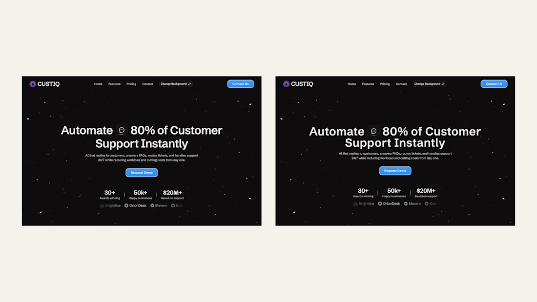
Been busy working on one of the old design for a property rental template in framer. I feel like a lot of my first generation design get lost in translation and end up being all over the place so I always go back to them after a while with a fresh eyes. This one turned out to be pretty good as compared to last design. How does it look?
The network for creativity
Join 1.25M professional creatives like you
Connect with clients, get discovered, and run your business 100% commission-free
Creatives on Contra have earned over $150M and we are just getting started








Related posts

Just made a new Framer component to showcase projects!
It has two views: Floating and Masonry Grid. You can use both with a toggle or stick to just one view.
And of course, it’s CMS-connected, making it easy to update your content, with an optional manual upload for smaller collections.
You can scroll or drag to explore, and even rearrange the grid by dragging. Really love this one!
Would you use both views or just choose one?
Check it here


Floating view for me. The drifting images look great.

The same font can look different. (Look at the headline/main text)
Look at the letter spacing. Look at the line height.
When I import design from Figma to Framer, these things often change, so it's must to double check it.

Ye le Jani is post ke liye:
So true! 👌 This is such an underrated detail. Figma to Framer import always messes with letter spacing and line height - the same font ends up looking totally different if you don't double check. Great reminder to QA the typography properly!

Title: Proper Form — Brand Identity & Visual Language
A brand identity for Proper Form built around a more modern, movement-driven take on recovery and healthcare.
The visual system extends the logo into a complete language through color, typography, imagery and layout, creating a consistent identity across different brand touchpoints.
Created by Lepisov Branding in collaboration with @Creative Mints
Logo design: Ilya Gorchanyuk
Creative direction: Dmitry Lepisov
Brand identity: Lepisov Branding × Creative Mints


Using the logo mark as the big graphic across the layouts is smart. The purple to pink gradient gives recovery a more energetic feel.