The network for creativity
Join 1.25M professional creatives like you
Connect with clients, get discovered, and run your business 100% commission-free
Creatives on Contra have earned over $150M and we are just getting started
Back to feedPost

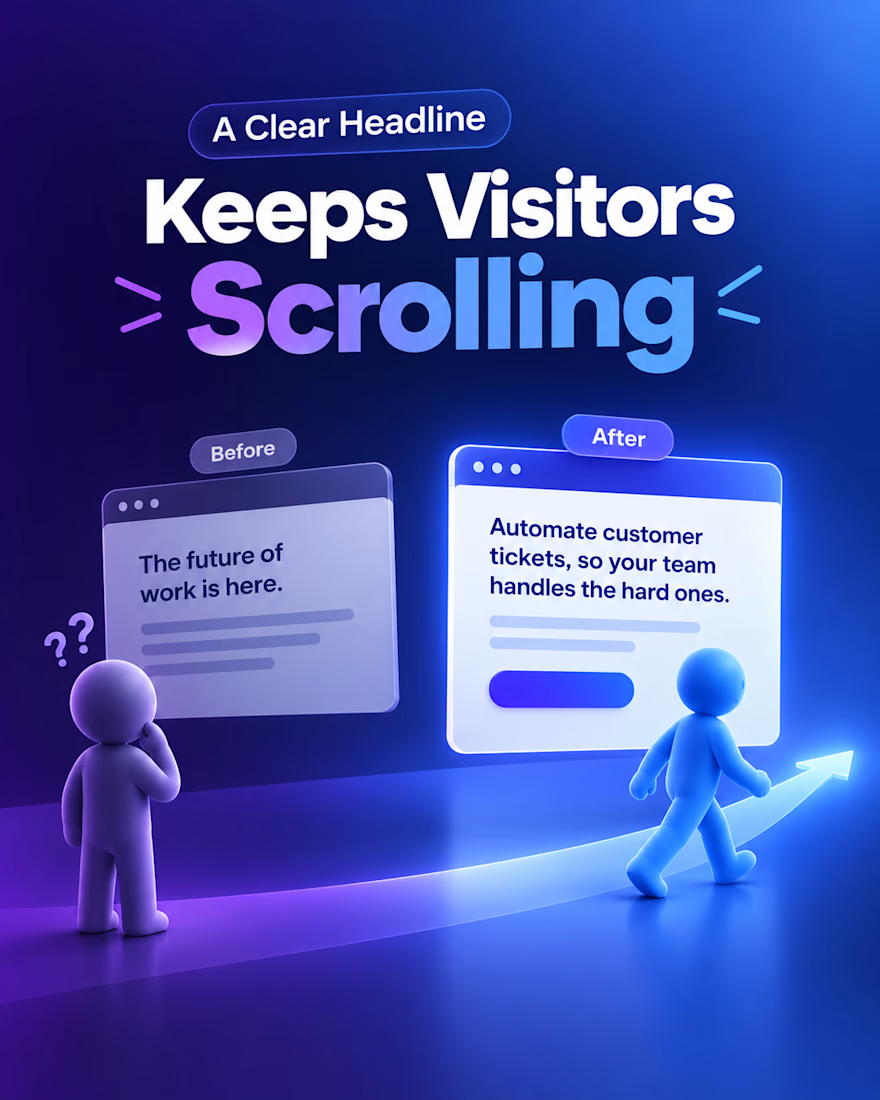
Most founders lose a visitor in the first five seconds and never know why.
The problem is usually the headline.
It says things like "The future of work is here" or "AI that powers your growth." It sounds nice, but a stranger has to think to understand it, and people do not think on a landing page. They leave.
The fix is to say what your product does and what result the person gets, in plain words.
Before: Reimagine your customer support with next-gen AI.
After: Answer most of your customer tickets automatically, so your team only handles the hard ones.
The second line shows who it helps, what it does, and why it matters. The visitor gets it in three seconds, keeps scrolling, starts to trust you, and then clicks.
Quick test: show your page to a friend for five seconds, hide it, and ask what your product does. If they cannot say it clearly, the headline needs a rewrite.
I design and build landing pages in Framer for AI SaaS teams, and this is the first thing I check on every project.
Once your headline is clear, what stops people from clicking your button? Too many choices, an unclear next step, or not enough proof?
The network for creativity
Join 1.25M professional creatives like you
Connect with clients, get discovered, and run your business 100% commission-free
Creatives on Contra have earned over $150M and we are just getting started

Challenges
View all


Related posts

Landing page exploration 🐙
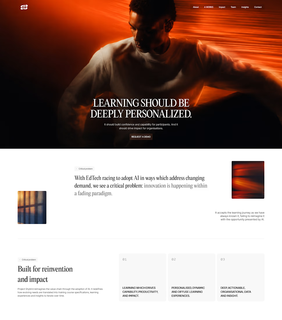

creative

How Much would You pay for this level of Motion in your landing pages


I would price the scope and performance requirements before the amount of motion.


Ukill: a website template for law firms. The first screen offers a face and a free consultation before any list of cases.
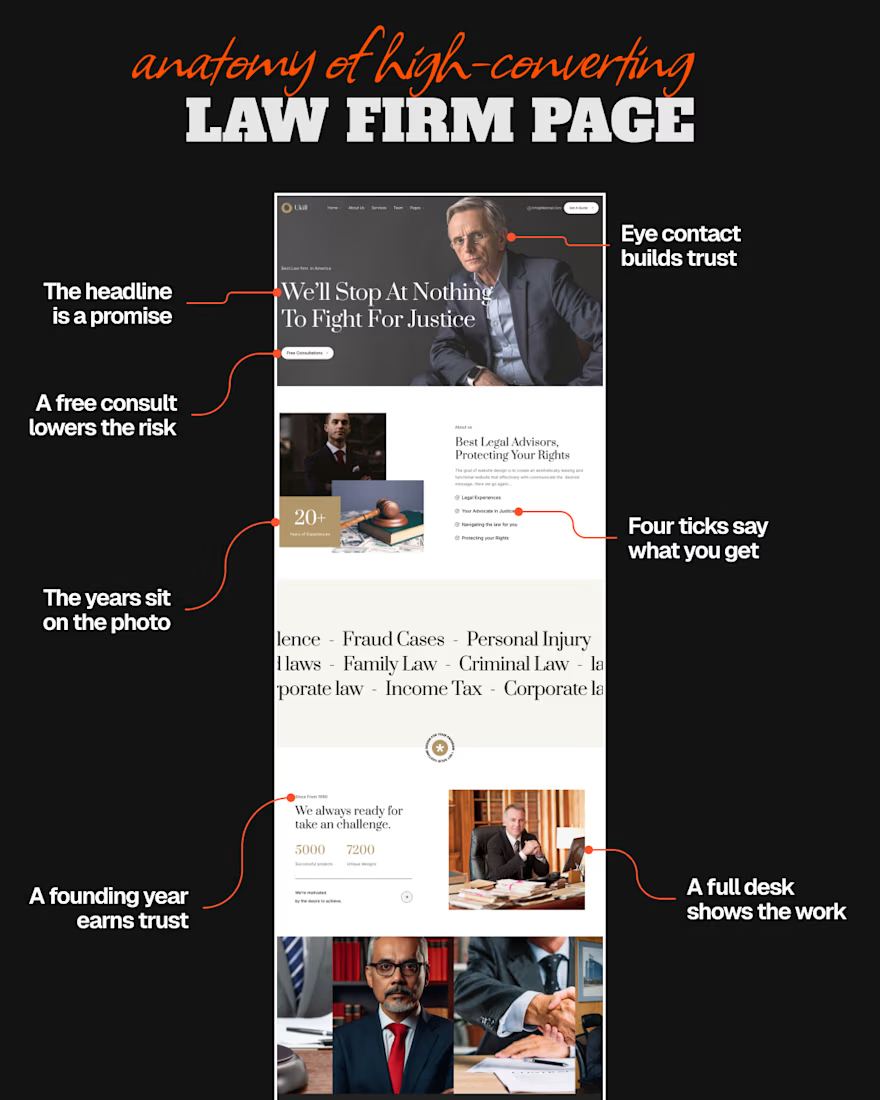

Putting the portrait and free consult ahead of the practice list is a smart trust order. The black canvas and orange callouts also make the spacing of the promise, ticks, and desk photos read clearly.