The network for creativity
Join 1.25M professional creatives like you
Connect with clients, get discovered, and run your business 100% commission-free
Creatives on Contra have earned over $150M and we are just getting started
Back to feedPost


The network for creativity
Join 1.25M professional creatives like you
Connect with clients, get discovered, and run your business 100% commission-free
Creatives on Contra have earned over $150M and we are just getting started








Related posts

Bold before/after split-screen thumbnail for a room makeover video brush typography, expressive face, directional arrow, warm vs cool contrast.
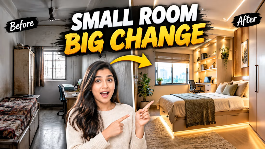

SMALL ROOM BIG CHANGE with the before and after split is a classic click-worthy thumbnail formula. The brush typography and yellow arrow carry the transformation story well. Strong YouTube design instincts.

New case study added!
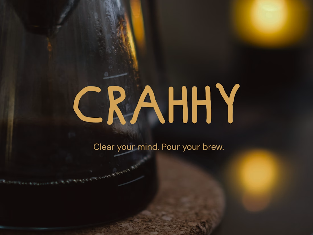
Crahhy is a speciality coffee brand rooted in the relatable human psychology of coffee cravings.
The objective was to design a brand that is minimal on the outside yet delightfully chaotic on the inside, blending specialty coffee aesthetics with honest, humorous storytelling.


minimal outside chaotic inside is the right brief for coffee

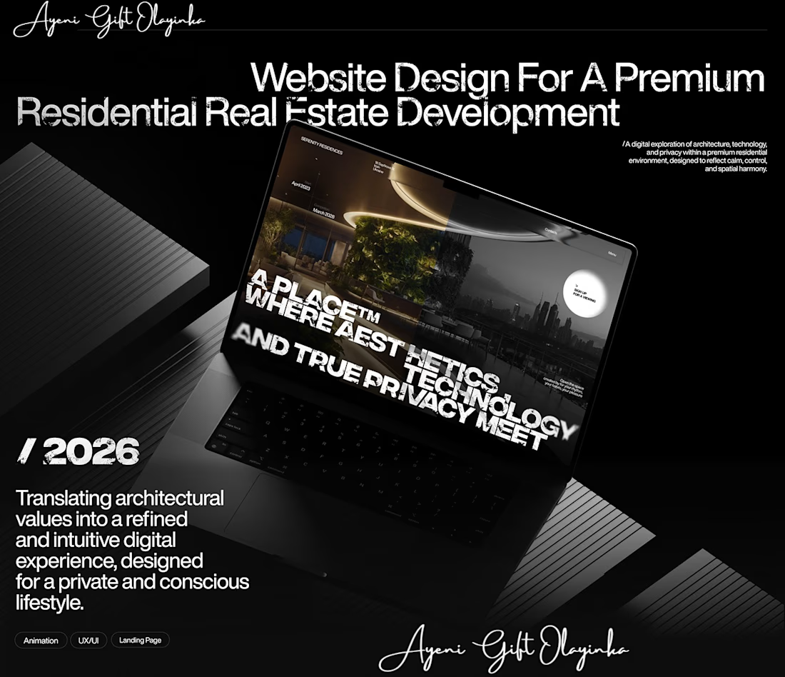
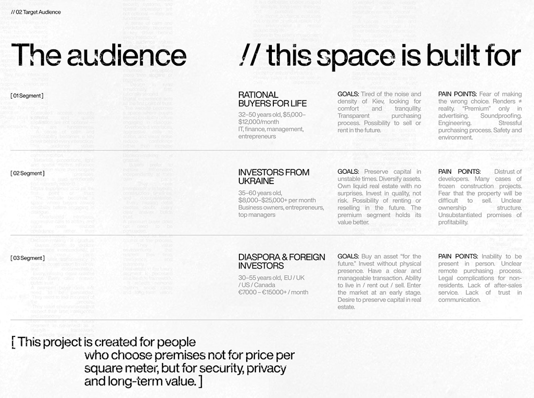
What makes someone stop scrolling and imagine themselves living in a property?
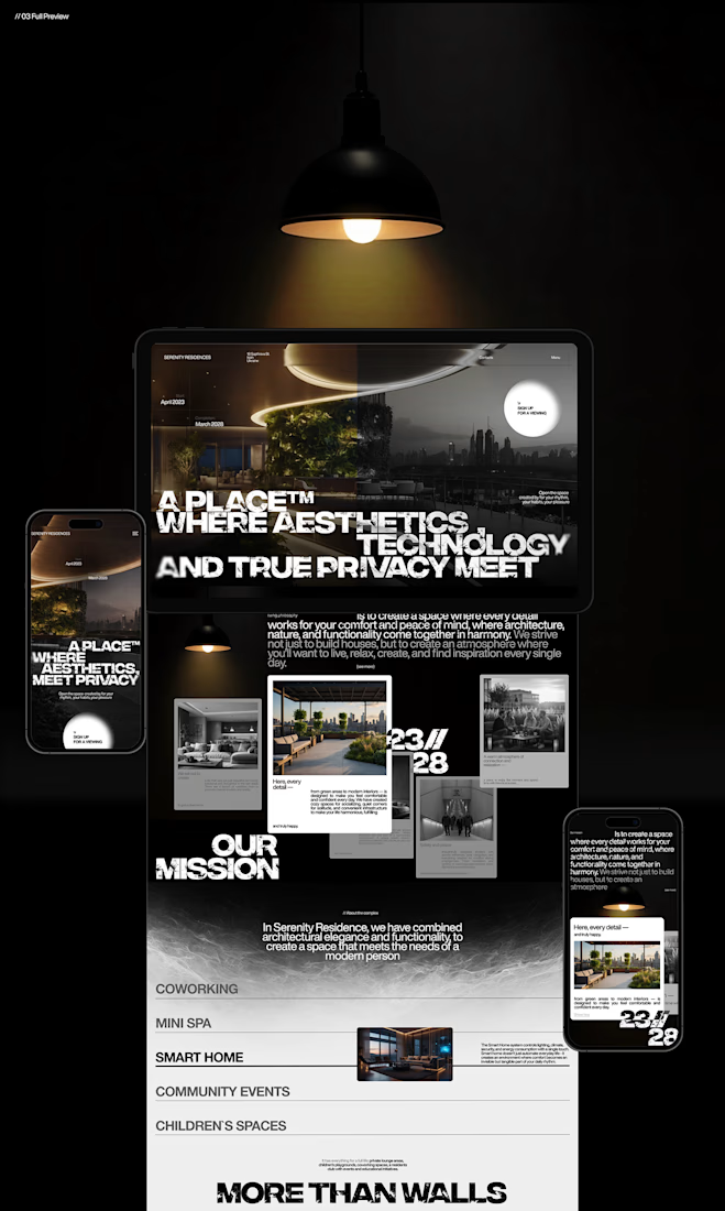
That's something I kept in mind while working on this luxury real estate website concept.
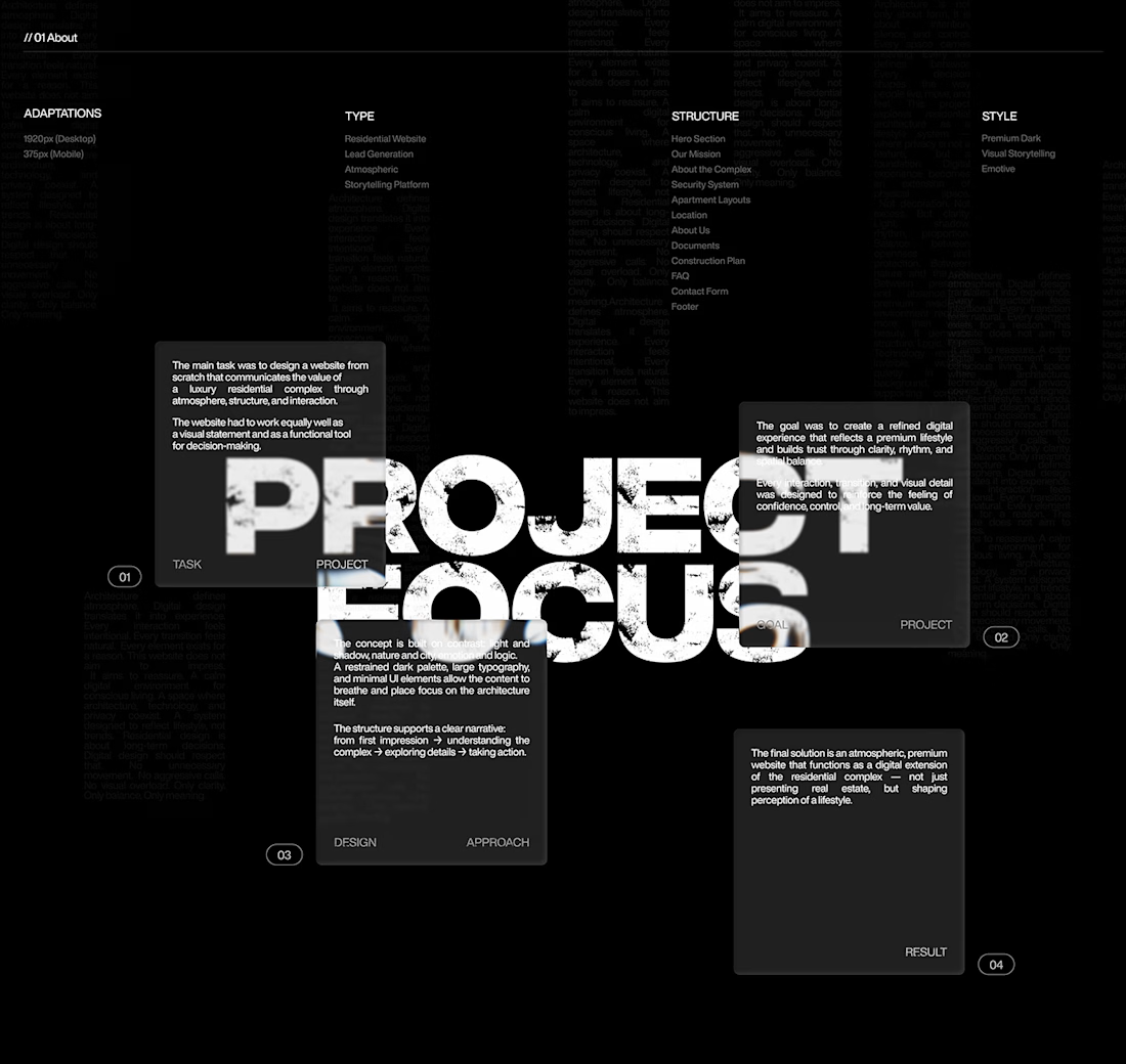
I wanted the design to feel premium without making the experience complicated. The focus was on strong visuals, clean layouts, and a clear structure that lets the properties speak for themselves.
I also paid attention to how visitors move through the website, from their first impression to exploring the properties and taking the next step.
Because when someone is looking for a home, the experience matters just as much as the presentation.
I couldn't fit every screen into this post, so I'll share more of the design in the comments. 👇
I'm curious: when you visit a real estate website, what makes you want to explore further?
#WebDesign #Architecture #LuxuryRealEstate #UIUXDesign #RealEstate #Figma



nice work