The network for creativity
Join 1.25M professional creatives like you
Connect with clients, get discovered, and run your business 100% commission-free
Creatives on Contra have earned over $150M and we are just getting started
Back to feedPost

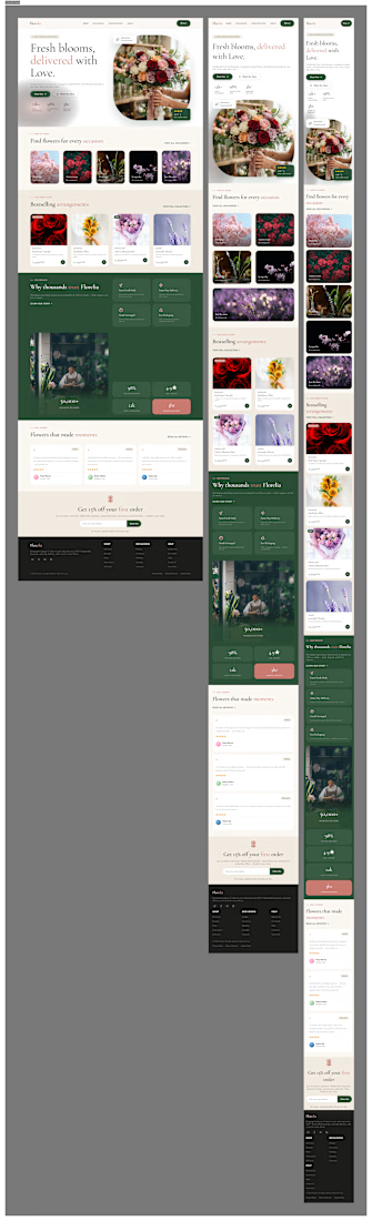
Florelia is a same-day flower delivery service. I designed the full marketing and shop-entry experience across desktop, tablet and mobile — a single responsive system rather than three separate layouts.
The problem
Flower buying is emotional and time-pressured. People arrive knowing the occasion, not the product. Most florist sites organise around flower type, which forces the buyer to translate "my mom's birthday" into "gerbera vs. lily." The design had to remove that translation step and make trust legible fast, since the buyer never sees the product before it reaches someone they care about.
Approach-
Occasion-first navigation. The primary browse module is Shop by Mood — Birthday, Anniversary, Wedding, Sympathy, Just Because — with arrangement counts so the path feels stocked, not empty.
Trust surfaced early and repeatedly. Delivery window, satisfaction rate, and review score sit inside the hero, then recur as a proof band and named regional testimonials further down.
A warm, editorial visual language. Deep forest green and blush against off-white, with a serif/italic pairing in the headlines to carry the emotional register a typical e-commerce sans would flatten.
Product cards built to compare. Consistent category tag, name, one-line composition note, and strikethrough pricing so scanning four options takes seconds.
Responsive behaviour-
The desktop four-up product grid becomes two-up on tablet and single-column on mobile. The hero stat row reflows from a single line to a 2+1 arrangement, and the five-column footer collapses to stacked groups. Nav condenses to a menu trigger while the cart stays persistent.
Outcome
A complete, build-ready homepage system with defined breakpoints, a reusable card and section pattern, and a consistent type and colour scale.

The network for creativity
Join 1.25M professional creatives like you
Connect with clients, get discovered, and run your business 100% commission-free
Creatives on Contra have earned over $150M and we are just getting started



Related posts


generated these little fellas for a concept and now i want to build a whole brand around them.
if you're making something that helps people dream and aspire, they're looking for a home:)


adorable!🥹

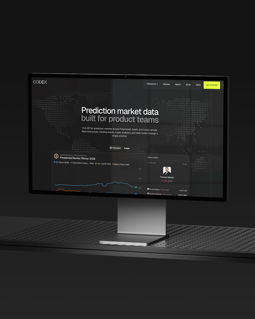
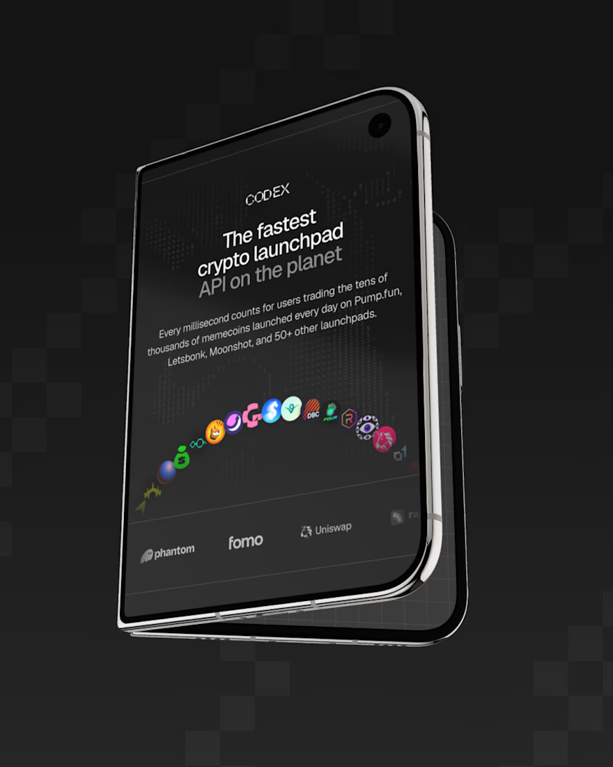
Excited to share the latest web redesign projects for Codex⚡
The goal was to pair technical credibility with a more approachable, modern financial aesthetic while preserving the depth and complexity that make Codex a high-profile data provider.
The result is a visual direction designed to resonate across the spectrum, from crypto builders and neofinance founders to enterprise-scale exchanges like Coinbase. 💻



Love the logo on the keyboard key