The network for creativity
Join 1.25M professional creatives like you
Connect with clients, get discovered, and run your business 100% commission-free
Creatives on Contra have earned over $150M and we are just getting started
Back to feedPost
Taste Test

Which is the best layout for a great user experience?
1 voted
50%

1 voted
50%

2 votes
Closed
The network for creativity
Join 1.25M professional creatives like you
Connect with clients, get discovered, and run your business 100% commission-free
Creatives on Contra have earned over $150M and we are just getting started
Related posts

One produc Multiple experiences One cohesive design system
Meet TEAMIO a product I designed from the marketing website to the partner dashboard, bringing the entire experience together through thoughtful UX and consistent UI
Which screen is your favorite?


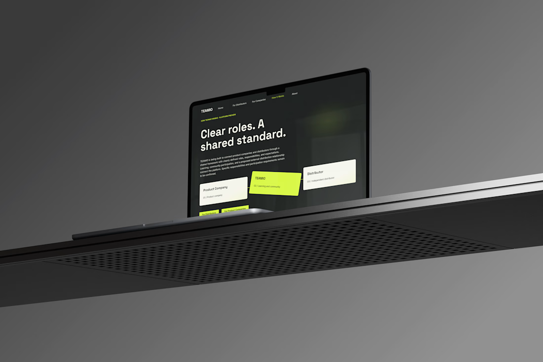
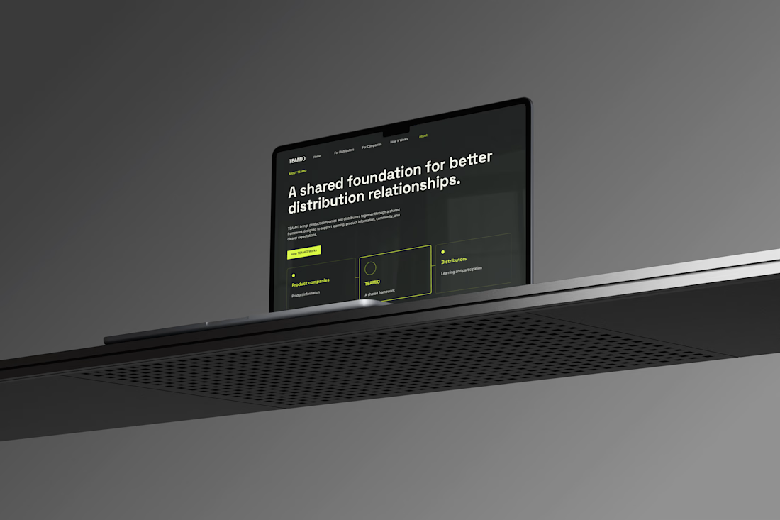


I like the colour combinations and the website vibes it's super elegant but still very creative 👏✅

Design A vs. Design B — Which One Wins?
Every design decision makes a difference. I'd love to hear your perspective!
Which concept do you think works best in terms of visual impact, layout, and overall effectiveness?
🔹 Option A
🔹 Option B
Drop your choice in the comments and tell me why. I'd love to hear your thoughts!
0 voted
0%

3 voted
100%

3 votes
Closed

I'd go B: the yellow headline pops against the blue sky and the phone number gives drivers a next step. Did you test a version with fewer words in the small print line?

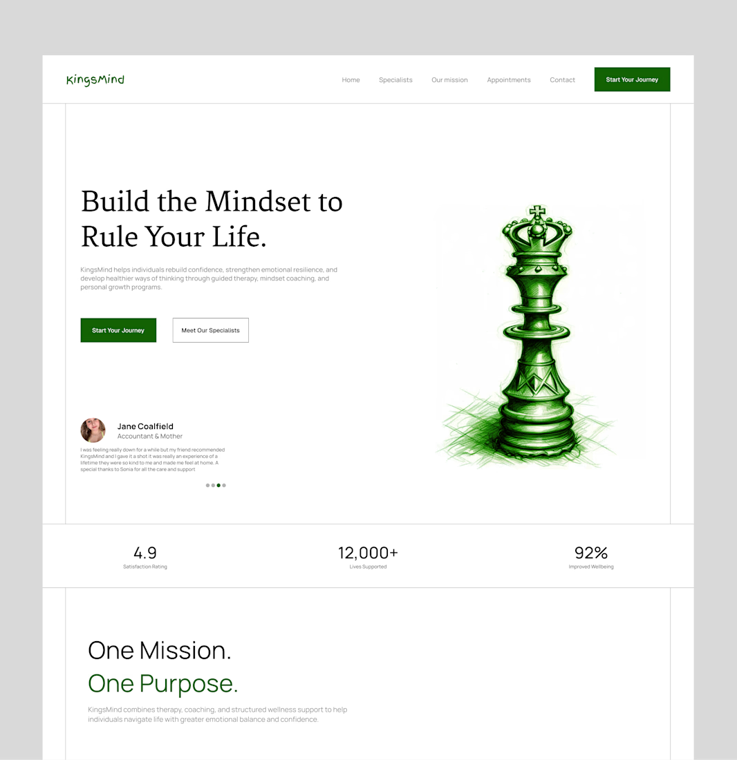
Bringing an old hero section design back to the spotlight. ✨
A hero section is often the first thing people see when they visit a website, so it needs to do more than just look good. It should capture attention, communicate the brand's message, and guide visitors toward the next step.
For this concept, I focused on creating a clean layout, strong visual hierarchy, and a balanced composition that makes the content feel clear and engaging without overwhelming the viewer.
Looking back at older projects is always a good reminder of how much thought goes into the little details that make a design work.
What do you think of this one? 👀
#WebDesign #UIUXDesign #HeroSection #LandingPageDesign #Framer #WebDesigner #UIDesign #DesignInspiration #Contra #PortfolioWork


this is amazing design