The network for creativity
Join 1.25M professional creatives like you
Connect with clients, get discovered, and run your business 100% commission-free
Creatives on Contra have earned over $150M and we are just getting started
Back to feedPost
Taste Test


Choosing the hero image for a concept I’m currently developing.
Both belong to the same visual world, but they lead the campaign in completely different ways.
If you were making the call, which one gets hero status and why? 👀
I already have my pick. Curious to see if everyone sees what I see.
4 voted
100%

0 voted
0%

4 votes
Closed

Lobster is the clear winner
The Serpent, the bottle completely drowns out and becomes harder to see


Less is more for this one.
The network for creativity
Join 1.25M professional creatives like you
Connect with clients, get discovered, and run your business 100% commission-free
Creatives on Contra have earned over $150M and we are just getting started



Related posts

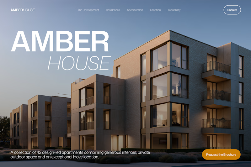
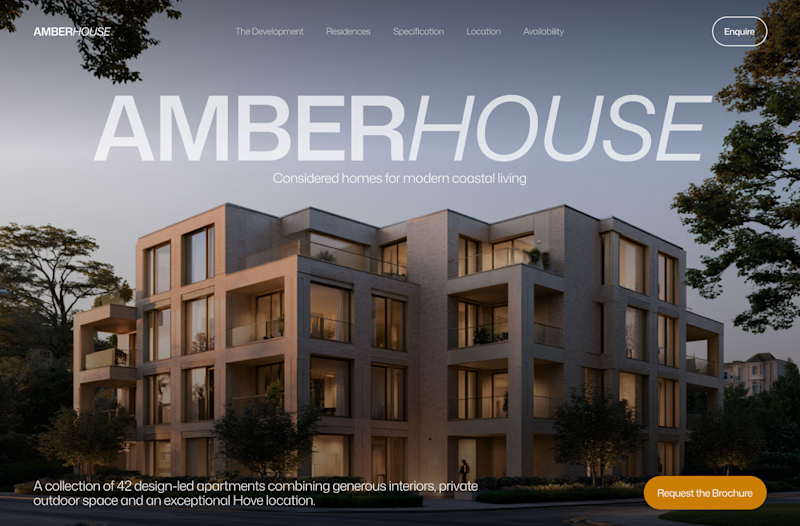
Which hero would you choose — 1 or 2?
Two directions for Amber House, my real estate website template. The first pairs a closer architectural crop with an asymmetric layout. The second gives the building more breathing room, with a wide view and a centered headline.
Same template, two different first impressions. Which feels stronger to you, and why?
24 voted
59%
17 voted
41%
41 votes
Closed

I will go with Bold & Asymmetric!

Really liked how these designs turned out!
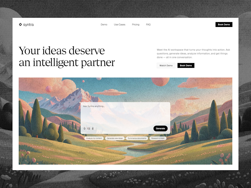
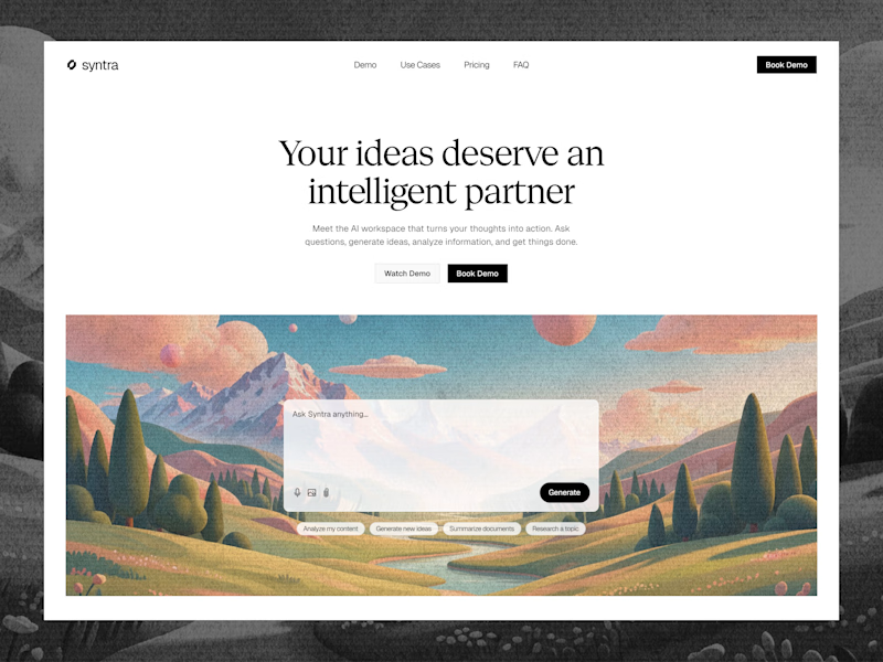
Explored a concept for AI SaaS product, focusing on a clean interface and a simple, intuitive chat experience.
Tried two different layout variation for the hero section.
Which would you like?
13 voted
57%
10 voted
43%
23 votes
Closed

Really clean concept! 👏
I like the second layout more — the headline "Your ideas deserve an intelligent partner" + the chat preview below makes the AI feel real and easy to use immediately. The first one is also clean, but this one sells the product faster.
I also design SaaS...

Dark Mode 🖤 or Light Mode 🤍?
Which one matches your vibe? 👀
15 voted
54%
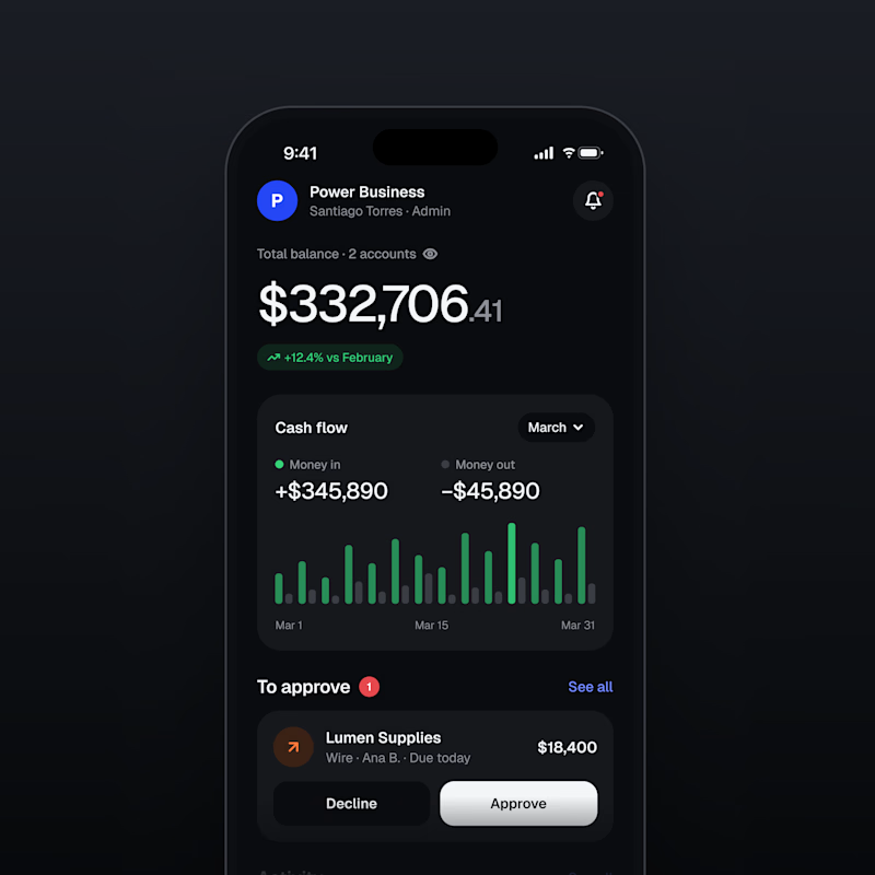
13 voted
46%
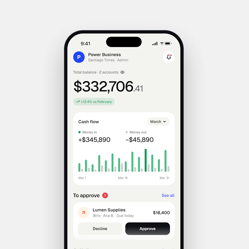
28 votes
Closed

Both are nice clean designs...for me,Dark mode!